-
Welcome to the Community Forums at HiveWire 3D! Please note that the user name you choose for our forum will be displayed to the public. Our store was closed as January 4, 2021. You can find HiveWire 3D and Lisa's Botanicals products, as well as many of our Contributing Artists, at Renderosity. This thread lists where many are now selling their products. Renderosity is generously putting products which were purchased at HiveWire 3D and are now sold at their store into customer accounts by gifting them. This is not an overnight process so please be patient, if you have already emailed them about this. If you have NOT emailed them, please see the 2nd post in this thread for instructions on what you need to do
You are using an out of date browser. It may not display this or other websites correctly.
You should upgrade or use an alternative browser.
You should upgrade or use an alternative browser.
WIP Hunter 3D's Upcoming Products (featuring Dawn 2.0)
- Thread starter Doug Hunter
- Start date
-
- Tags
- dawn dusk dynamic clothes hunter 3d
Yet another render of some Borsala Cyber Sci-fi mat with Dawn 2.0;
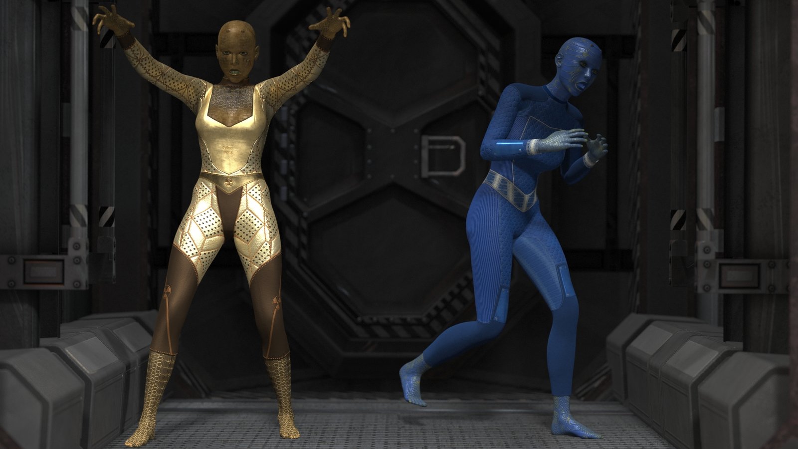
I'm looking at if I should cull some of these mats. Any suggestions of what ones should stay and what ones should go;
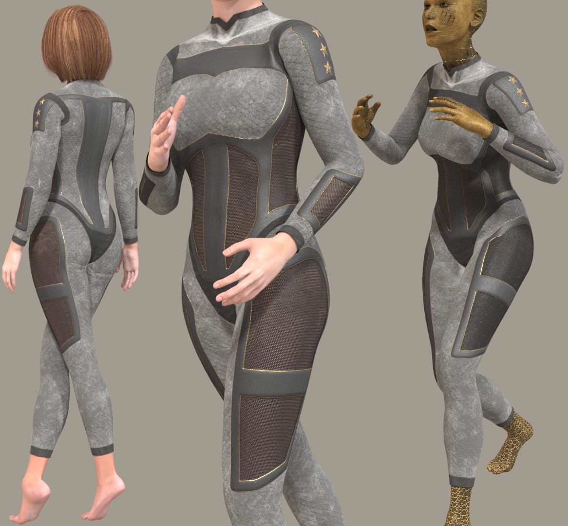
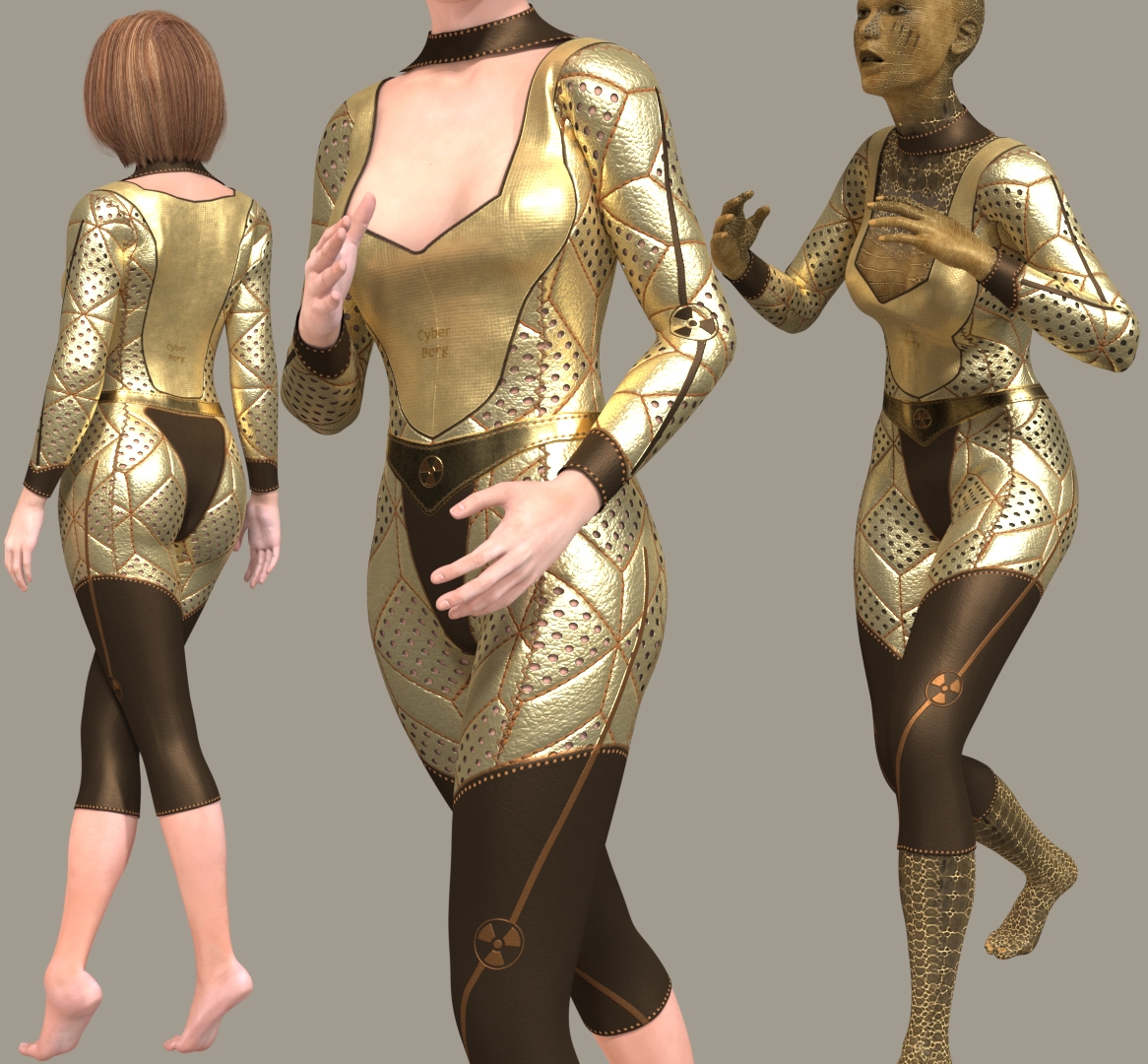
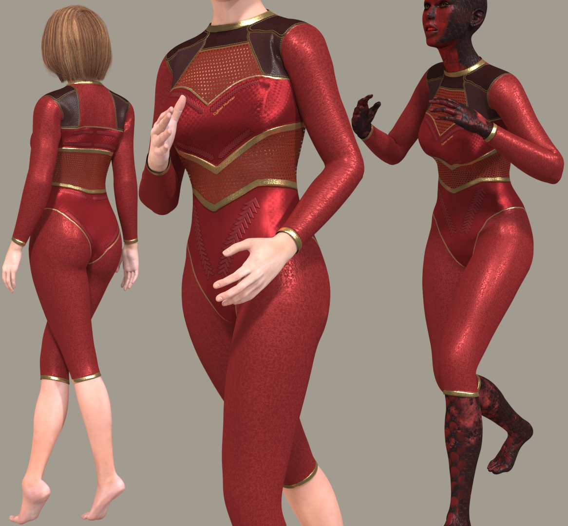
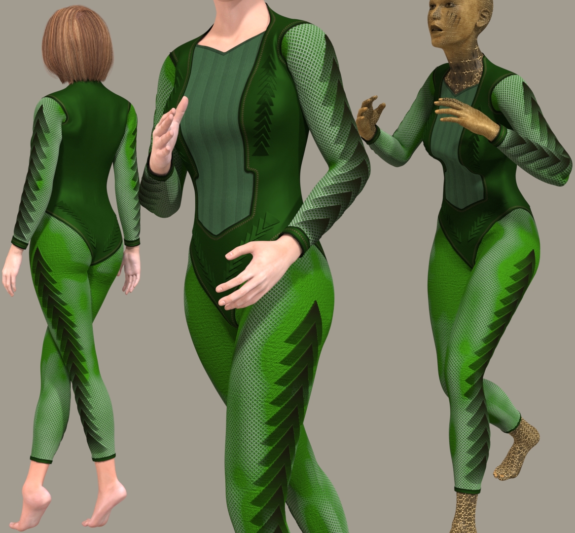
Me too, that's the start of my problem in trying to cull any of themI like them all.
I already binned three other ones.
Hornet3d
Wise
Just like Janet I like them all but I also like the idea of a separate texture set so people can have the option. There is not a bad texture there but something to be aware of is in many cases the texture will depend very much on the scene being portrayed. For example I may well use the blue or the grey for work or office type environment but less likely to use the gold textures as I do not see them as being every day. On the other hand the gold would me my choice if portraying an evening out. That is why many of the renders use your Borghild outfit there is almost always always a texture to suit any occasion. Hopefully the spin off for you is that the outfit gets seen more widely resulting in increased sales.
Thanks. I'll certainly take this into consideration.Just like Janet I like them all but I also like the idea of a separate texture set so people can have the option. There is not a bad texture there but something to be aware of is in many cases the texture will depend very much on the scene being portrayed. For example I may well use the blue or the grey for work or office type environment but less likely to use the gold textures as I do not see them as being every day. On the other hand the gold would me my choice if portraying an evening out. That is why many of the renders use your Borghild outfit there is almost always always a texture to suit any occasion. Hopefully the spin off for you is that the outfit gets seen more widely resulting in increased sales.
That's what I'm thinking. Doug, no one will tell you they all have to be in the same product. You can cut them in half, or even thirds, and do Vols. 1, 2 and 3. They don't ALL have to hit the store at the same time.Do a separate texture set?
Hornet3d
Wise
That's what I'm thinking. Doug, no one will tell you they all have to be in the same product. You can cut them in half, or even thirds, and do Vols. 1, 2 and 3. They don't ALL have to hit the store at the same time.
True and you also have the advantage that you have returning customers.
So, I'm going to re-visit the colour schemes.For example I may well use the blue or the grey for work or office type environment but less likely to use the gold textures as I do not see them as being every day.
Actually I had one of those gold outfits originally as blue - what's better?
Last edited:
How about changing this yellow/gold for black?
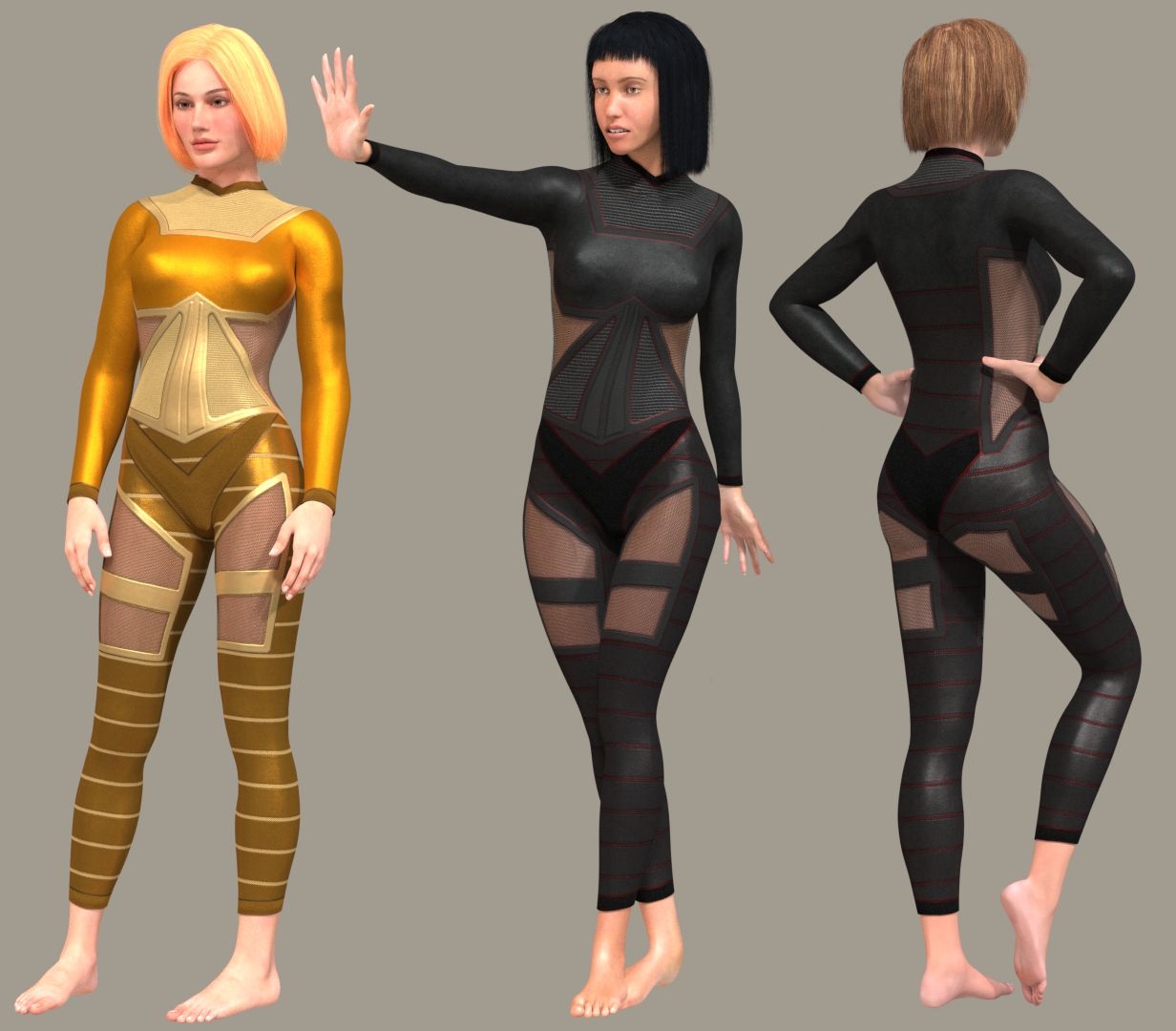
They're both nice, but users might have more use for the blue set, than they'd have for the "bright" gold set.So, I'm going to re-visit the colour schemes.
Actually I had one of those gold outfits originally as blue - what's better?
View attachment 70004
For this set I like the Black better, though I'd remove those patches on the back of her thighs and glutes. Instead, you could make the trim around her neck and hands that color to give more contrast to the set. To me, the patches on the back don't add anything to the design. Just my 2 cents, FWIW.
For this set I like the Black better, though I'd remove those patches on the back of her thighs and glutes. Instead, you could make the trim around her neck and hands that color to give more contrast to the set. To me, the patches on the back don't add anything to the design. Just my 2 cents, FWIW.
Like this?
Since I'm going to split the Borsala Cyber Sci-fi into two sets, I'm thinking that I could keep some mats that I previously binned;
What about bringing back this one? And if so, then in what colour?
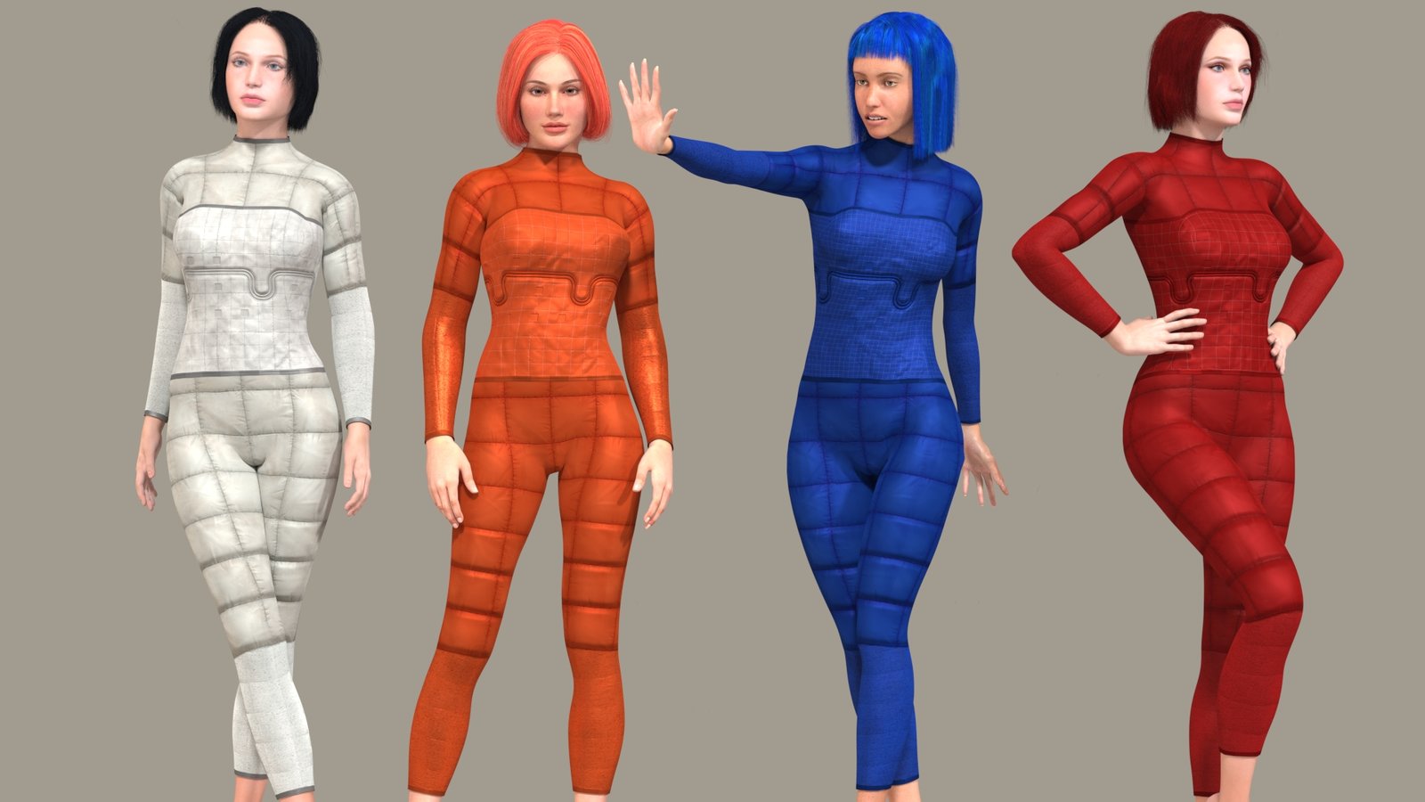
What about bringing back this one? And if so, then in what colour?
That would depend on which color(s) you've already used. I would think having it in a color you haven't used much in the other sets would work well. Folks like variety, and not using the same colors all the time would be useful.
That said, for this set, I think I like the white/grey set on the left, as I haven't seen you use those colors much in the other sets.
That said, for this set, I think I like the white/grey set on the left, as I haven't seen you use those colors much in the other sets.
