-
Welcome to the Community Forums at HiveWire 3D! Please note that the user name you choose for our forum will be displayed to the public. Our store was closed as January 4, 2021. You can find HiveWire 3D and Lisa's Botanicals products, as well as many of our Contributing Artists, at Renderosity. This thread lists where many are now selling their products. Renderosity is generously putting products which were purchased at HiveWire 3D and are now sold at their store into customer accounts by gifting them. This is not an overnight process so please be patient, if you have already emailed them about this. If you have NOT emailed them, please see the 2nd post in this thread for instructions on what you need to do
You are using an out of date browser. It may not display this or other websites correctly.
You should upgrade or use an alternative browser.
You should upgrade or use an alternative browser.
SKYLAB CHAT
- Thread starter skylab
- Start date
skylab
Esteemed
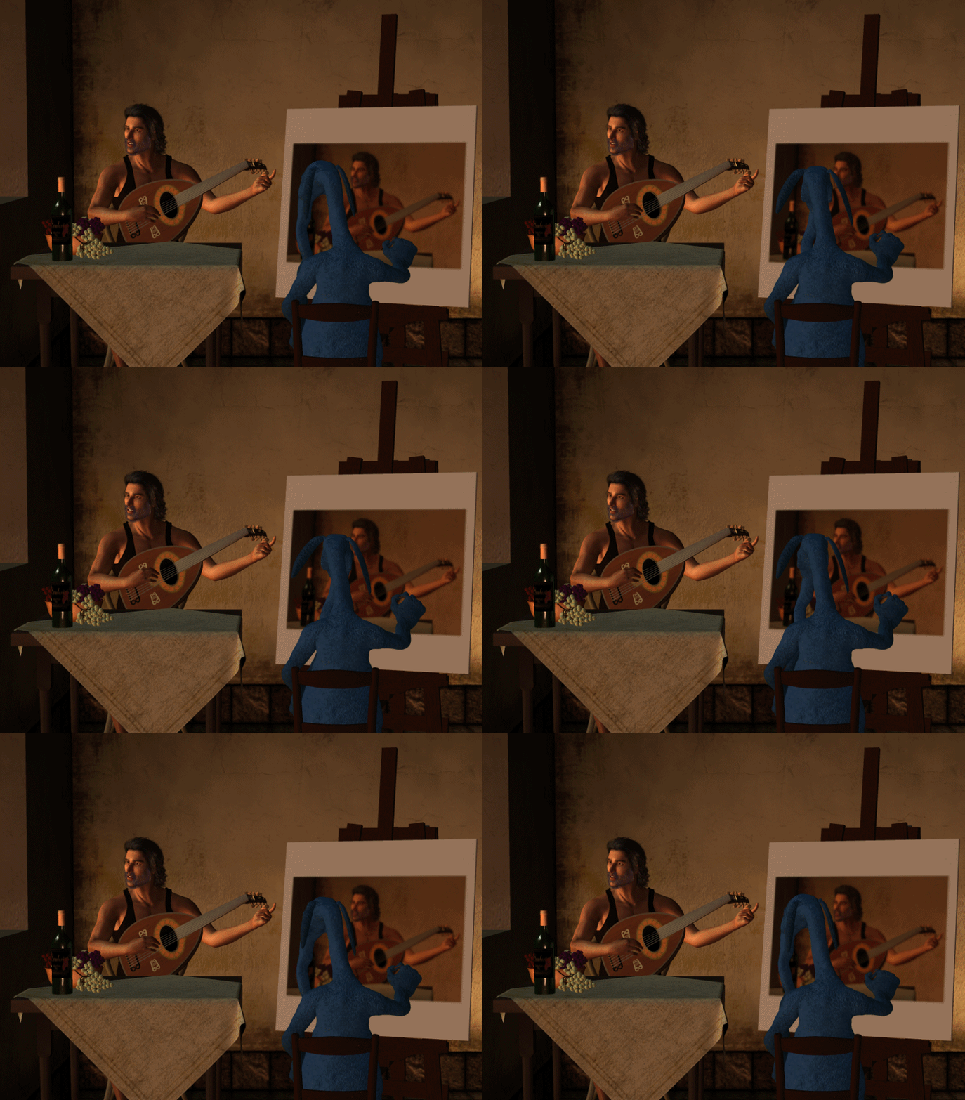
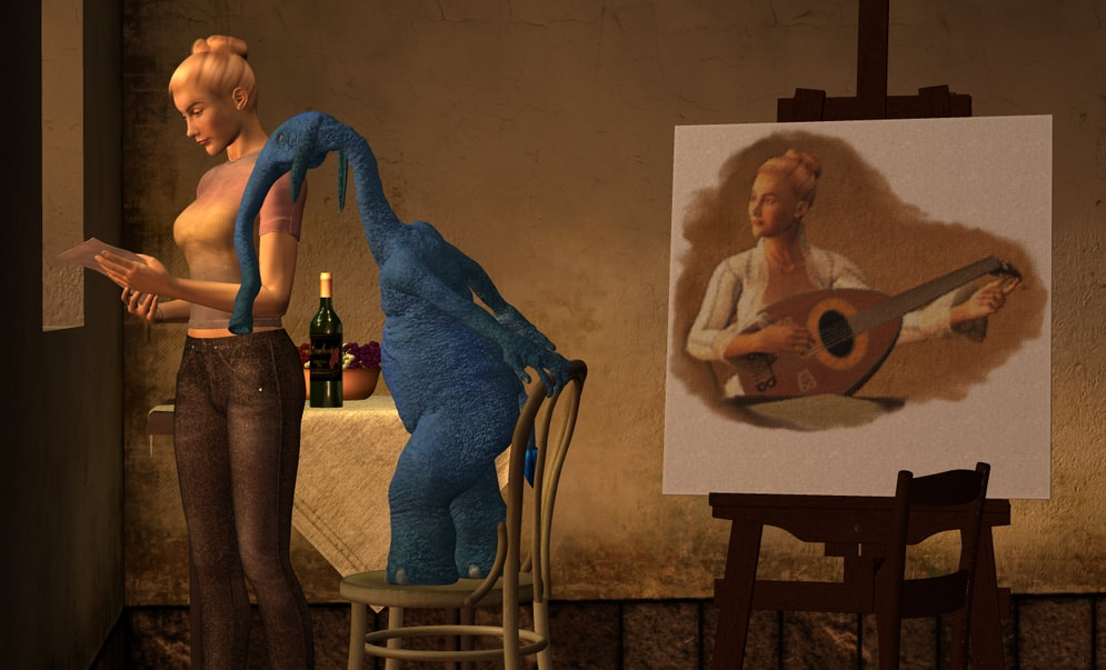
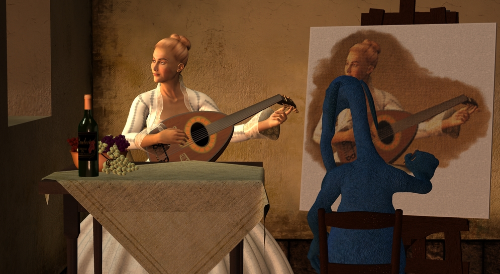
And one more at Rendo, one that I use fairly often, called Still Life. I've used it a lot in my gag Vermeer paintings with Slon 
skylab
Esteemed
Rendo 20% off is good until late tonight...I think around 2:00 am eastern, since they are on central time.


skylab
Esteemed
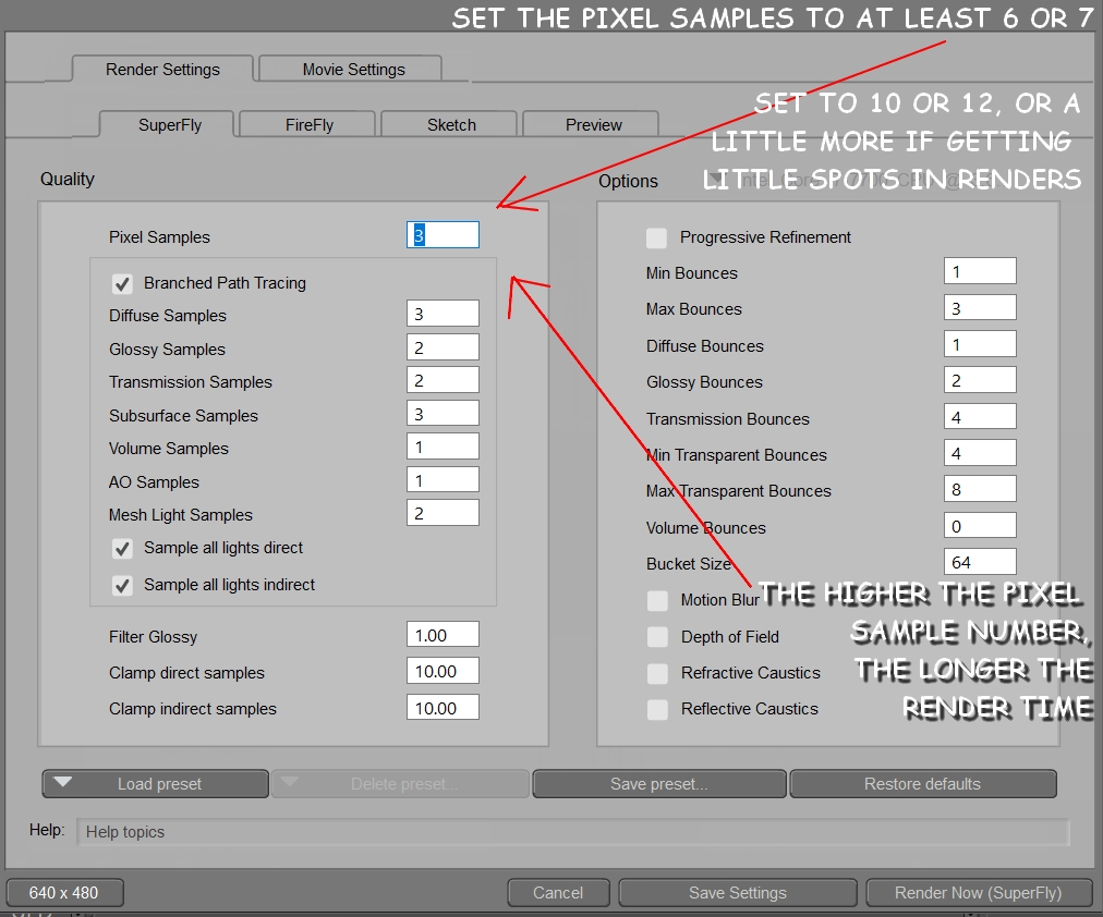
One last thing that I almost forgot...Dani has been mentioning superfly, and I don't know if you do any superfly renders, but this is just a tip about getting the best render results with the least amount of render time. When you choose render settings in Poser, this box pops up. The default number for pixel samples is 3. This is almost always too low. I usually use anywhere from 6 to 10, depending on how it's turning out. Sometimes superfly renders have little white spots....this means you need to try raising the pixel sample number. The higher the pixel sample number, the longer the render time. After you've had experience with it, you'll be able to guess what the best number, or number range to try, would be. Dani, I didn't try very many times to get a superfly of the drapes...it started off not looking right, so I just switched to firefly, used smooth polygons, and cast shadows. Have fun! See you folks later 
skylab
Esteemed
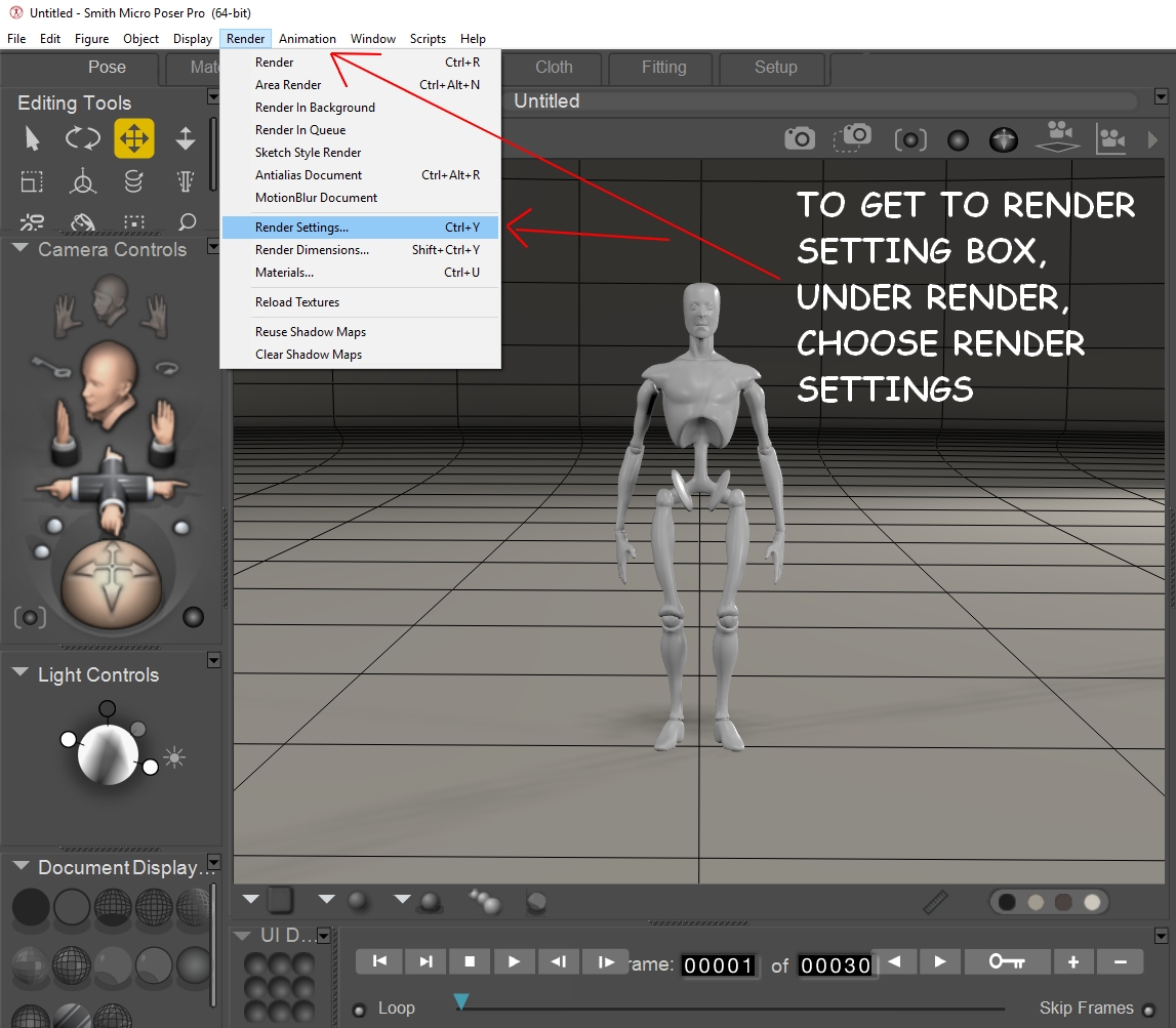
Awake again, and a little refreshed, so will post a few more Poser 11 tips. I failed to indicate how one gets the above boxes to pop up, and so I'll put that here, since I don't want to make the mistake of assuming that this is already known. Under Render (across the top menu), pull down to Render Settings...then the above boxes will appear. The default is the first one, the superfly settings. If you want the firefly settings, just choose the firefly tab, and it will jump to the front, and display the firefly options. The same is true with Preview, just tab over, and you have the option to render a preview version. Janet and I use this one a lot when we're setting up animations, and just want a quick rendering of how the movements are coming along. When it renders, you can still see the lines in the construct dome. It's just meant for work in progress usually.
skylab
Esteemed
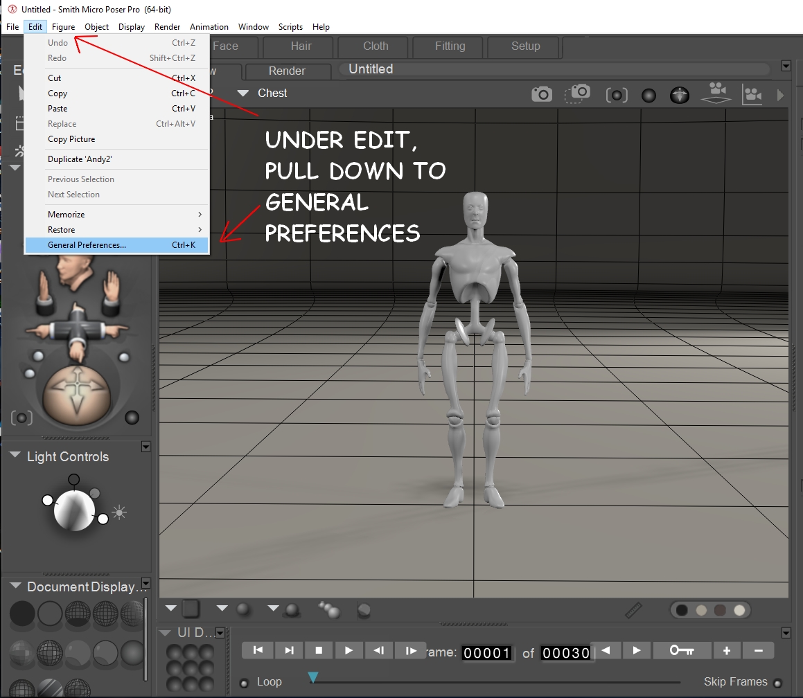
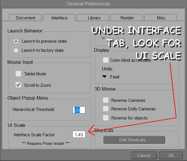
If you have visual challenges, or just like the larger print that you see in my screen captures, Poser 11 allows you to customize the text. It's a wonderful feature for the visually challenged. However, I'll caution you to be very careful what you type in as the UI text setting. I made the mistake one time of trying to guess, instead of looking it up. I guessed wrong, and the UI was HUGE on restart...haha....so make sure that you check your screen resolution and choose a number that is appropriate. I'm running a display resolution of 1920 x 1080 on my large flat screen monitor...so that means that my default Poser text is very tight and tiny. If you have this same issue, then you can enlarge the UI text in Poser 11 under Edit, then pull down to General Preferences. The General Preferences box will pop up, choose the Interface tab, then look toward the bottom, and find UI Scale. With my tight resolution, I find that a setting of 1.45 works well. If you go too high with this number, you'll be sacrificing more of your space to work in the preview box (where Andy is standing). And, as I mentioned before, if you go way too high, then you'll have a mess...haha.
skylab
Esteemed
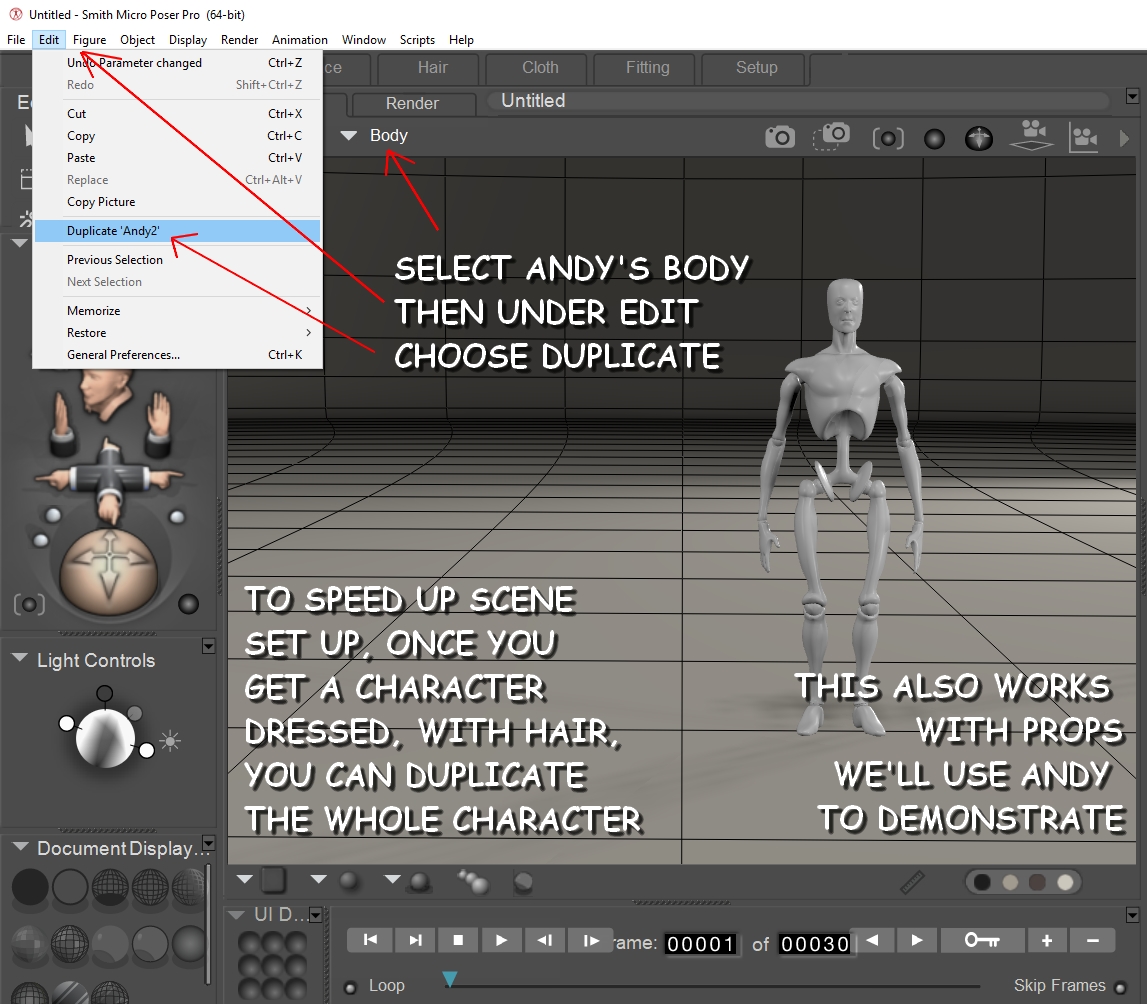
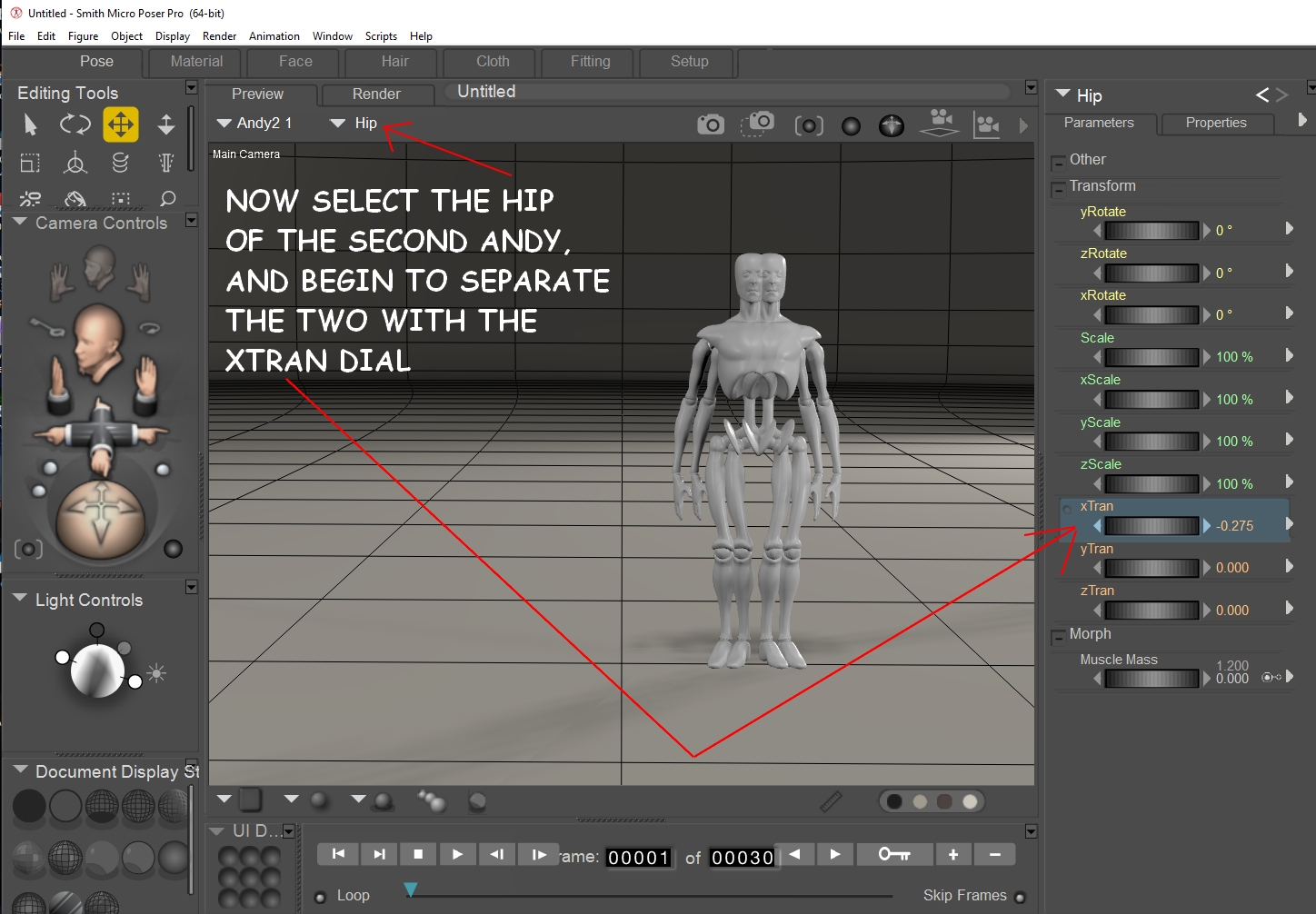
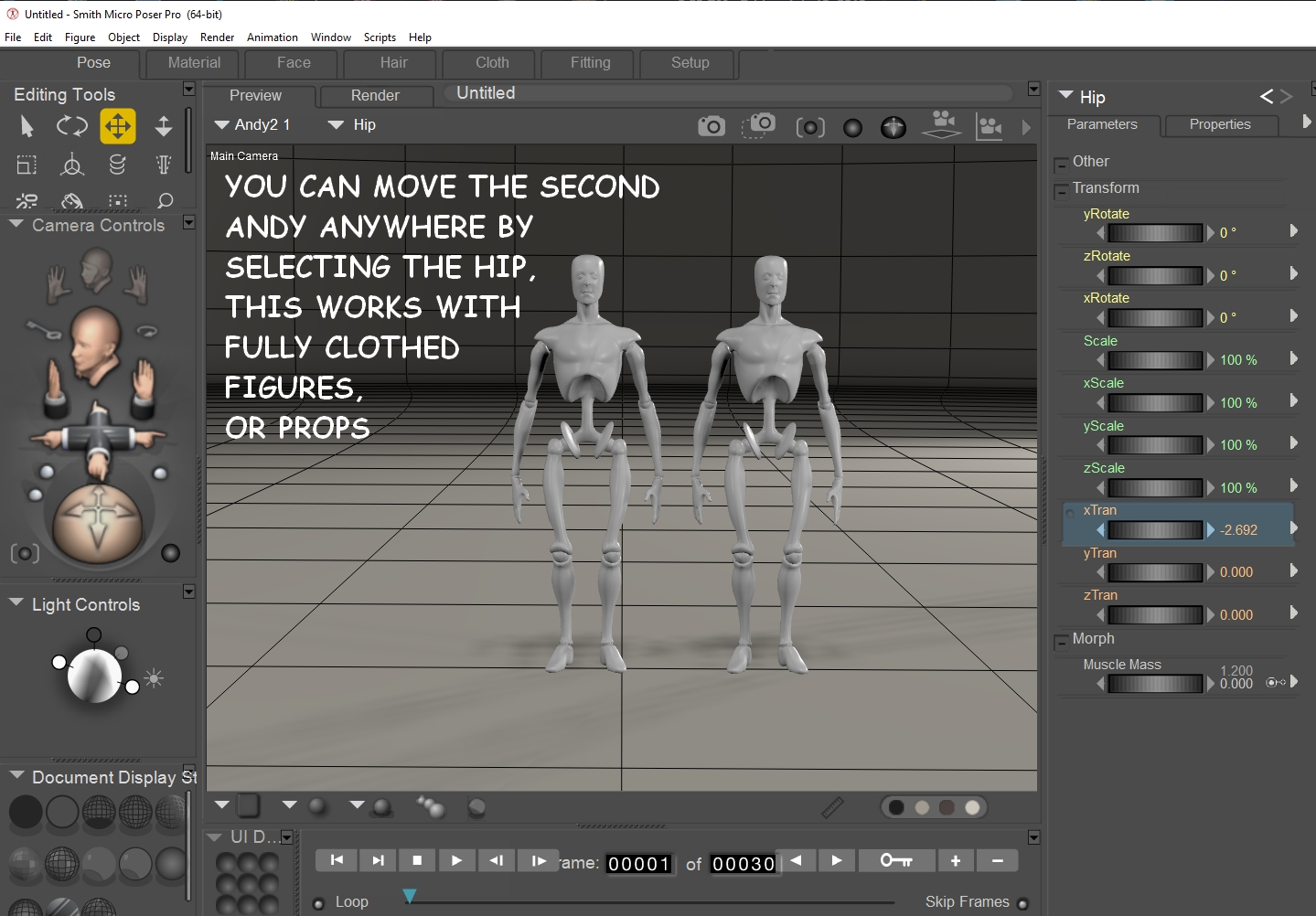
This is just a tip for speeding up workflow. You can duplicate a prop, or a figure (even fully clothed with hair), by this simple process. Make sure you have selected the body of whatever you want to duplicate....in this example, we'll use Andy. Under Edit, choose Duplicate, then select the Hip of the second Andy....and use the xTran dial to separate the two (or yTran, or zTran...wherever you want them to be located). This really helps when doing large scenes....I used it a lot on the Last Supper project....it saved a lot of time and effort.
skylab
Esteemed
Hey Linda....oooo, you wore a sneaker....and in this heat....your poor foot. Back when I was still doing a lot of baking, I was trying to get a hot casserole out of the oven, in one of those large, heavy Anchor Hocking glass dishes, and that joker slipped out of my hand....that was before I realized that diabetes plays some nasty tricks on the grip in your hands and fingers. It's a wonder it didn't scald all my skin off...when I realized it was going to fall, I tried to balance it with my other hand (with no oven mitt) to keep it from going all down my entire body. I came out of that experience with not a single burn on my hand...I don't know to this day how that happened, however just a little bit of the scalding casserole landed in my slipper, up on the side, and I didn't feel it at first. But boy, the next day, I had a blister on the side of my foot that just wouldn't quit paining me. As embarrassing as it was, I had to wear bedroom slippers (not bunny slippers....haha) when I went on errands for two months until that thing healed....but when it healed, there was no scarring or diabetic problems with it. All that to say, have some mercy on your foot, and wear a pair of discrete slippers....it's nobody's business if it looks a little strange. I just used a black pair of slippers, and one would have to look twice to realize that they were even slippers. Shoot, I worked with a friend who never wore shoes on the weekends...she had to stay dressed in heels all week on the job, and on the weekends, she wouldn't touch a pair of shoes....haha. They even had fuzzy tops! Haha. She didn't care. She was being kind to her feet. And, by the way, after that incident with the casserole dish, I packed up every heavy baking dish that I had and gave them away....never again....I knew I couldn't trust my grip any more with hot casserole dishes. I just use light weight, no stick pans now, but even with those, I'm very cautious when using them. Same with pans cooking on top of the stove....I have to be very careful. That's why I tend to cook at night. When I first get up in the morning, my hands are just a tad swollen, and they don't move (or type) so well. It takes being active all day before they are ready for things like cooking.


skylab
Esteemed
I have used some of Doarte's backgrounds in the past...some are listed in Rendo free stuff....and some are on ShareCG. Doarte commercial stuff is here on Rendo.
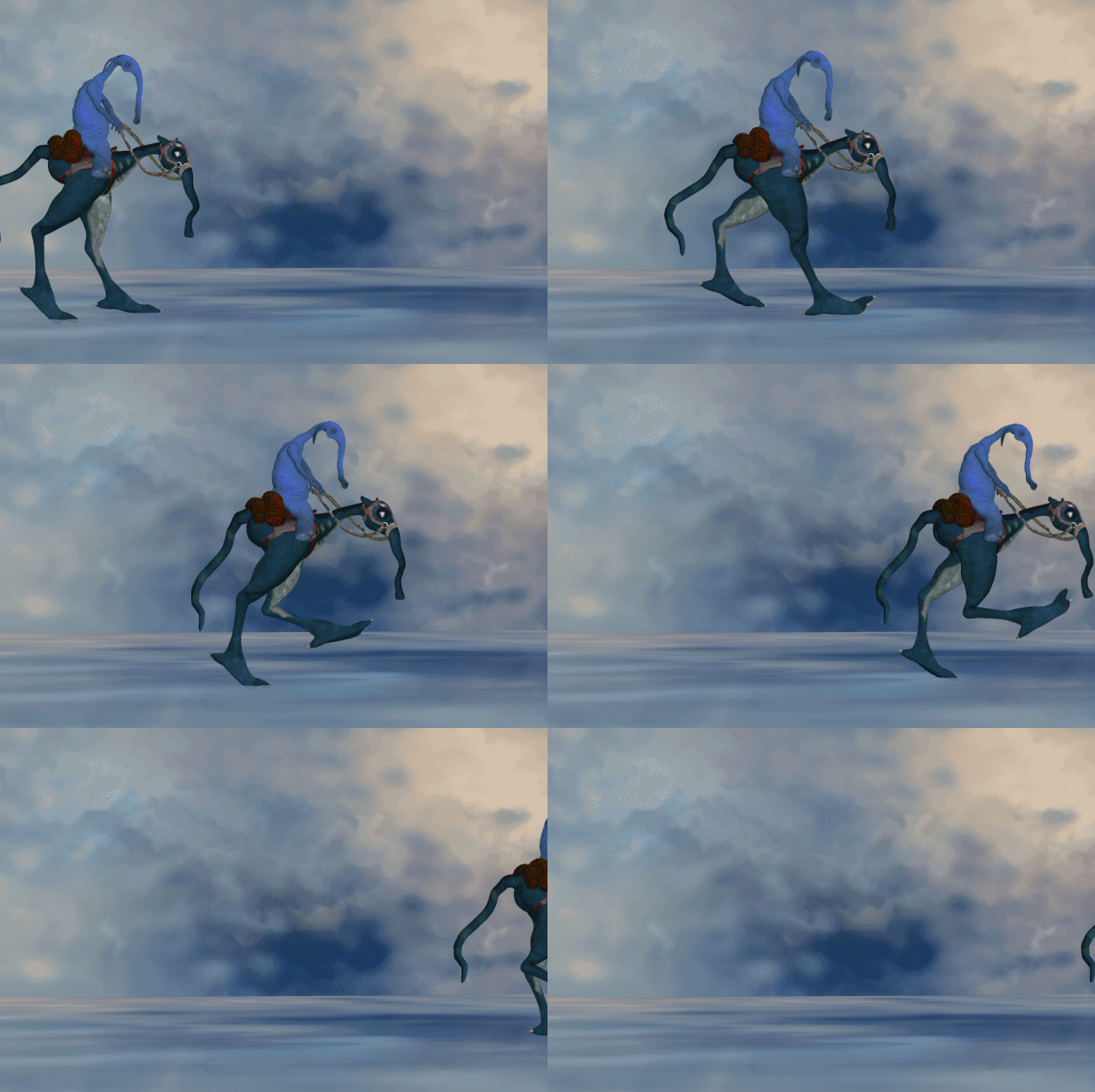
Another 2D artist who has some good backgrounds is Designfera, especially some of the older stuff, like Painted Dreams and Wispy, which are reasonably priced since they are older. It was this artist who did the eerie background and ground mat for Reipus and Slon's little stroll...haha... looks like it was from Wispy. Some of those background sets must have cycled off on clearance, since I have a few of them.
Another 2D artist who has some good backgrounds is Designfera, especially some of the older stuff, like Painted Dreams and Wispy, which are reasonably priced since they are older. It was this artist who did the eerie background and ground mat for Reipus and Slon's little stroll...haha... looks like it was from Wispy. Some of those background sets must have cycled off on clearance, since I have a few of them.
skylab
Esteemed
Hey Terre 
This must be a mighty large flower...on ShareCG....called Fantasy Flower.
Cattails
HoSM Flowers & Shrubs by mapps
HoSM Flowers Set 2 by mapps
Floral Patterns and 2D Stuff
Flower Table by Wappen

This must be a mighty large flower...on ShareCG....called Fantasy Flower.
Cattails
HoSM Flowers & Shrubs by mapps
HoSM Flowers Set 2 by mapps
Floral Patterns and 2D Stuff
Flower Table by Wappen

skylab
Esteemed
A few more freebies 
Assorted Baskets for Poser
Basket and stuff for Mavka
GentleHeart's Wicker Baskets
Basket by dberryart
Wicker Basket by Gerald Day
Simple Vase
Plant Model (FBX import)
Watering Can
Deco Pot
Flowers (.lwo import)
Underwater Land with Grass
Scene 04 - Fence, Tree, Hedge and Land
Flower-08
Flower-3d-07
Flower-3d-06
Flower-03
Flower-01-d
Flower-01-c
Flower-01-b
Flowers-01-a

Dani Foster Herring
Adventurous
Good morning! Nice downloads...that little blue watering can is adorable! Thank you!
Talking of flowers and superfly...I bought many plant sets, The Grasslands series, from RDNA. They render fine in Firefly but in Superfly I have found I have to use a different rendering setup from the one that I usually use which means that I don't use them anymore. I loved how they filled in my landscapes but I do have the ground plants from Andrey Pestryakov which work nicely in both Firefly and Superfly. I hate long, long, long render times so I'm always looking for workarounds.
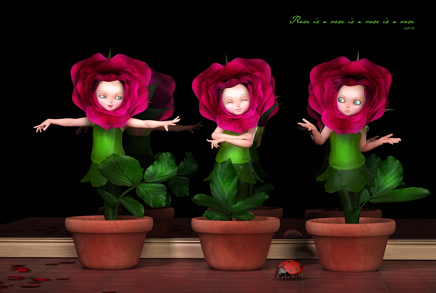
Rose is a Rose is a Rose is a Rose...from 2012
Dani Foster Herring
Adventurous
This one uses ferns and filler plants and the ground cover from RDNA...from 2012. I think some of it I got from the store and some from Traveller's Old Props Club that he had....I loved all the goodies that I got from there and still use many of the items.


 Wearing a sneaker NOT a good idea.