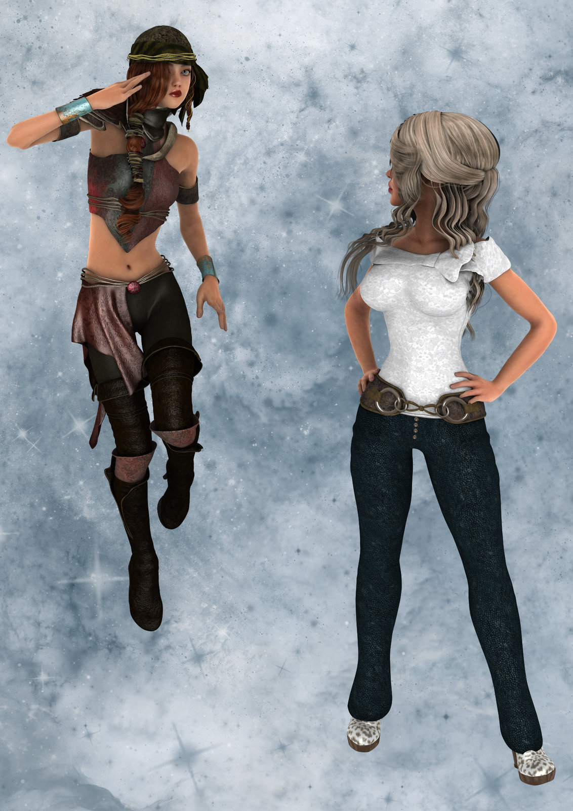
I belatedly realized that if I was going to redo the graphics in my old project, it behooved me to redo *all* the graphics. Not just the internal illustrations. So I've spent the last couple of days fighting with covers. I do think that what I've got now is better than what I had, but these may not be the final iterations.
Nor am I going to post the complete covers -- which are pure Photoshop. So you will be losing something of the effect. However, each cover has a long narrow inset, and those were rendered.
The originals were are composited from renders and clip art and whatever else. If nothing else, at least the new ones were all rendered all in one go, even if some touchup might have been needed afterwards.
I'm fairly satisfied with this one. But may get bright ideas between now and reposting.
I'm not altogether satisfied with the redo of this one. But the old version was an ungodly mess of a composite.
I'm kind of stuck with the old Dinokonda as a model for the Basilisk. Not altogether happy with the composition, though. It may well get redone before I post anything.
With something like 60 more images to build I'll have time to reconsider.


