-
Welcome to the Community Forums at HiveWire 3D! Please note that the user name you choose for our forum will be displayed to the public. Our store was closed as January 4, 2021. You can find HiveWire 3D and Lisa's Botanicals products, as well as many of our Contributing Artists, at Renderosity. This thread lists where many are now selling their products. Renderosity is generously putting products which were purchased at HiveWire 3D and are now sold at their store into customer accounts by gifting them. This is not an overnight process so please be patient, if you have already emailed them about this. If you have NOT emailed them, please see the 2nd post in this thread for instructions on what you need to do
You are using an out of date browser. It may not display this or other websites correctly.
You should upgrade or use an alternative browser.
You should upgrade or use an alternative browser.
I Just Wanted to Post an Image Thread
- Thread starter Stezza
- Start date
Rokket
Dances with Bees
Nice tweeks shows how little adjustments can have such an impact.
I have to agree with Hornet. I like this second render better Rokket, as now he's the center action of the scene.
You know about the rule of thirds, right? I didn't follow it in the first image, so I corrected it for this one. I also changed the camera angle and zoomed in on him before I rendered.
Rokket
Dances with Bees
This one actually looks better to me. Her tear ducts aren't glowing in this render. Just my 2 cents.So here is the Firefly comparison.
View attachment 33650
I was not trying to make this scientific so the figure is not exactly the same as far as the expression is concerned and there is no jewelry. What I have done is deleted the SF version of the figure and imported a FF version into the same scene. The lights are identical except the intensity is reduced by around 20% in the FF render. To my eyes the eyes and lips are more natural and the skin features a lot crisper.
Render time are 5 hours 20 minutes for Superfly with branch path tracing unticked in progressive ticked, samples set at 45 so it could have been stopped sometime sooner with little loss of detail.
Render time for Firefly 42 minutes (but there was no jewels) and the dimension was 2500 X 1730 in both cases.
Yes, I know the Rule of Thirds, but there are times when you can throw it out and still get a well planned render.You know about the rule of thirds, right? I didn't follow it in the first image, so I corrected it for this one. I also changed the camera angle and zoomed in on him before I rendered.
There are times when I wish there was a Rule of Thirds add-on to use in Poser, as there is in DS. I used it all the time when setting up a scene, but I'm not aware of any Python script that can do the same.
Hornet3d
Wise
This one actually looks better to me. Her tear ducts aren't glowing in this render. Just my 2 cents.
I am not sure it is the tear ducts glowing but it does give that impression. I found it very difficult to get even lighting across the eyeball and it gives the impression of a flat surface with some shading but the firefly eyes look much more ball like. Clearly superfly can do a much better job I just don't know how. The softness of the skin features is another issue and I need to try Glitterati's idea of using normals. The massively extended render time is another issue so it may have to wait until I can afford a better specified computer. There are lots of other things I want to play with in Poser 11 as well so I might have to put superfly on the back burner for now.
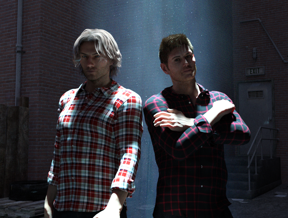
I feel like a traitor using Michael instead of Dusk but these Supernatural characters are for Michael only. A little Christmas present to myself. With Dan and Sean characters for Michael 8 by Phoenix1966 at Renderosity, H&C Checkered Shirt Outfit at Daz and Stonemason's Dark Alley.

Hornet3d
Wise
I feel like a traitor using Michael instead of Dusk but these Supernatural characters are for Michael only. A little Christmas present to myself. With Dan and Sean characters for Michael 8 by Phoenix1966 at Renderosity, H&C Checkered Shirt Outfit at Daz and Stonemason's Dark Alley.

What a great render, the lighting is superb and very dramatic. I also still use M4 with a similar uneasy feeling as you but for similar reasons, just not enough content to do what I want to do even M4 has some limitations.
Rokket
Dances with Bees
M4 is my Man Of Steel AND my Flash. He might be my Aquaman too...What a great render, the lighting is superb and very dramatic. I also still use M4 with a similar uneasy feeling as you but for similar reasons, just not enough content to do what I want to do even M4 has some limitations.
Bonnie2001
Extraordinary
Very nice Rich. I like using HDRi images in Poser too.
I love using HDRI's as often as I can. They really do allow photo-real renders with very little additional work
Bonnie2001
Extraordinary
That looks promising Rokket.
Rokket
Dances with Bees
Do you know what it's going to be?That looks promising Rokket.
Don't get hung up on the Rule of Thirds guideline. It's just one of many composition guidelines. Others can result in a more striking composition.
Think of composition rules more as a shortcut until you develop an eye for composition. And always remember ... rules are to be broken :wink:
I'm sure at some point in my art training, composition was discussed, but the first time I remember hearing about the rule of third was on the DAZ forums. I kinda sat there and scratched my head as it was discussed. Composition isn't something I've ever consciously thought about. I tend to throw things into a scene until it looks pleasing to me.
I like to fill the scene with my primary object, and I like to put objects in the foreground ... so the main object is "layered" between background and foreground objects. I use a focal point on the camera of 120 mm rather than the default. And I use 5 to start with as the xOrbit on the camera. Sometimes I lean the scene toward the camera (-5 or more), other times I bring the camera even lower (-10 or more). All depends what looks good to me. I usually forget to experiment with zOrbit, but changing the zOrbit can make a difference.
I rarely ever do the depth of field thing. Then too, since I filter my renders quite a bit, the background usually ends up softer and more out of focus than my characters.
Creepy Kid Too loaded and Pose applied. Main camera brought in closer so the top of his head and tips of his fingers are visible, but he is centered in the scene.
Image 1: 0 zOrbit, 0 xOrbit, 0yOrbit
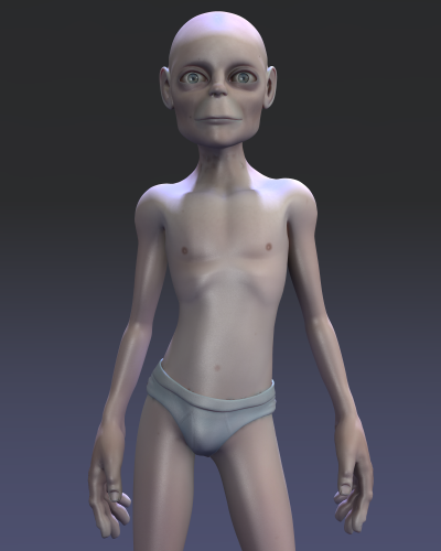
Images 2 - 5 experiment with the xRotate and zRotate. As a rule, I tend to keep the Camera yRotate set to 0 and rotate the objects in the scene.
Poser has a cool little trick where you can create an object group (Object / Create Group), move objects in the scene into the group, and then rotate or move the entire group. The added benefit is that if you uncheck visible on the group, everything in that group is made invisible. I usually create a group for background objects and a separate group for foreground objects. This makes hiding objects in the scene to render masks easy.
Image 2: 5 xOrbit
Image 3: -5 xOrbit
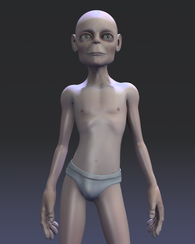
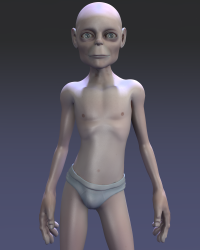
Image 4: -2.5 zOrbit, -5 xOrbit
Image 5: 2.5 zOrbit, -5 xOrbit
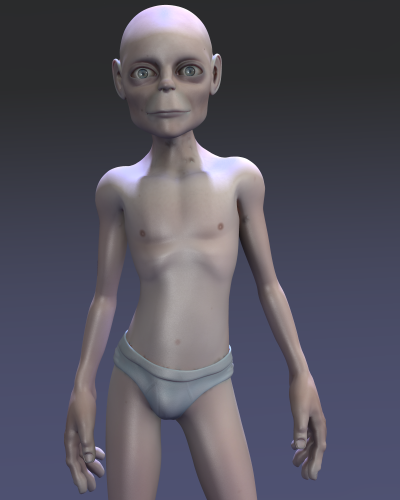
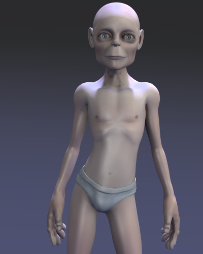
In the end, I preferred Creepy Kid Two leaning into the camera because it emphasized his creepy little head, and the -2.5 zRotate worked better with the pose than the 2.5 rotate.
With these slight camera changes, he's also no longer centered in the scene.
Image 6: Creepy Kid Too rotated (yRotate 15), expression added, and lighting change
Image 7: Filtered, overlays, and frame added in Photoshop
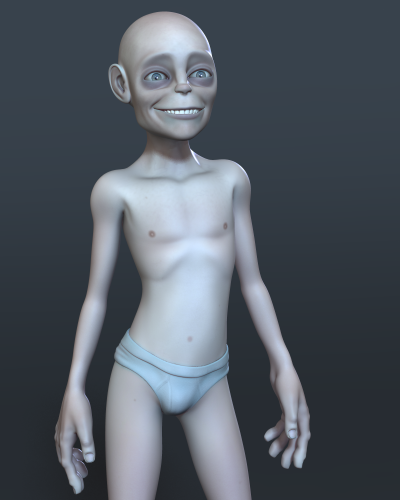
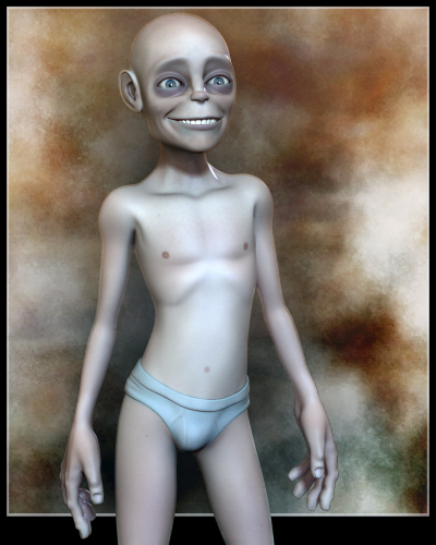
Think of composition rules more as a shortcut until you develop an eye for composition. And always remember ... rules are to be broken :wink:
I'm sure at some point in my art training, composition was discussed, but the first time I remember hearing about the rule of third was on the DAZ forums. I kinda sat there and scratched my head as it was discussed. Composition isn't something I've ever consciously thought about. I tend to throw things into a scene until it looks pleasing to me.
I like to fill the scene with my primary object, and I like to put objects in the foreground ... so the main object is "layered" between background and foreground objects. I use a focal point on the camera of 120 mm rather than the default. And I use 5 to start with as the xOrbit on the camera. Sometimes I lean the scene toward the camera (-5 or more), other times I bring the camera even lower (-10 or more). All depends what looks good to me. I usually forget to experiment with zOrbit, but changing the zOrbit can make a difference.
I rarely ever do the depth of field thing. Then too, since I filter my renders quite a bit, the background usually ends up softer and more out of focus than my characters.
Creepy Kid Too loaded and Pose applied. Main camera brought in closer so the top of his head and tips of his fingers are visible, but he is centered in the scene.
Image 1: 0 zOrbit, 0 xOrbit, 0yOrbit
Images 2 - 5 experiment with the xRotate and zRotate. As a rule, I tend to keep the Camera yRotate set to 0 and rotate the objects in the scene.
Poser has a cool little trick where you can create an object group (Object / Create Group), move objects in the scene into the group, and then rotate or move the entire group. The added benefit is that if you uncheck visible on the group, everything in that group is made invisible. I usually create a group for background objects and a separate group for foreground objects. This makes hiding objects in the scene to render masks easy.
Image 2: 5 xOrbit
Image 3: -5 xOrbit
Image 4: -2.5 zOrbit, -5 xOrbit
Image 5: 2.5 zOrbit, -5 xOrbit
In the end, I preferred Creepy Kid Two leaning into the camera because it emphasized his creepy little head, and the -2.5 zRotate worked better with the pose than the 2.5 rotate.
With these slight camera changes, he's also no longer centered in the scene.
Image 6: Creepy Kid Too rotated (yRotate 15), expression added, and lighting change
Image 7: Filtered, overlays, and frame added in Photoshop
All too true, though the Rule of Thirds discussions we had on Dreamlight's forum, and his add-on for DS, helped me to develop a better "eye" for composition. In fact, he always said there are times you can throw out the Rule of Thirds, and still produce a great render. Then again, a lot of the renders I've been doing of late have a character without any type of "scene" in the background, unless I'm using Snarly's EZDome and HDRi images, so I haven't thought much about Rule of Thirds in quite a while.Think of composition rules more as a shortcut until you develop an eye for composition. And always remember ... rules are to be broken :wink:
jvrenderer
Eager
Sorry to interrupt.
After a 4 month hiatus.
Happy Holidays!
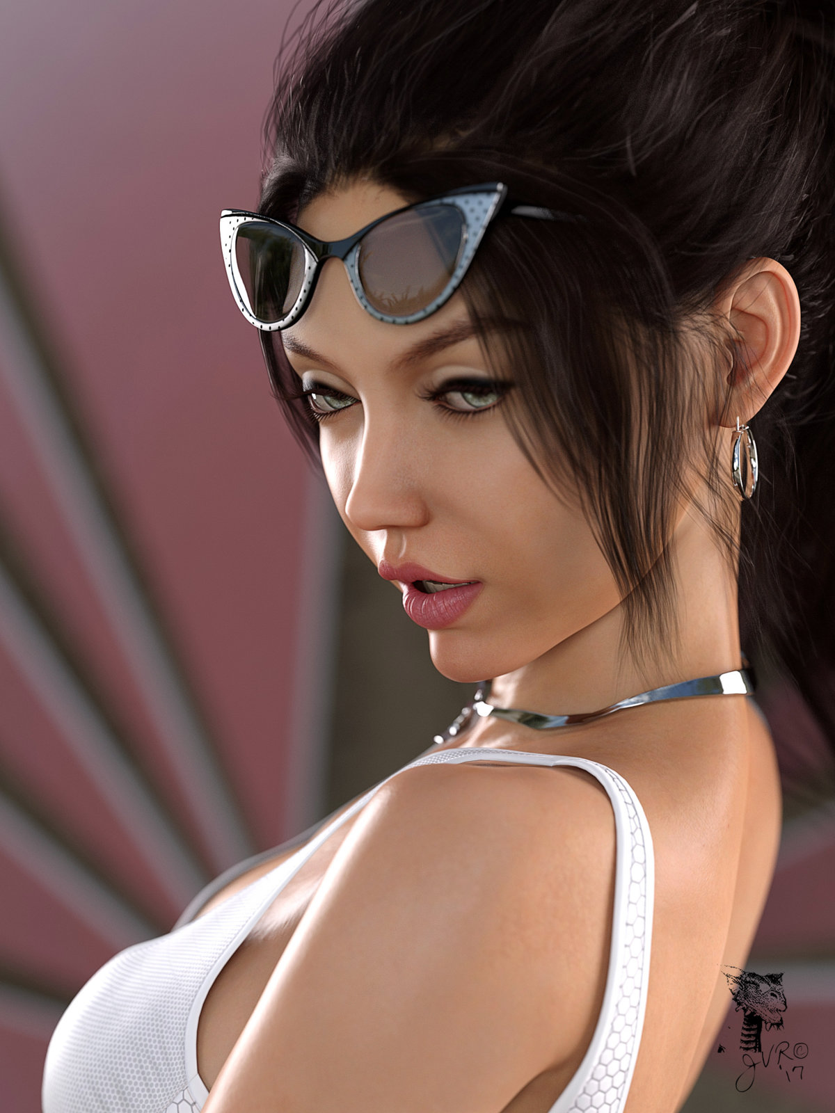
Charley!
After a 4 month hiatus.
Happy Holidays!

Charley!
