-
Welcome to the Community Forums at HiveWire 3D! Please note that the user name you choose for our forum will be displayed to the public. Our store was closed as January 4, 2021. You can find HiveWire 3D and Lisa's Botanicals products, as well as many of our Contributing Artists, at Renderosity. This thread lists where many are now selling their products. Renderosity is generously putting products which were purchased at HiveWire 3D and are now sold at their store into customer accounts by gifting them. This is not an overnight process so please be patient, if you have already emailed them about this. If you have NOT emailed them, please see the 2nd post in this thread for instructions on what you need to do
You are using an out of date browser. It may not display this or other websites correctly.
You should upgrade or use an alternative browser.
You should upgrade or use an alternative browser.
guaiamustudio
Eager
Thanks Pendraia! ^^ For now they are working normally. I thought i would have some problems with the smile but no problems so far.Wicked cool...love the teeth! How well does the morph work with Dusk's current expressions?
I will upload some images with expressions soon, thanks for asking!
Great tusks! I'm loving this so far. 
guaiamustudio
Eager
I'm happy you liked it Seliah!Great tusks! I'm loving this so far.
guaiamustudio
Eager
I hope you like it! ^^Glad to hear that...
I have to agree.Great tusks! I'm loving this so far.
guaiamustudio
Eager
Thaaankss Miss B!I have to agree.
This is so fantastic!! I need me some creature characters and I could never do what you did with this morph. I can hardly wait to see the progress with some map work.
guaiamustudio
Eager
Thanks AetherDream!! I hope you like the complete character!This is so fantastic!! I need me some creature characters and I could never do what you did with this morph. I can hardly wait to see the progress with some map work.
icedragonart
Admirable
Thank you!
Welcome icegraonart, and welcome back Desertsilver, from me as well.
icedragonart
Admirable
The teeth look great, this is going to be super cool.
guaiamustudio
Eager
Thanks icedragonart!!!The teeth look great, this is going to be super cool.
guaiamustudio
Eager
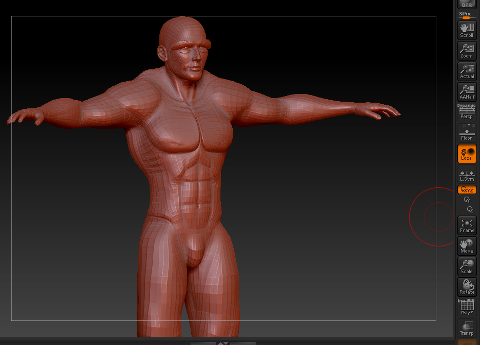
Hi everyone! I'm creating a bodybuilder morph for the orc. What you guys think? I started today, i should exaggerate a little in the morph? ^^

My initial impressions? The hips and waist could do with a little widening. Dusk has very narrow hips and waistline - almost feminine in appearance. From my impressions off of the screenshot here, he looks a little off-balance to my eyes.
I think from the bottom of the Lats down to the hips could use a little widening, but other than that, I think it's a really nice start to the morph.
I think from the bottom of the Lats down to the hips could use a little widening, but other than that, I think it's a really nice start to the morph.
guaiamustudio
Eager
My initial impressions? The hips and waist could do with a little widening. Dusk has very narrow hips and waistline - almost feminine in appearance. From my impressions off of the screenshot here, he looks a little off-balance to my eyes.
I think from the bottom of the Lats down to the hips could use a little widening, but other than that, I think it's a really nice start to the morph.
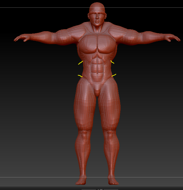
Thanks for the ideas Seliah! Looks better now?
Hips definitely look a little bit better... here's where I think the most adjustment needs to be made at the moment :

I used the yellow to outline the top and bottom limits of the area I'm talking about. In this area, for a muscular male (I know we're talking an Orc here, but still male..) right now, to my eyes it just looks a little TOO narrow; he almost has a female hourglass look to him in that area.
If it were my project, I would probably try to widen that area out a little bit, especially where the deepest part of the curves are.
Does that help? I know my ability to put things into words is sometimes not very good, so I figured the quick yellow "markers" would show a little better what i meant.
guaiamustudio
Eager
Hips definitely look a little bit better... here's where I think the most adjustment needs to be made at the moment :
View attachment 3054
I used the yellow to outline the top and bottom limits of the area I'm talking about. In this area, for a muscular male (I know we're talking an Orc here, but still male..) right now, to my eyes it just looks a little TOO narrow; he almost has a female hourglass look to him in that area.
If it were my project, I would probably try to widen that area out a little bit, especially where the deepest part of the curves are.
Does that help? I know my ability to put things into words is sometimes not very good, so I figured the quick yellow "markers" would show a little better what i meant.
Thanks a lot for the help Seliah. I tried to fix it. You think it's better now?
guaiamustudio
Eager
And helped me a lot! Thanks!!Hips definitely look a little bit better... here's where I think the most adjustment needs to be made at the moment :
View attachment 3054
I used the yellow to outline the top and bottom limits of the area I'm talking about. In this area, for a muscular male (I know we're talking an Orc here, but still male..) right now, to my eyes it just looks a little TOO narrow; he almost has a female hourglass look to him in that area.
If it were my project, I would probably try to widen that area out a little bit, especially where the deepest part of the curves are.
Does that help? I know my ability to put things into words is sometimes not very good, so I figured the quick yellow "markers" would show a little better what i meant.
Ah-hah! Now you're cooking! That looks MUCH better for his waistline!! 
