• Welcome to the Community Forums at HiveWire 3D! Please note that the user name you choose for our forum will be displayed to the public. Our store was closed as January 4, 2021. You can find HiveWire 3D and Lisa's Botanicals products, as well as many of our Contributing Artists, at Renderosity. This thread lists where many are now selling their products. Renderosity is generously putting products which were purchased at HiveWire 3D and are now sold at their store into customer accounts by gifting them. This is not an overnight process so please be patient, if you have already emailed them about this. If you have NOT emailed them, please see the 2nd post in this thread for instructions on what you need to do

Stable

eclark1894

Visionary
Okay, so I know it doesn't look like much difference, but I'm refining the textures and the geometry. As you can see the bars of the stall are now red. That was a mistake, but I did make some changes on the bars since they really seemed to bothering some of you. This version also does not have the water buckets in the stall. Another oversight, but i think I may leave them out and just have them smart-propped to each stall instead. Also, almost have the roof done, but I'm having reversed normals on that holding me up. Otherwise, I'm close.
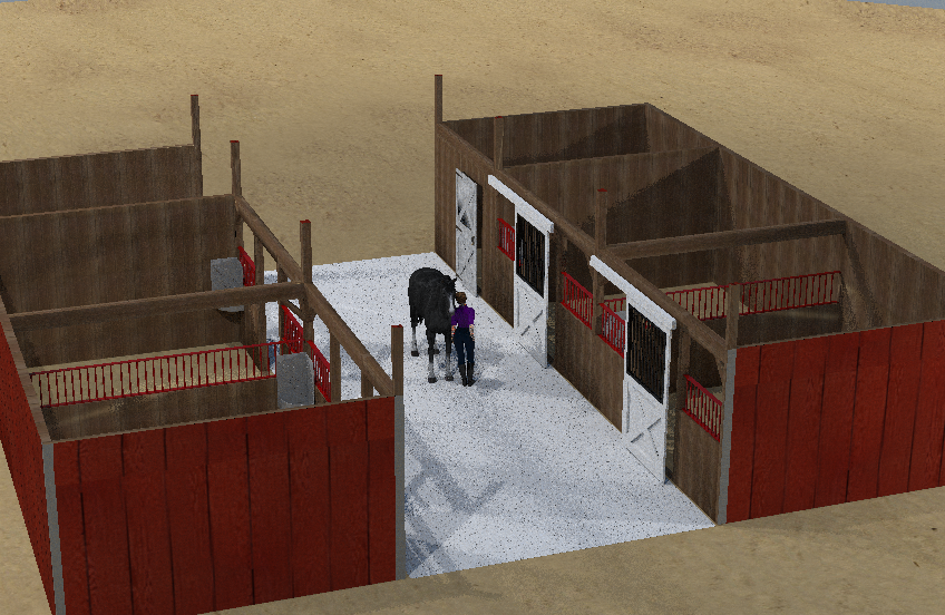
stables3.png
 

RAMWolff

Wolff Playing with Beez!
Contributing Artist
Your textures you mean? Looks to me like it may be a UV issue. For a square area like that doing a single or double sided Planer UV should work very well!
 

Miss B

Drawing Life 1 Pixel at a Time
CV-BEE
I think Richard's right about it being a possible UV issue. Odd only because the wall in the tack room (?) next to it's wall seems fine.
 

Miss B

Drawing Life 1 Pixel at a Time
CV-BEE
It renders fine, though.
Oh. I've seen that at times with clothing textures with lots of nodes that look strange in preview, but render fine. However, I'm not sure why a plain wood texture would do that.
 

Gadget Girl

Extraordinary
Contributing Artist
Did your textures start out in Blender? I ask because I know that Cycles Surface Nodes in PP11 don't always look right in preview. For instance on the dress I'm working on the preview looks like this:


The main part of the dress shows white because of the Cycles Surface node I used so that I could have a double sided shader. And even though the sleeves are a Poser Surface Node, it doesn't show correctly. Also under the armpits it looks like there's some pink which shouldn't be there. A quick render looks like this:

In other words, I would only worry some about previews not looking right as long as things render okay.
 

Rae134

Renowned
CV-BEE
Contributing Artist
You could almost make the isle narrower if you wanted to. There should be enough room for a large horse to stand nose/tail to the walls with a bit of room, it looks like could almost have 3 horse in a line :) (unless of course its supposed to be a very lux stable then its all good :p)
 

Miss B

Drawing Life 1 Pixel at a Time
CV-BEE
You could almost make the isle narrower if you wanted to. There should be enough room for a large horse to stand nose/tail to the walls with a bit of room, it looks like could almost have 3 horse in a line :) (unless of course its supposed to be a very lux stable then its all good :p)
You know Rae, I didn't realize how wide it was until I just saw this straight in render of it.
 

eclark1894

Visionary
In response to this critique, I did go and look up horse stable interiors. As far as I can tell, there doesn't seem to be a standard size for the aisle. In fact, from what I saw, mine's actually not that wide. There's also the matter that I wanted the horses to have plenty of room to turn around if needed, and in some stables it seems some have objects that sit out in the main aisle. Also, learning my lesson from the house, I wanted plenty of room to position a camera somewhere. So, while I value the suggestion, I'm gonna leave the width as is. However, I may see if there's someway an enduser can adjust the width of the aisle to suit her own tastes.
 

Gadget Girl

Extraordinary
Contributing Artist
I think your right, placing camera's in interiors can be a lot of trouble, and overall it would be better to have it wide, although it kind of feels too wide to me too, but then I'm more used to barns than the sort of stable you're making. So yes, after that rambling sentence, I think wider is better.
 

eclark1894

Visionary
Quick question, which may stir some debate, but generally speaking, what's the best resolution for UVMaps? Right now, mine are at 1024x1024 and that's primarily because that's Blender's default resolution. I should probably know by now, don't use the default anything. I'm thinking now that I may have to go back and retexture some of this stuff with a higher rez like 2048x2048 as my absolute baseline. What say you guys? (Or gals, if being called a guy offends you;). I always tell people stuff like that doesn't bother me since I'm half female on my mother's side.:sneaky:)
 

RAMWolff

Wolff Playing with Beez!
Contributing Artist
You can easily export larger UV maps via the free UV Mapper program. I'd suggest nothing lower than 3068 X 3068, esp if this will be used in close up renders, which I imagine it will be. Anything lower will produce artifacts in high end renders!
 

Rae134

Renowned
CV-BEE
Contributing Artist
yeah 1024x1024 seems really small (I looked at CWRW Harry textures and they are 6000x6000! I don't know if this is because its an animal and you need more details) I'd go with RAMs suggestion of nothing under 3068 X 3068
 
Top