• Welcome to the Community Forums at HiveWire 3D! Please note that the user name you choose for our forum will be displayed to the public. Our store was closed as January 4, 2021. You can find HiveWire 3D and Lisa's Botanicals products, as well as many of our Contributing Artists, at Renderosity. This thread lists where many are now selling their products. Renderosity is generously putting products which were purchased at HiveWire 3D and are now sold at their store into customer accounts by gifting them. This is not an overnight process so please be patient, if you have already emailed them about this. If you have NOT emailed them, please see the 2nd post in this thread for instructions on what you need to do

Show Us Your Dawn Renders!

Hornet3d

Wise
So I thought I would do a comparison render to see just how lighting a figure via the background compares with the use of a dome. I used a figure already uploaded to this thread but here I have tried to do a side by side comparison. The background lit render is on the left and both renders used the same .exr image with no additional light used in either.
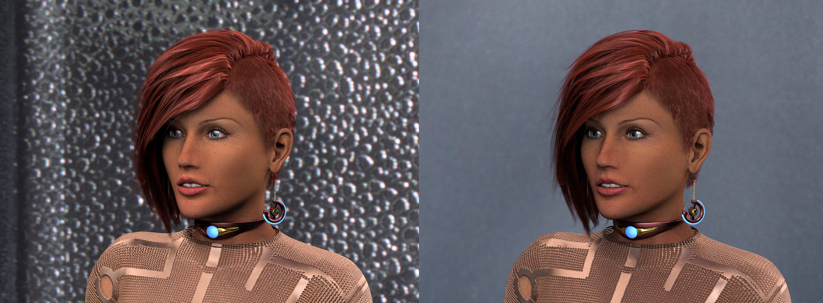
Dome - Background 1.jpg


The render setting were the same for both although the time taken for the dome to render was slightly longer. The background render is clearly brighter which I suspect is because of the concentration of the image which is stretched across a dome rather than concentrated on the background. There is more noise in the dome image and clearly less punch to the highlights. The comparison is perhaps unfair as I suspect in the majority of cases the dome would be used along with at least one light but my aim here was to compare like with like. I am now running another render with a single light added to the dome. One other point is also clear in that the dome is far easier to set up as placement is difficult in the background set up, not helped by the fact that the background is not displayed correctly in the preview in that it does not fill the working panel, unless I am doing something wrong of course.
 

Miss B

Drawing Life 1 Pixel at a Time
CV-BEE
.One other point is also clear in that the dome is far easier to set up as placement is difficult in the background set up, not helped by the fact that the background is not displayed correctly in the preview in that it does not fill the working panel, unless I am doing something wrong of course.
I found that as well when I tried using the Background instead of my usual use of EZDome, so I don't think you did anything wrong, it's just not as easy to set up.
 

Ken1171

Esteemed
Contributing Artist
So I thought I would do a comparison render to see just how lighting a figure via the background compares with the use of a dome. I used a figure already uploaded to this thread but here I have tried to do a side by side comparison. The background lit render is on the left and both renders used the same .exr image with no additional light used in either.

The problem with making comparisons of this kind is that the HDRI effect from dome props is highly subjective. How large is it? how is the image mapped to it? What is the emissive parameter setup? All this affects the final result. Conversely, the background emissions don't depend on dome prop size, we can configure how the HDRI mapping is done, and this doesn't block your render if making renders with transparent background.

Perhaps a major point would be that depending on the dome prop size, that defines how close the emitters are from the subject, which affects light intensity. We don't have to worry about that when using the background. We can also make it optional if we want the HDRI image to show on the render, or not, which I consider an extra bonus.

One other point is also clear in that the dome is far easier to set up as placement is difficult in the background set up, not helped by the fact that the background is not displayed correctly in the preview in that it does not fill the working panel, unless I am doing something wrong of course.

You are not doing anything wrong - this is something that has changed from P11 to P12. The background HDRI image used to display all around the scene in the past, but for some reason they have changed this in P12.
 

Hornet3d

Wise
The problem with making comparisons of this kind is that the HDRI effect from dome props is highly subjective. How large is it? how is the image mapped to it? What is the emissive parameter setup? All this affects the final result. Conversely, the background emissions don't depend on dome prop size, we can configure how the HDRI mapping is done, and this doesn't block your render if making renders with transparent background.

Perhaps a major point would be that depending on the dome prop size, that defines how close the emitters are from the subject, which affects light intensity. We don't have to worry about that when using the background. We can also make it optional if we want the HDRI image to show on the render, or not, which I consider an extra bonus.


You are not doing anything wrong - this is something that has changed from P11 to P12. The background HDRI image used to display all around the scene in the past, but for some reason they have changed this in P12.

Thank you for the input which I value a great deal, I understand it is very subjective I guess I am trying to emulate the results for the average user assuming the average user would use HDRI in the first place. I imagined that most users would just add a dome and maybe a light and not play with many of the parameters. All I did in this case was to return the background to normal and add a dome from the level up superfly collection by Afrodite-Ohki and then replaced the default image with the .exr image I used in the background set up. I am not saying that is particularly valid but it is the way I would work in normal circumstances.

My reason behind all this is, given the extra difficulty in using the background set up, do I actually get any benefit over using a dome? I can see from the information in your post there are certain scenes I would use background lighting as some of the features would be an advantage. I suspect that either method is going to provide great results and certainly capable on improving on what I am producing. I am out to try and prove one better then the other just, having discovered background lighting is possible, how and when to use this new tool from the Poser tool box.
 

Ken1171

Esteemed
Contributing Artist
My reason behind all this is, given the extra difficulty in using the background set up

I have an open ticket with Bondware dev team concerning how convoluted this is in Poser, comparing to basically ALL other programs. HDRI is supposed to be a property of the rendering engine - not a separate prop we load from the library and make it emissive by editing its materials. For once, emissive props used as lights produce a lot of noise in renders, which is exactly what we try to avoid.

In other words, using domes is "faking" real HDRI. The closest we can get to the real thing is to use the Poser background to map the HDRI to. We don't need to load any props, it is independent of prop size, and UV mapping, we can change the mapping method to match your HDRI images, it won't block your lights if they end up outside the dome (super annoying), and it won't show in your renders unless you want them to.

Although this is "closer" to real HDRI, it's still not quite there. We have to save this set up as a material to the library, for that's what it still is. This way we can quickly load it back to the Poser background when we need it, and keep a number of different set ups as material presets.

Again, real HDRI should be a property of the rendering engine, usually accompanied by a physical sky and a physical camera (like we do in Blender). Poser is still not quite there, but for the time being, using the Poser background is as close as it gets.
 

Hornet3d

Wise
This is getting interesting and it is a lot of fun. Although the positioning is not easy with the limited preview when using the background for lighting I am finding there is a great deal that can be done with care. Balancing the camera position and focal length with the rotation and scaling of the .exr file means placing can be precise, still not as easy as with a dome, but possible.

In this case the .exr files did not have a hotspot of of light so, just as I would with dome I added a single light which not only brightened the figure but gave life to the eyes. As I move forward some stuff does not work but more possibilities become apparent and all this from a feature I never knew Poser had.

Classroom HW.jpg
 

Ken1171

Esteemed
Contributing Artist
Yet another Poser feature most people never use is the background "Atmosphere" from the Material Room. We can add convincing atmospheric depth to backgrounds in Poser renders, and it's most useful when making larger scenes. It can be used for both interiors and exteriors, making them more realistic. I bet the great majority of people don't even know Poser can do that. It's the item just below "Background" in the Material Room.
 

Hornet3d

Wise
Yet another Poser feature most people never use is the background "Atmosphere" from the Material Room. We can add convincing atmospheric depth to backgrounds in Poser renders, and it's most useful when making larger scenes. It can be used for both interiors and exteriors, making them more realistic. I bet the great majority of people don't even know Poser can do that. It's the item just below "Background" in the Material Room.

I had noticed that in the last few days, I sort of knew Poser could do that but how I was not sure so thanks for the information. I really need to pay with that as well but at the moment I am trying to correct a major drop off in that I have somehow picked up an old version of my character and the skin materials are wrong. I was not even aware of this until hborre questioned what skin I was using and I could see it was wrong. That has spoilt my fun a bit not only because of the slightly duff renders but also I have to find where the error happened and correct it. Still I still have all the knowledge I have gleaned in the last few days.
 

Ken1171

Esteemed
Contributing Artist
at the moment I am trying to correct a major drop off in that I have somehow picked up an old version of my character and the skin materials are wrong. I was not even aware of this until hborre questioned what skin I was using and I could see it was wrong.

Shading human skin is a science on its own right. That became more evident to me after seeing the renders Mec4D was showing here in the forums. She said she hand painted at pores level to achieve a realistic effect, and painted her own bump and specular maps. She knows the proper PBR values for human skin, which (according to her) play correctly with any lighting conditions. Way down to my level, I only think I know the values that "look right", which are probably not because they only work in some lighting conditions. Looking at her work tends to be a humbling experience.
 

Hornet3d

Wise
Shading human skin is a science on its own right. That became more evident to me after seeing the renders Mec4D was showing here in the forums. She said she hand painted at pores level to achieve a realistic effect, and painted her own bump and specular maps. She knows the proper PBR values for human skin, which (according to her) play correctly with any lighting conditions. Way down to my level, I only think I know the values that "look right", which are probably not because they only work in some lighting conditions. Looking at her work tends to be a humbling experience.

I know what you mean but I am afraid I will never make it to that level, even in my other hobby of model steam engines if it looks right from six foot it is good enough for me. I never really set out to produce photorealist renders and after twenty plus years of playing I am still looking for believable rather the photo realistic. In this case I used a version of my character that was based on the PoserSurface when I converted all my figure textures to PhysicalSurface a while ago, still not perfect but it was an improvement.

Anyway I have moved to the new version and tried to use my improved understanding of background lighting, so here is the church revisited.

Church BG Corrected HW.jpg
 

Ken1171

Esteemed
Contributing Artist
Hehe I don't think I will get to Cath's level either. One thing to consider is that Physical Surface does not mean better skin, since PBR is more helpful for special materials like glass and metals. Poser Surface can create good skin shaders as well.

Another thing to consider is that MOST human textures produced for Poser/DS are not of great quality when it comes to physical properties. Most lack a specular map or even bump map. Many have bump maps that are just grayscale versions of the diffuse map. There are plenty of skin maps with unnatural colors as well. If the maps aren't good, that affects the end result.

In a way, that is not surprising when we consider this is a low budget market, where contents are entirely created by a single person. People who are good with morphs are not necessarily good texture painters, which (as seen from Cath) is an art on its own right. I believe this is one reason why it takes so much extra effort to make skin look good in Poser/DS renders - the texture sets aren't that great to start with. For instance, finding a texture with a decent lip bump map is a rarity.
 

Hornet3d

Wise
Hehe I don't think I will get to Cath's level either. One thing to consider is that Physical Surface does not mean better skin, since PBR is more helpful for special materials like glass and metals. Poser Surface can create good skin shaders as well.

Another thing to consider is that MOST human textures produced for Poser/DS are not of great quality when it comes to physical properties. Most lack a specular map or even bump map. Many have bump maps that are just grayscale versions of the diffuse map. There are plenty of skin maps with unnatural colors as well. If the maps aren't good, that affects the end result.

In a way, that is not surprising when we consider this is a low budget market, where contents are entirely created by a single person. People who are good with morphs are not necessarily good texture painters, which (as seen from Cath) is an art on its own right. I believe this is one reason why it takes so much extra effort to make skin look good in Poser/DS renders - the texture sets aren't that great to start with. For instance, finding a texture with a decent lip bump map is a rarity.

I can't remember all the changes I made to the skin material but I know I was happy about the changes so much so I attempted to make sure I only used the new skin from there on in. That may have been the intention but I slipped up somewhere. I know many of the materials were reworked after reading a lot of advice from the likes of Baggins Bill and others. I also blended some of the materials using Paintshop Proto do so, that is not to say it was a great texture but it was one I was happy with.
 

Hornet3d

Wise
I have taken a step back from background lighting and spent the day re-arranging my process after I managed to foul up, I have been using a old version of my character for months now and not even noticed. I think is was the result of be testing my back up procedure changing a few files, hopefully it is all corrected now and I still fond time to play.

Heloisa Hair 2 HW.jpg


This is the version of the figure I should have been using, now with Heloisa Hair by Afrodite-Ohki.
 

Miss B

Drawing Life 1 Pixel at a Time
CV-BEE
Ohhhh, I threw Okhi's new hair into my wishlist, and hoping to get it soon.

How do you like working with it?
 

Hornet3d

Wise
Ohhhh, I threw Okhi's new hair into my wishlist, and hoping to get it soon.

How do you like working with it?

It is great to work with and is clearly of great quality, if like me you are used to using hair by Ali you are going to find the adjustment options are limited most are movement related with a couple of adjustments to control length and how much body the hair has. This is true of most Okhi's hair I can't say all as there are a few I don't have, but they are still well worth adding to the runtime.
 

Miss B

Drawing Life 1 Pixel at a Time
CV-BEE
OK, thanks for the comments, and yes I have some of Ali's hair products, though haven't used any recently.
 
Top