• Welcome to the Community Forums at HiveWire 3D! Please note that the user name you choose for our forum will be displayed to the public. Our store was closed as January 4, 2021. You can find HiveWire 3D and Lisa's Botanicals products, as well as many of our Contributing Artists, at Renderosity. This thread lists where many are now selling their products. Renderosity is generously putting products which were purchased at HiveWire 3D and are now sold at their store into customer accounts by gifting them. This is not an overnight process so please be patient, if you have already emailed them about this. If you have NOT emailed them, please see the 2nd post in this thread for instructions on what you need to do

Redistributing Poser Dynamic Hair without the base figure - a solution

Cliff Bowman

Adventurous
Clumpiness
CastsShadows

and

VisibleInRaytrace

clicks later...
Textures006.jpg
 

Cliff Bowman

Adventurous
Let's do RootWidth+ just once - it might be a bit subtle (I did RootWidth+ twice on the white fur hat) but maybe just once I can be subtle?

The more we do, the more we wander into the taste of the end-user artist. Does that fur look good enough, or do we need it to look denser? Can we reduce the "curviness" of the hair by reducing the vertices or do we need it to be floppier, by adding extra vertices? And so on.

Textures007.jpg
 

Cliff Bowman

Adventurous
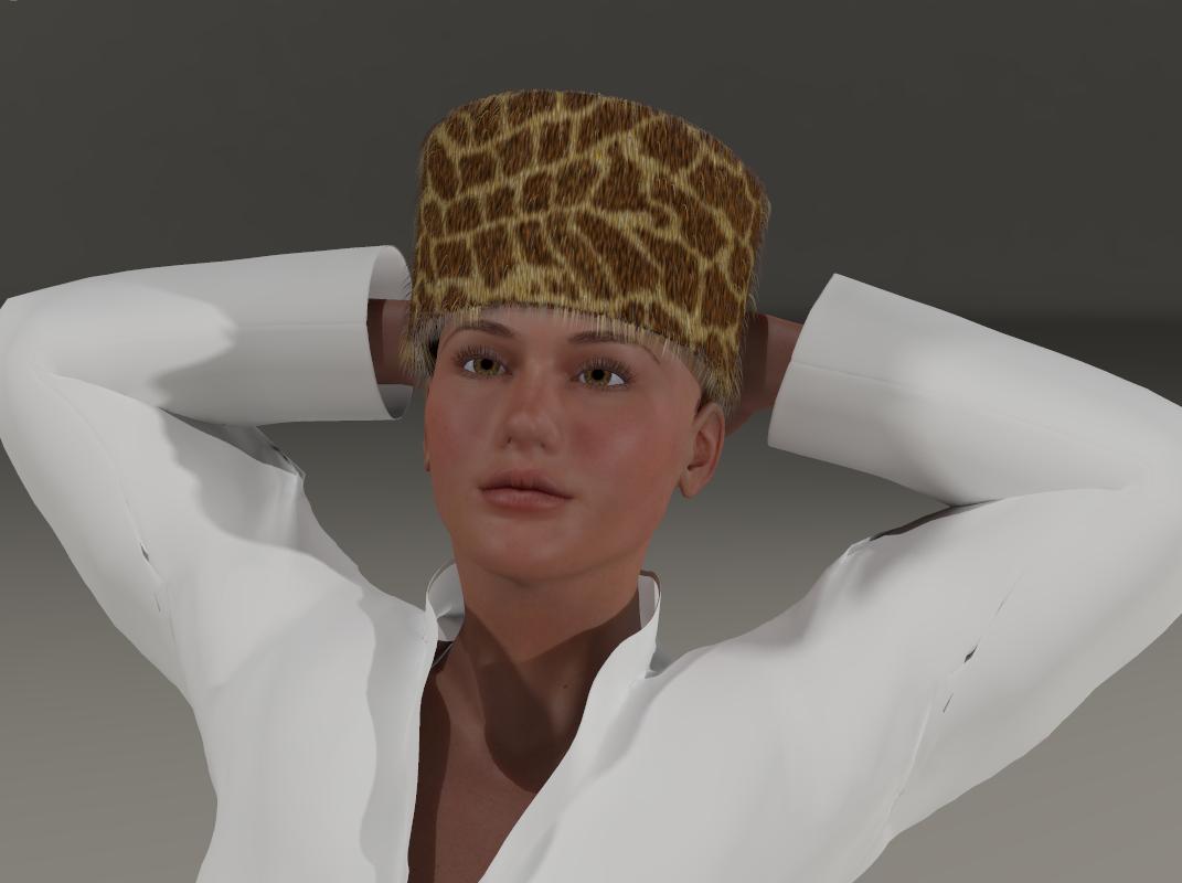
The next render I did proved that I was correct in worrying that there was a texture size mismatch - so I'll created a 2x2 of the fur texture for the actual hair strands to get this:


Yeah.. that's looking better to me. BTW I don't plan on addressing the brim hair being denser than the side hair here - that's because we're using one hair group across different polygon densities.


And now - a short break.

Textures009.jpg
 

Cliff Bowman

Adventurous
OK, let's see - setting PullBack to 0 at this stage makes the fur look "spikey" to me, we probably want a lower value than we have but not zero. Let's do Density+ instead, and make Poser work for its money!

Textures010.jpg
 

Cliff Bowman

Adventurous
Personally I like to add a little animation in to the mix - here I have rotated the hat through 360 degrees and got Poser Dynamics to "drape" the hair, then rendered the last frame. Great for if you find the above version too "spikey".

Textures012.jpg
 

Rae134

Renowned
CV-BEE
Contributing Artist
poor Giraffe :p

I promise there were no animals harmed during the creation of the texture. I just thought a recognisable pattern might show the hair strands a bit better for testing :D (feel free to share the textures with your testers)
 

Cliff Bowman

Adventurous
poor Giraffe :p

I promise there were no animals harmed during the creation of the texture. I just thought a recognisable pattern might show the hair strands a bit better for testing :D (feel free to share the textures with your testers)

Thank you kindly, I shall do exactly that :)

I think that skinning virtual animals for style is a HUGE improvement on skinning real animals just for style. It's also going to be great to be able to supply a consistent texture map (or two - I am away from desktop right now but plan to test it out later) because that should mean consistent results/repeatability.

Cheers indeed!

Cliff
 

Cliff Bowman

Adventurous
And here I've taken the texture off of the hat - so you can clearly see how very useful a good base texture can be.

Textures015.jpg


Sure, we don't NEED a texture, as I hope my "WhiteISH" fur coat renders before demonstrated - but we get the BEST results (IMO) by using ALL of the tools at our command, rather than just 1 technique.
 

Cliff Bowman

Adventurous
So far the manual has reached 17,671 words covering 112 pages. I think I've wrapped up the first pass on tutorials for Dynamic Hair with the renders of white coat, though I may go back and add some of the textured ones in as "this is what it would look like with a texture". Next though it's time to move on to more tutorials on how to get under the surface of TrueHair and get the following functions to do more than is readily apparent.

001bLibraryUI.png


The different colour boxes around the thumbnails are to help identify functions by group more quickly than you might without. The colours don't mean anything except that "a red box next to another red box is related" and "a blue box next to a green box is not very closely related".

BTW, none of the "?" functions are coded yet, but I do not anticipate huge hurdles there.

Cheers,

Cliff
 
Top