-
Welcome to the Community Forums at HiveWire 3D! Please note that the user name you choose for our forum will be displayed to the public. Our store was closed as January 4, 2021. You can find HiveWire 3D and Lisa's Botanicals products, as well as many of our Contributing Artists, at Renderosity. This thread lists where many are now selling their products. Renderosity is generously putting products which were purchased at HiveWire 3D and are now sold at their store into customer accounts by gifting them. This is not an overnight process so please be patient, if you have already emailed them about this. If you have NOT emailed them, please see the 2nd post in this thread for instructions on what you need to do
You are using an out of date browser. It may not display this or other websites correctly.
You should upgrade or use an alternative browser.
You should upgrade or use an alternative browser.
Ken Gilliland's Products In Renders
- Thread starter HiveWire3D
- Start date
Bonnie2001
Extraordinary
Very nice Lyne. Dogs do love a ball to play with.
fantastic!
when i seen the title in another place it was thinking about this 

Bonnie2001
Extraordinary
Here is old Scruffy going for a swim in the dark parts of Norway's Fjordland waters.
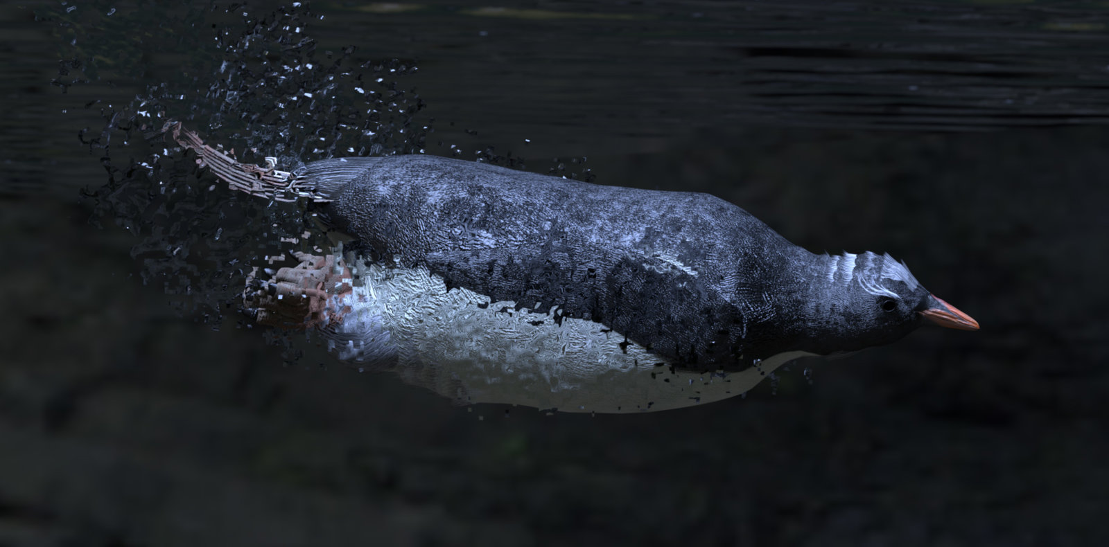
Two minutes cooking on Octane. No postwork at all, although I really should have spent more time on the bubbles in ZBrush, but it's a Sunday afternoon and I need to get outside right now with my friends! As it is, the bubbles are in three layers behind, in front and middle of Scruffy to give some impression of depth and refraction. Chat later.
Two minutes cooking on Octane. No postwork at all, although I really should have spent more time on the bubbles in ZBrush, but it's a Sunday afternoon and I need to get outside right now with my friends! As it is, the bubbles are in three layers behind, in front and middle of Scruffy to give some impression of depth and refraction. Chat later.
Greatly done Bonnie !
Bonnie2001
Extraordinary
Thanks Min!
Bonnie2001
Extraordinary
I did a fun render, Scruffy the head waiter ready to welcome guests at the Kenguin Club.
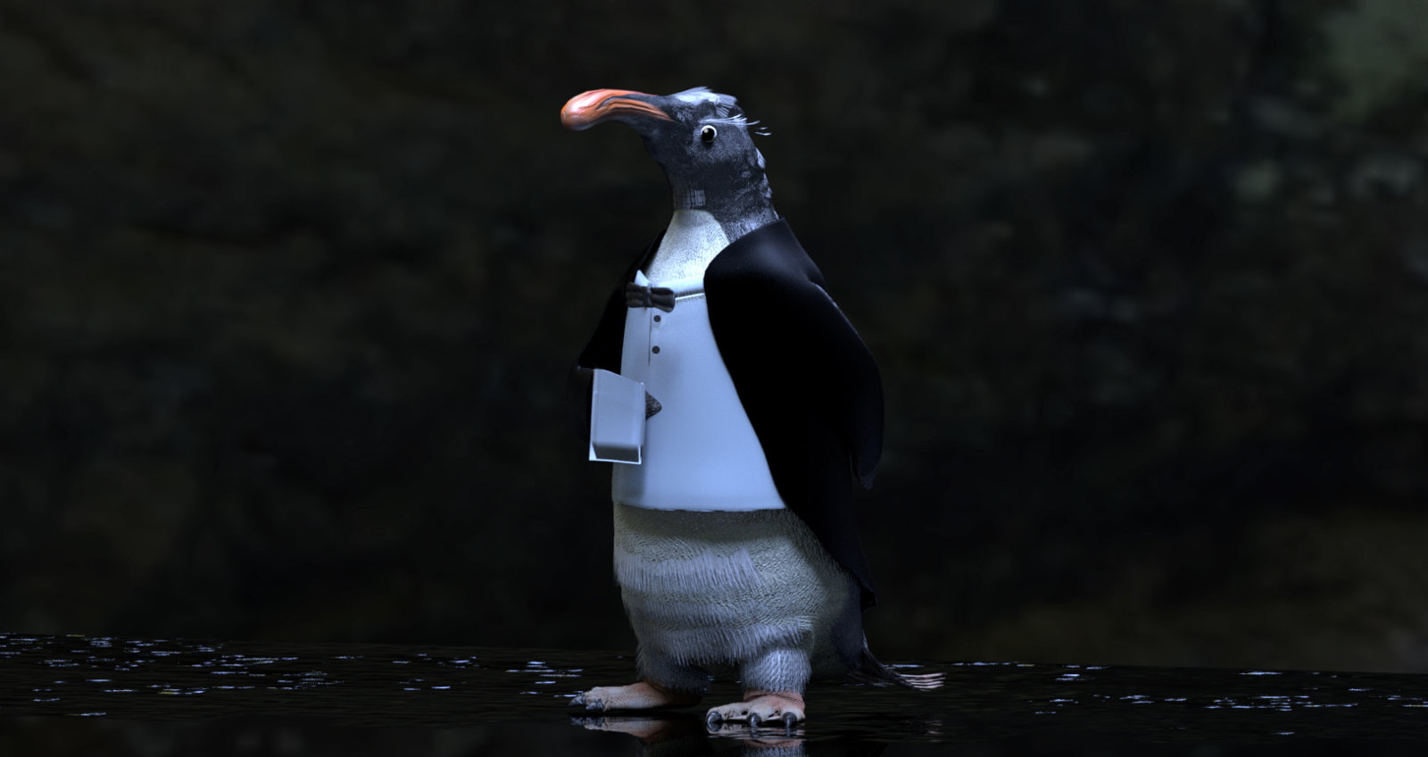
I did this in about an hour, all ZBrush. Morphed his beak into a snooty nose and did the clothes and napkin as extracts, sent them from ZBrush to Poser and rendered in Octane.
I did this in about an hour, all ZBrush. Morphed his beak into a snooty nose and did the clothes and napkin as extracts, sent them from ZBrush to Poser and rendered in Octane.
So cute!
Carey
Extraordinary
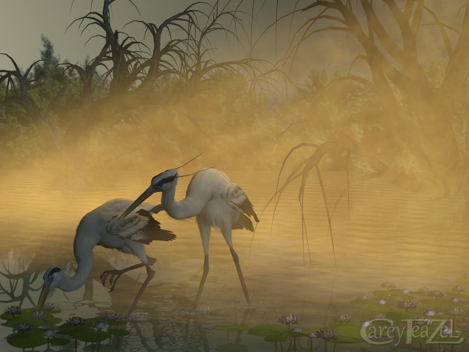
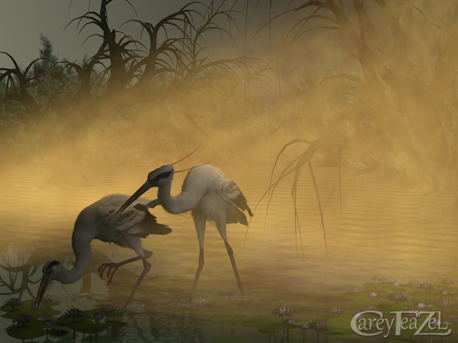
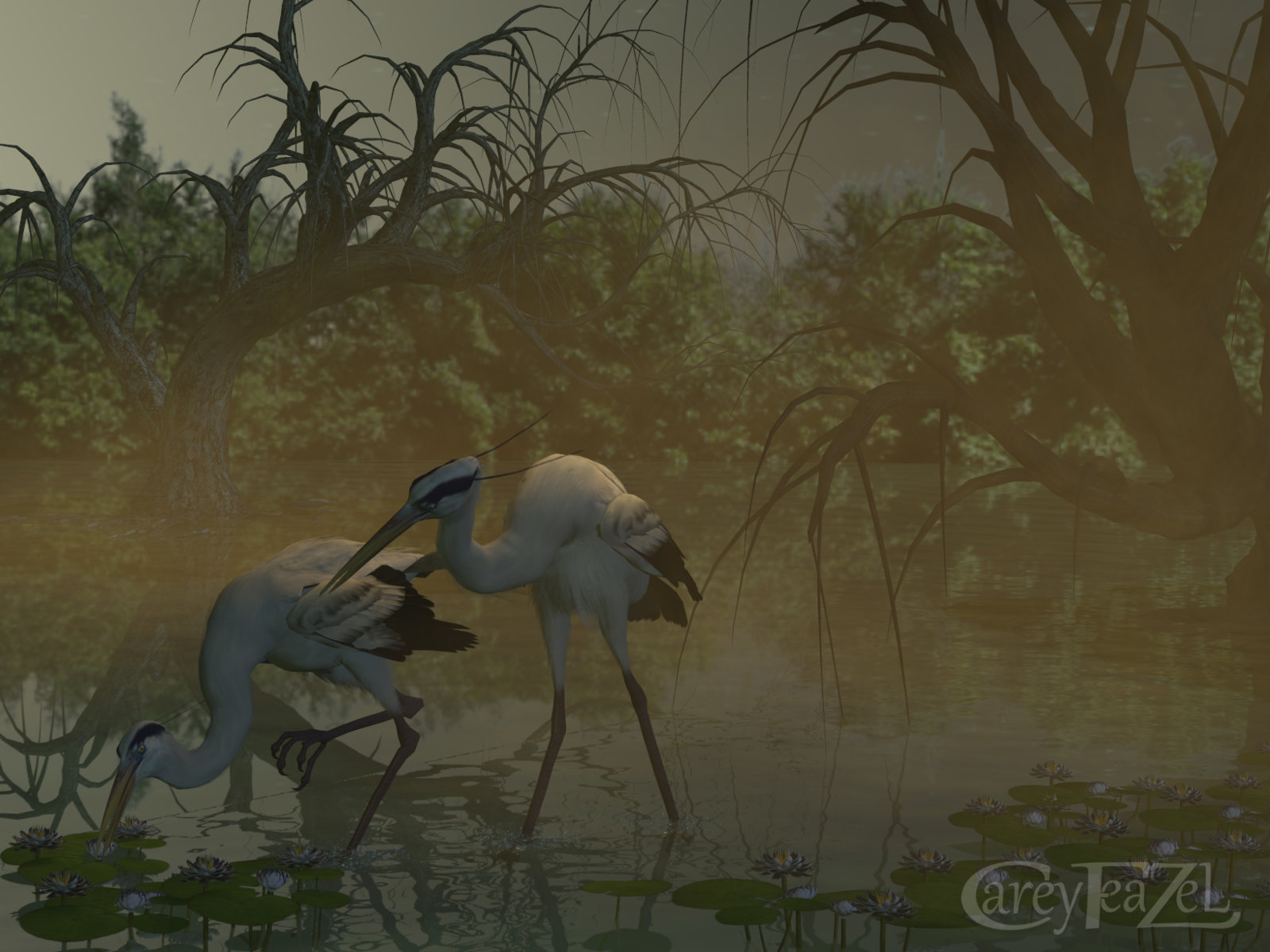
Which one do you like best?
I think this is one of those times it's all a personal preference. All 3 versions are really nice, but for me, the last one. The-hunt-1, is the one I like the best.
My reasoning is, even though you did a nice job of the atmosphere/fog in the first 2, I think it's a bit overwhelming. In the last render, there's just enough fog to give the viewer the feeling of the scene's atmosphere, without it blocking out too much of the rest of the scene.
My reasoning is, even though you did a nice job of the atmosphere/fog in the first 2, I think it's a bit overwhelming. In the last render, there's just enough fog to give the viewer the feeling of the scene's atmosphere, without it blocking out too much of the rest of the scene.
Carey
Extraordinary
Yea, that would be my choice, but I was getting opinions other wise, I did this to show that I doing a lot of experimenting with light, I rendered this one at least twenty timesI think this is one of those times it's all a personal preference. All 3 versions are really nice, but for me, the last one. The-hunt-1, is the one I like the best.
My reasoning is, even though you did a nice job of the atmosphere/fog in the first 2, I think it's a bit overwhelming. In the last render, there's just enough fog to give the viewer the feeling of the scene's atmosphere, without it blocking out too much of the rest of the scene.
Carey
Extraordinary
well said...lolI did a fun render, Scruffy the head waiter ready to welcome guests at the Kenguin Club.
View attachment 39575
I did this in about an hour, all ZBrush. Morphed his beak into a snooty nose and did the clothes and napkin as extracts, sent them from ZBrush to Poser and rendered in Octane.
Yes, lighting, at least to me, is one of the most important parts of a good render, and at least for me, sometimes one of the hardest to get just right.Yea, that would be my choice, but I was getting opinions other wise, I did this to show that I doing a lot of experimenting with light, I rendered this one at least twenty times
I'm in a different camp :wink:
I originally liked The Hunt 3 best, but when I opened all three images in separate tabs and switched back and forth between them ... turned out I liked The Hunt the best. The sky and the birds are a wee bit brighter in the The Hunt compared to The Hunt 3, which makes both stand out a bit.
I love the orange/yellow coloring to the fog in the first two.
Bonnie2001
Extraordinary
I like the last one best, for the same reasons as Miss B. But I would probably have boosted the contrast of it a small bit as well.
Carey
Extraordinary
How cute!

