• Welcome to the Community Forums at HiveWire 3D! Please note that the user name you choose for our forum will be displayed to the public. Our store was closed as January 4, 2021. You can find HiveWire 3D and Lisa's Botanicals products, as well as many of our Contributing Artists, at Renderosity. This thread lists where many are now selling their products. Renderosity is generously putting products which were purchased at HiveWire 3D and are now sold at their store into customer accounts by gifting them. This is not an overnight process so please be patient, if you have already emailed them about this. If you have NOT emailed them, please see the 2nd post in this thread for instructions on what you need to do

I Just Wanted to Post an Image Thread

Seliah (Childe of Fyre)

Running with the wolves.
CV-BEE
Contributing Artist
Adelaide... this is a current WIP character for G3F. I liked the way this rendered up, and decided to finalize it. On an odd note... boy, I need to practice more with rim lighting. She could have really used a nice rim light in this one...

-----------------------------------

-- Fredel's Pencil Dress in use here, though admittedly you can't see a lot of it, and I did change the shaders.
-- Samsil's Box Braids (G2F item)
-- Skin and morph are my own. (Morphs are final; skin is WIP)
-- My own light rig (AOA Advanced Ambients in use)
-- Rendered in DS 4.8; 3Delight.
-- Minor postwork in Photoshop. (DOF, frame, signature.)

------------------------------------
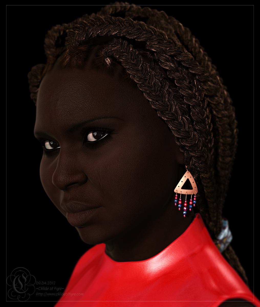
Adelaide.jpg
 

Seliah (Childe of Fyre)

Running with the wolves.
CV-BEE
Contributing Artist
I love that hairstyle on her. ^_^ I used the ponytail morph for it in her case, but I've used it in the Morning Soul thread already as well. Samsil does some really gorgeous African hairs.
 

Miss B

Drawing Life 1 Pixel at a Time
CV-BEE
I love that hairstyle on her. ^_^ I used the ponytail morph for it in her case, but I've used it in the Morning Soul thread already as well. Samsil does some really gorgeous African hairs.
Ohhh, I was going to ask you who the vendor was for that hair. What store?

Edited to Add: Never mind, I found Sansil's store at Renderosity, and lo and behold there's a G2F character named Miss-B. WOW, I feel flattered. :rofl:
 
Last edited:

quietrob

Extraordinary
Everythign is so nice!

Lorraine, I love the colors in that render. It's an interesting experiment with the filters, but the colors touch it off beautifully. Very minimalist, and it suits the image.

Vortigen, the lighting on that is really good. I like the interaction between the squirrel and the girl as well. I'm assuming that was an Iray render?

Hornet, that reminds me of either a scene out of a vampire movie, or a novel illustration.

Glitter, I love that little kiwi burrow! I wish I had the patience for volumetrics. I have to treat them the way I treat DOF rendering though... I set them to run while I'm going to be sleeping, otherwise I get impatient and cancel it out and do it in postwork instead. This looks really nice, though... just like a foggy early morning.
After years I just this year tried something called render in background. It allows you to work on more than one image at a time and it also seems to free up resources so you can still use your computer for other things. I'll still set a long after midnight render but it's nice to know that I won't be handicuffed if I decide to work on more than a couple of things at a time. Try it!
 

Seliah (Childe of Fyre)

Running with the wolves.
CV-BEE
Contributing Artist
After years I just this year tried something called render in background. It allows you to work on more than one image at a time and it also seems to free up resources so you can still use your computer for other things. I'll still set a long after midnight render but it's nice to know that I won't be handicuffed if I decide to work on more than a couple of things at a time. Try it!

Not sure if I can. It sounds like a Poser thing? I use DS...
 

Hornet3d

Wise
Using volumetrics is difficult as it is. The lighting has to be just right. It works fine in this scene. A little too fine, I think. You might want to hit that figure with the dodge tool in postwork. I had to look a bit to see him. Unless that is what you wanted. Is everything in this scene the way you wanted?

I apologize for the critique if it was not wanted.


There is never any need to apologise for any critique on any of my renders, I am always grateful for the feedback and pleased anyone took the time to pass any thoughts on. That goes for positive or negative feedback I try to take both on board in equal measure.

It may seem like a cop out but I do not want the figure to be seen that clearly only that there is a figure. The reason is that the first contact is made in a graveyard and the figure was only glimpsed so the exact nature of the figure was not known so I am trying to keep the intrigue. In this case figure is sort of identifiable as the same figure in the previous render I uploaded but they are in the reverse order in the book.

I have to be honest and say I did not use volumetric lighting, the fog is post worked as layers with one given a hue similar to the lamps. The apparent atmosphere is in another layer added with a diffuse brush in Particle Shop which allows the brushes to be used on a duplicate layer and only the differences saved. Using layers in this was allows me to play with the hue and transparency of each layer. As far as Poser is concerned the only lighting is two point lights set in each street lamp. They are set with attenuation as inverse square shadow blur radius at 5.

As to if I am happy with the end result, in the sense that I ever am happy then yes. It was more a proof of concept and whether it remains in the book exactly as it is now is anyone'e guess.
 

Hornet3d

Wise
I really like this Hornet. First thing I thought of was a dark, isolated street on the outskirts of London. :)


Thank you for that, it suggests I got it right on one level at least. While never place a exact time in my story that was definitely what I had in mind when I set the scene. I am a great fan of Charles Dickens's ghost stories, not just a Christmas Carol, although it is my favorite. That was certainly in the back of my mind when the idea took shape.
 

Hornet3d

Wise
I love using volumetrics, but you need the perfect scene and plenty of time to do it right. I used it here with Ken's Kiwi burrow and loved it.

View attachment 25289

I also used Nerd3D's "cheat video" to get good volumetrics:

His suggestions really speed up the render times for volumetrics.

That is a great render with atmosphere in more than one sense. I wish I could master volumetrics, until I find the time and skill to do so I just cheat.
 

Hornet3d

Wise
Everythign is so nice!


Hornet, that reminds me of either a scene out of a vampire movie, or a novel illustration.

Thanks, the reason for creating it was to be included on a photo story book so an illustration was sort of what I had in mind. Then again, now you mention it with a few changes it could work as a vampire or Jack the Ripper scene.
 

Hornet3d

Wise
Adelaide... this is a current WIP character for G3F. I liked the way this rendered up, and decided to finalize it. On an odd note... boy, I need to practice more with rim lighting. She could have really used a nice rim light in this one...

-----------------------------------

-- Fredel's Pencil Dress in use here, though admittedly you can't see a lot of it, and I did change the shaders.
-- Samsil's Box Braids (G2F item)
-- Skin and morph are my own. (Morphs are final; skin is WIP)
-- My own light rig (AOA Advanced Ambients in use)
-- Rendered in DS 4.8; 3Delight.
-- Minor postwork in Photoshop. (DOF, frame, signature.)

------------------------------------

View attachment 25290

Fantastic creation and what a wonderful character. I love it as it is but you could be right, a nice rim light might be a good addition.
 

quietrob

Extraordinary
There is never any need to apologise for any critique on any of my renders, I am always grateful for the feedback and pleased anyone took the time to pass any thoughts on. That goes for positive or negative feedback I try to take both on board in equal measure.

It may seem like a cop out but I do not want the figure to be seen that clearly only that there is a figure. The reason is that the first contact is made in a graveyard and the figure was only glimpsed so the exact nature of the figure was not known so I am trying to keep the intrigue. In this case figure is sort of identifiable as the same figure in the previous render I uploaded but they are in the reverse order in the book.

I have to be honest and say I did not use volumetric lighting, the fog is post worked as layers with one given a hue similar to the lamps. The apparent atmosphere is in another layer added with a diffuse brush in Particle Shop which allows the brushes to be used on a duplicate layer and only the differences saved. Using layers in this was allows me to play with the hue and transparency of each layer. As far as Poser is concerned the only lighting is two point lights set in each street lamp. They are set with attenuation as inverse square shadow blur radius at 5.

As to if I am happy with the end result, in the sense that I ever am happy then yes. It was more a proof of concept and whether it remains in the book exactly as it is now is anyone'e guess.

Thanks. I feel better about my little critique. Back when I was still a pencil artist, I wondered where my art had gone one day. Even my drawing table was missing. It turned out that my next door neighbor had stolen (borrowed) it while I was doing my shift fixing radios for the US Army. I quickly found he was a better artist than me, used the cylinder, square and rectangle method rather than just imagining it in his head and he gave me all kinds of tips and pointers that only a superb artist could give. One of the best things he ever asked me was, "Does it look the way you wanted it to look?" It seems simple but anyone who has done pencil sketches or 3d Rendering will tell you that is the most important thing of all. Does your mind's eye match what is on your drawing table? Once it does, you'll be happy enough because we always think we can do better. If that eerie atmosphere with the figure almost hidden away (You could've put a red and white sweater on him and played Where's Waldo) is what you were indeed going for, than indeed nice job. I know my senses would be heightened and I'd be thinking, "Why didn't I bring a crowbar?" if I had to journey down that street.

You wrote, "They are set with attenuation as inverse square shadow blur radius at 5."

Yeah, tell me again that 3d rendering is just press the "ART" button.
 

Satira Capriccio

Renowned
CV-BEE
Contributing Artist
What? It isn't?

But ... but ... but ...

Well gosh. I guess I'll stop looking for that Make Art button :wink:

I originally couldn't see a figure at all, but that was because it was night here, and it gets hard to see dark images. When I looked at it the next day (the sun was out and shining brightly), I could just see the figure. I think. I couldn't even see the alley the first time :p

I keep thinking I should get another floor lamp. The one I have does a decent job. But, one lamp for the room really isn't enough ... given it's a L-shaped room (living room, dining room, and entry). The computer is setup in what's supposed to be the dining room, and the lamp is at the inside corner of the L so the most light is hitting the couch, and the least light is reaching the computer and the entry.

Seliah, that is a lovely character.
 

Hornet3d

Wise
Thanks. I feel better about my little critique. Back when I was still a pencil artist, I wondered where my art had gone one day. Even my drawing table was missing. It turned out that my next door neighbor had stolen (borrowed) it while I was doing my shift fixing radios for the US Army. I quickly found he was a better artist than me, used the cylinder, square and rectangle method rather than just imagining it in his head and he gave me all kinds of tips and pointers that only a superb artist could give. One of the best things he ever asked me was, "Does it look the way you wanted it to look?" It seems simple but anyone who has done pencil sketches or 3d Rendering will tell you that is the most important thing of all. Does your mind's eye match what is on your drawing table? Once it does, you'll be happy enough because we always think we can do better. If that eerie atmosphere with the figure almost hidden away (You could've put a red and white sweater on him and played Where's Waldo) is what you were indeed going for, than indeed nice job. I know my senses would be heightened and I'd be thinking, "Why didn't I bring a crowbar?" if I had to journey down that street.

You wrote, "They are set with attenuation as inverse square shadow blur radius at 5."

Yeah, tell me again that 3d rendering is just press the "ART" button.

Thanks for the advice and perhaps "Does it look like they way you wanted it to look" is a question I should ask myself more often. Many of my renders develop as I go, in this case placing the point lights inside the lamps created a horrible sharp shadow produced by the frame of the lamp, hence the need to play with the blur radius. I wanted a dark scene which was the reason for the attenuation set at inverse square. I play with the attenuation but I cannot get consistent results so it is often trial and error.

For comparison, here is the render straight from Poser, as you see it is a lot lighter and the figure is clearly visible. The difference between the renders all done in Paintshop Pro with the Particle Shop providing the atmospheric effect just around the lights.

The Street Untouched.jpg
 

Hornet3d

Wise
What? It isn't?

But ... but ... but ...

Well gosh. I guess I'll stop looking for that Make Art button :wink:

I originally couldn't see a figure at all, but that was because it was night here, and it gets hard to see dark images. When I looked at it the next day (the sun was out and shining brightly), I could just see the figure. I think. I couldn't even see the alley the first time :p

I keep thinking I should get another floor lamp. The one I have does a decent job. But, one lamp for the room really isn't enough ... given it's a L-shaped room (living room, dining room, and entry). The computer is setup in what's supposed to be the dining room, and the lamp is at the inside corner of the L so the most light is hitting the couch, and the least light is reaching the computer and the entry.

When doing dark scenes I am very conscious that others may not see the render just as I do. As you point out the surrounding light has a major impact as does the calibration of the monitor. My monitor is calibrated so that I get the colours I want when I send my renders for print so that may have a further impact. In this particular case I was trying, to a large degree, to keep the figure almost hidden as you can see if you compare my before and after shots. The result is really down to the fact that I intended to use it in a book, if that had not have been the case it would be very different.

Please don't see any of this as a defense to anything that has been said here, I do not feel under attack and I am always interested in how others view what I create. The whole idea of trying to create this book is directly due to suggestions and ideas made here. I am immensely grateful to anyone taking and interest in my art and the fact that they may see ways to make it better is a plus in my book as they are still showing interest.

If anyone likes any of my renders here then part of the credit for that has to go to all the people here who have helped, advise and guided me. I am so lucky to have found such and great and friendly bunch of artists and a home for my pictures.
 
Top