• Welcome to the Community Forums at HiveWire 3D! Please note that the user name you choose for our forum will be displayed to the public. Our store was closed as January 4, 2021. You can find HiveWire 3D and Lisa's Botanicals products, as well as many of our Contributing Artists, at Renderosity. This thread lists where many are now selling their products. Renderosity is generously putting products which were purchased at HiveWire 3D and are now sold at their store into customer accounts by gifting them. This is not an overnight process so please be patient, if you have already emailed them about this. If you have NOT emailed them, please see the 2nd post in this thread for instructions on what you need to do

I Just Wanted to Post an Image Thread

Gadget Girl

Extraordinary
Contributing Artist
Sorry Myth and GG, I'd be one of those people who'd do chess that way since I have no idea how to play :D.

So just so you know, if you ever want to do a render with a chess set, the secret is not to have a ton of pieces on the board. I've heard that there are as many possible chess games as atoms in the universe, but. . . that's if you play all the way to the end. The beginning after all starts out with some pretty strict rules. The 'bad' games I've seen, it was obvious that one side had to have had many more moves the other side to get that many pieces out (okay I guess someone could spend their turns doing nothing but moving a knight in and out of place but. . . ).
 

Pendraia

Sage
Contributing Artist
lol...so for once it isn't my eyesight playing up...I have to say if I had that much hair there I'd wax or pluck it as it would drive me nuts.
 

phdubrov

Noteworthy
Contributing Artist
Finley v3-3 tm.png

G3-based HD character in Superfly
 

Zaarin

Brilliant
The Sleeper Ship

I actually completed this a few months ago, but forgot to upload it. It's based on a scene I started a few years ago, but I rebuilt it from scratch. It's lit solely by light-emitting objects, and everything in the scene uses Superfly shaders. :D Most of the shaders are based on Vincebagna's Superfly shaders from DAZ (including the awesome shader that puts a layer of dust on the horizontal surfaces of objects!), but the skin is EZSkin 3.0, the eyes use Bagginsbill's tricky glass shader, and the hair shader is my own.

The Sleeper Ship_postwork.jpg
 

VortigensBane

Busy Bee
So I've been working on these for FOREVER. The first version was part-way through the development of the scene, but it rendered all the way through, so since the final render wasn't done by the PC render contest deadline over at, well, somewhere else, I went ahead and uploaded it. Now that the final version is "done," I thought I'd upload both to see which one people like better. Part of me likes the brighter version 1, but I really like some of the lighting effects in the second version... Criticisms and opinions PLEASE. :)

Please Don't Die (version 1)
Please Don't Die Courtyard Edition shrunk.jpg


Please Don't Die (version 2)

please don't die finalized and shrunk.jpg
 

Dreamer

Dream Weaver Designs
Compensation wise I like 2 but I like the lighting and framing of 1 better.
With one the eye goes straight to her face where as in 2 its the glass dome you look at first.
In 1 what is up with her hand BTW? It looks a little funky.
Those are my thoughts any way :) Both are lovely well done images in their own right and if I had to pick one over the other I would have to go with 1 only because having her face as the focal point tells a more compelling story than the wider focus of 2
 

Zaarin

Brilliant
I agree with everything Dreamer said, but I'd add that I like the ground texture in #2 better--the ground texture in #1 is a little blurry.
 

VortigensBane

Busy Bee
Hmmm. Maybe I'll do a third version. Or not...
I do like that the details stand out better in 1 with the better lighting. Adding the glass dome made lighting a nightmare, because I kept getting a visible reflection of my spotlights on the glass. I changed the lighting to "fix" that problem, but then I ended up doing a render of just the glass dome without the spotlights on and postworking it in. Maybe I should go back sometime when I won't need my computer for four+ days and re-render using the original lighting.

As far as what's up with her hand, it's covered in blood. She has been trying to save him from a stabbing wound, after all... ;) Maybe I should add more red stuff to the wound and the dagger in the fictional third version to help make it more obvious.
 

Dreamer

Dream Weaver Designs
Hmmm. Maybe I'll do a third version. Or not...
I do like that the details stand out better in 1 with the better lighting. Adding the glass dome made lighting a nightmare, because I kept getting a visible reflection of my spotlights on the glass. I changed the lighting to "fix" that problem, but then I ended up doing a render of just the glass dome without the spotlights on and postworking it in. Maybe I should go back sometime when I won't need my computer for four+ days and re-render using the original lighting.

As far as what's up with her hand, it's covered in blood. She has been trying to save him from a stabbing wound, after all... ;) Maybe I should add more red stuff to the wound and the dagger in the fictional third version to help make it more obvious.
If you do a third maybe see if you can get the blood on her hand more smeared looking and maybe add a bit on the ground under him. Just a thought ;) I would love to see a third taking the best bits of both but render times can be a cow I know. If a render is going to take more than 24 hours, 48 at a push, I wont go there lol
 

Pendraia

Sage
Contributing Artist
If you do a third version...you may want to look at the fold at the front of the dress...it doesn't look natural too me. That said they are both beautiful renders and I can't improve on what Dreamer said already.
 

Rae134

Renowned
CV-BEE
Contributing Artist
Please do a third version, I think it will be well worth it :D

I like the first version as it focuses on the couple. If that is supposed to be blood on her hand, maybe it needs a little on his fur around that area (since it would transfer from her hand to the fur if she is stroking him). I like the moodiness of the second one but its maybe a little too dark? (at least on my screen) and as the light is hitting the dome not the people that is the focus, if the lighting was hitting the couple more I think I'd like it better. (I do like the ground in 2 better.)
 

Gadget Girl

Extraordinary
Contributing Artist
Now that the final version is "done," I thought I'd upload both to see which one people like better.

So I think I like the first version better, although they are both great. I love the rose in the second one and the glass case but the first one does tell the story much better.

So there's an interesting questions about the blood and the hand. I think you're right that 'correctly' the blood belongs there, or does it. It depends on what sort of fairy tail render you are trying to do. If it's a dark and gritty 'realistic' one then you need a lot more blood. But if you are going for something more traditional the blood may not belong at all. For that sort of render, I think the snow covering the flowers is a much better metaphor, and the blood just makes her hand vanish in the second render.

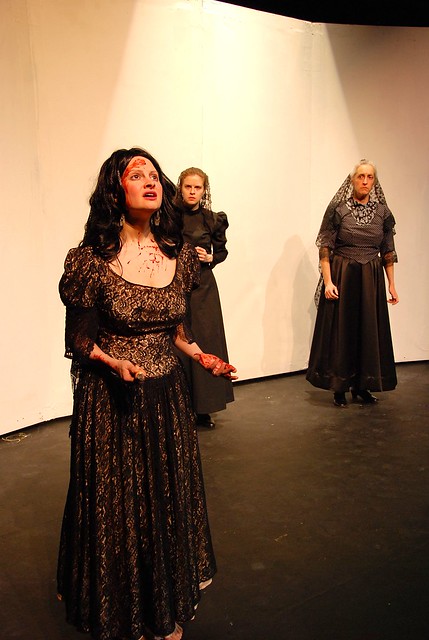
This is a question I spent a lot of time thinking about because several years ago I played The Bride in a play, Blood Wedding by Federico García Lorca, and at the end of the play she enters after her lover has been stabbed and killed, carrying in the knife. We spent a lot of time trying to figure out how to do the blood.


One of the big things we decided, was the on the hand that pulled the knife out, blood would mostly be on the back of the hand, while the other hand would have blood on the palm where she would have put it on his chest while she was pulling the knife out. We also decided with the blood spatter she might have wiped her forehead, and that's were the big blood smear comes in. (And interesting note for those of us who spend time on writing, in Lorca's stage directions for the final scene, the set is supposed to be totally white, with no shadows. Not really sure how he wanted us to do that, but you know . . . )

But here's the thing. . . this was all great for that play because, well it's called Blood Wedding, and it's sort of poetic horror. Here are the last lines of the play:

Bride:
And this is the knife,
A little knife.
So small it barely fits the hand.
Fish without scales or river.
But one fine day between two and three,
With this knife,
Two strong men were quenched,
Their lips turning yellow.

Mother:
And it scarcely sits in the hand.
But penetrates, chill,
Through the startled flesh
Where trembles enmeshed,
The dark root of a scream.

All that being said, I really like both of them. And thanks for sharing both, I'm sure we all know how much renders progress and change. It's nice seeing both points on the spectrum and having a chance to compare.
 

Mythocentric

Extraordinary
Thank you everyone! A touch of madness to keep the aging brain cells active, or as Lucy would put it, "Grandpa's done another weirdy picture!" :whistling:
 

Mythocentric

Extraordinary
Some fantastic renders in the last few pages here, I am amazed that the quality just seems to keep on rising. So just to prove that it it not true for everyone :-

View attachment 19844

Not quite sure about it being sweet but parting is definitely a sorrow.

Nowt wrong with that our kid! Seriously though. I'm constantly amazed with the range of genre's and high standards you people bring to your artistic endeavours. GO THE HIVE!!!:applause::bee::applause::bee::applause::bee::bee:
 
Top