• Welcome to the Community Forums at HiveWire 3D! Please note that the user name you choose for our forum will be displayed to the public. Our store was closed as January 4, 2021. You can find HiveWire 3D and Lisa's Botanicals products, as well as many of our Contributing Artists, at Renderosity. This thread lists where many are now selling their products. Renderosity is generously putting products which were purchased at HiveWire 3D and are now sold at their store into customer accounts by gifting them. This is not an overnight process so please be patient, if you have already emailed them about this. If you have NOT emailed them, please see the 2nd post in this thread for instructions on what you need to do

RELEASED Hivewire Big Cat Has Begun!

CWRW

Extraordinary
HW3D Exclusive Artist
Me too Richard! Thank god Chris is doing them! Without his mad UV mapping skills I sure wouldn't be able to do my job worth a darn. There has been a lot of products I wanted to try textures for but the UV mapping totally got in the way.wouldn't allow me to do things I felt critical. Another with mad UV mapping skills is Lady Littlefox- she pulled me in on a project a few years ago and she blew me away with what she did with my suggestions for the UV. We totally made a silk purse out of a sow's ear on that one:)
 

Szark

Awesome
Yeah a big difference when UV mapping for 3D painting than for flat texture making in terms of how the UVs are layout out. I have spent hours manually adjusting the uvmappng so it looks like what Chris has done....I feel the pain. LOL But yes liking many out there I don't like uv unwrapping but I can do it. This is why I love programs like Substance Painter.
 

Sparky

Monster Maker
Contributing Artist
I actually kind of enjoy uvmapping organic models, like animals. What I don't like to uv map are things like hair and clothes, when you need super straight islands. I always feel like a taxidermist when I'm uvmapping an animal, though, and that makes it weird. :eek:
 

Chris

HW3D President
Staff member
Co-Founder
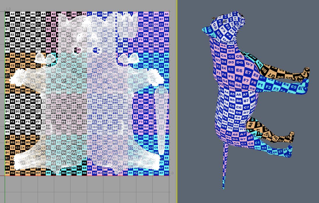
Here's today's work. On to the teeth, tongue, gums, claws, eyeballs and whiskers now. Very close now.

leopard1112.JPG


leopard1113.JPG
 

Sparky

Monster Maker
Contributing Artist
Looking very good, Chris! Might I suggest giving the paws a little more real estate? They look a little too small proportionally, and the paws are an area where I would want more detail, like the face. The ears also look like they have less texel density than the face, and I would imagine the face and ears should have comparable texel density. Especially as they are likely to be morphed to be larger for various cat shapes. It would be good if the ear uvs could support a good amount of detail.
 

RAMWolff

Wolff Playing with Beez!
Contributing Artist
Have to agree there. I remember back when DAZ started releasing their figures with these HUGE ear UV's, back then I thought it ridiculous but now I see the value of that decision.
 

Chris

HW3D President
Staff member
Co-Founder
Different schools of thought I imagine. I can do what ever, but I'm trying to keep the pieces the same density for map consistancey from section to section. This is exactly what I did for the Horse, and at 6K X 6K maps it gives Laurie plenty to work with. Nothing like having a high rez map next to a low rez area that seems too obvious of a transition. If the whole map area is large and consistant that would be good.

When I do UV maps on the hair strips and if they're not similar in size then I get the opposite and it's suggested that they be the same. So I try and do that.

I can for example cut the head off and make that larger, but I didn't have to do that for Harry or Eli and those maps worked out fine as long as the whole map area is large enough.

Am I missing something here?

Here's a few more with close up shots.

Also, I'm attaching paws to legs for less seams. With all of this I'm trying to create less seam work.

leopard1114.JPG

leopard1115.JPG
leopard1116.JPG
leopard1117.JPG
leopard1118.JPG
 

Sparky

Monster Maker
Contributing Artist
Well, you see, the purpose of the grid texture with the numbers is to check for stretching and texel density. So, you can see that the numbers and grid squares look smaller on the face than they do on the ears, and the grid looks larger on the paws, because the texel density is higher in the face and lower on the paws and ears, it isn't 1:1 as it is. The paws don't have to be removed to increase their texel density. It could easily be done by selecting the the polys in the paws with a soft selection and scale it up a little. The point about the ears was that, while it might be better to have absolute 1:1 texel to poly density for a figure that is not intended to be widely flexible in shape, for many shapes this figure will likely become, the ears will be larger, and it will be good in the long run for future characters on the big cat, like housecats and servals if the ears were a bit larger on the uv. You can see the problem in action on Laurie's in progress textures for the mule deer. The ears are of noticeably lower resolution than on the rest of the animal. Having somewhat larger uv islands for the ears now will facilitate similar characters on the figure later.


To clarify, I didn't mean to suggest that either the ears or paws be radically increased in size, but that I would like to be able to get as much detail in the paws and ears as will be available in the face given the uvs as shown. Just because the projects I am interested in creating for the big cat will benefit from as much texel density as possible, especially in the feet, and somewhat in the ears, which are currently under represented in the uv space.
 

AetherDream

Breathing Life into Characters
Contributing Artist
I really have no idea about all of the technical stuff that everyone is talking about here on what and how this is done, but I really value neat and even UV maps. I certainly have ran into a lot of different things on working with UV maps. I really appreciate the attention to detail on this. I might try my hand at a texture for it simply because I love cats!! I am anxiously awaiting the work that CWRW is going to do. She is amazing!
 

Lyne

Distinguished
HW Honey Bear
Huh? the "E" in the ear looks pretty huge to me, as do the numbers on the paws.... any larger on the paws and I'd think it would look odd... but I'm dyslexic, so who knows... I do know Chris's "feet" (ie: hooves) look plenty good on the horse with Laurie's mapping, and they are quite a bit smaller on Harry's uvs, than, say the back/tummy of the horse, or even the head...
 

Sparky

Monster Maker
Contributing Artist
That's just it, Lyne, you want the grid to look small, not large in areas where you want good detail.
 

Kimberly

Inspired
wow it keeps looking better and better. Thanks Chris for keeping us up to date on your progress. I love seeing wip. :)
 

Pendraia

Sage
Contributing Artist
Hey Sparky, I agree that you want the grid to be smaller for finer detail. You got me curious though so I took Chris's pictures into PS. I found that there isn't a lot of difference between the face and the ears but there is finer detailing on the nose and I'm thinking that some of that would be that the nose needs more polys to do the expression morphs?
Both of these were just a straight copy and paste in PS.
leopard1117b.jpg
leopard1118a.jpg
 

Sparky

Monster Maker
Contributing Artist
Well, the poly density is comparable. What I'm talking about is the texel density. That's the proportional area of the uvs. The finer "grid" you are seeing inside the number/letter texture checker grid is the topology of the model, it's not the texture.
 

Sparky

Monster Maker
Contributing Artist
Taking your example, Pen, this is an illustration of what I mean.

BigCatTexelDensity01.jpg


BigCatTexelDensity02.jpg


The feet are objectively proportionally smaller on the uvs. And the ears could use a little more room for texturing bigger ears. That's all I'm sayin'.
 
Last edited:

Chris

HW3D President
Staff member
Co-Founder
It's not the "grid image" that is the issue or concern. I'm only showing the grid image on the model to show where stretching occurs on the model so that I can try my best to minimize the UV stretching across the entire model. I can show this leopard with a smaller grid on him and then you might say "yes this is better, the grid is now smaller on the ears, so I must have more detailing available to me now".
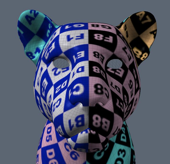
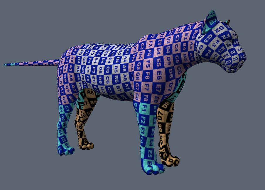
leopard1119.JPG
leopard1120.JPG
leopard1121.JPG


This whole UV process is a bit of a compromise. I'm concerned about minimizing the stretching, and so I try my best to relax the UVs and try to normalize the flow and layout. I'm also trying to minimize the seams that would have to be painted over. I also want to maximize the UV space by filling in the UV area as much as possible. Of course if I have to put things on different layers I can do that. The horse UVs are all on one layer for the animal portion at least. Then I have the eyes on a separate layer that certainly doesn't have to be a 6000 x 6000 map like the body. The mane is on another layer, and I think I put the fetlocks and tail on another layer.

For this Kitty I'm going to have 2 layers. One for the animal, with teeth, whiskers, tongue, claws included, which will be 6K x 6K. And the eyes will be on a separate layer and will be a smaller file size then 6K x 6K.

Having said this, I'm happy to make the footprint on the ears and paws larger, BUT if I do this you will certainly have a higher detailed area for the ears and paws that will not match the detail of the body, and that could offer yet another challenge to match one to the other in addition to the seam work.

Sparky alluded that the Mule deer morph from the Horse shows the inner ear with lesser detail on the map. True, this will happen by nature of the morphing process on more extreme morphs. Obviously its a marriage and compromise on the mesh density also. But also know that the inner ear on Harry's UVs are separate and that map can be made larger without having to redo the UV layout.

Laurie and I have discussed this a bit in email, and for now she'd like to see the ears on a larger footprint and try the paws as they are, so we'll do that and go from there. I personally think they should be similar is size to the rest of the animal so the detailing will match better.

Whatever the case, we'll end up with a great set up in my view. One that hopefully with be acceptable to Sparky and Lyne and anyone else that might have interest in creating morphs and maps for Kitty.
 

Sparky

Monster Maker
Contributing Artist
The texture checker shows the texel density across the map, that's why I brought it up. Having the paws of similar size to the rest of the animal is what I'm lobbying for, LOL. As it is, they are small.

Once again, not suggesting the paws be made into a separate island. Just that they should be scaled up a little. ;-)
 
Last edited:
Top