• Welcome to the Community Forums at HiveWire 3D! Please note that the user name you choose for our forum will be displayed to the public. Our store was closed as January 4, 2021. You can find HiveWire 3D and Lisa's Botanicals products, as well as many of our Contributing Artists, at Renderosity. This thread lists where many are now selling their products. Renderosity is generously putting products which were purchased at HiveWire 3D and are now sold at their store into customer accounts by gifting them. This is not an overnight process so please be patient, if you have already emailed them about this. If you have NOT emailed them, please see the 2nd post in this thread for instructions on what you need to do

Want to improve your rendering? Promos? Come join in and let's help each other out

Aylaaenas_Evenwing

Adventurous
I made a promo hdri light map, for studio rendering. I tested it in Studio, i dont have poser on the moment near me. So if anybody want to try to render it in poser, to see if it looks ok. If not than i will try to create a hdri light for poser too.

As you can see if you rotate the dome you can get a lot of different exposures. Feel free to use for your promos.

Studio light free promo.zip
 

Attachments

  • lights.jpg
    lights.jpg
    368.1 KB · Views: 213

Ken Gilliland

Extraordinary
HW3D Exclusive Artist
Of course, it's super rare when I include a human in my renders, but the principles are the same, so here's my tips...

1) Composition! Composition! Composition!... No matter how good your render is.... whether you are doing a simple promo or a full scale render, if you have a awful or boring composition, you're no going to attract an audience. A good, solid composition will win over technique every time. I have a tutorial on composition.

2) Good lighting doesn't necessarily have to be complex... just well placed. In Poser, I use a very simple 3 light set; Sunlight (off-white coloring usually set between 150-400% with a 50-70% shadow and generally coming out of the upper left corner), a Fill light (medium gray coloring, no shadows, >30% intensity pointed at the main character) and a Backlight (cool medium gray, no shadows, >20% intensity, usually coming from the lower right corner from behind the main character).

In DAZ Studio Iray, I use 2 lights; a distant photometric light at 100% with Lumen cranked up quite a bit (that's makes believable outside daylight) and a spot photometric light (pointed at the main character)-- that's basically a fill light with no shadow. Sometimes, I'll add more spotlights if there isn't enough light on the main subject.

3) Use "Depth of Field" in DS and Poser... Nothing sells an image better than DoF. DoF always makes an image a little more realistic. If you've never used it-- there's tons of tutorials online. It's a little tricky to get the correct Focal length right, so experiment... once you are happy start playing with F/Stop. The more F/Stop, the less DoF. In Poser, use DoF, plus the Material Room's "Atmosphere" "Depth Cue"... I prefer a light pastel color on the Depth Cue for outside lighting.

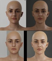
Here's the backside of my 2019 calendar showing 4 images (left side Poser renders, right side Studio renders). All 4 images use the 3 tips I discussed above. All use the composition techniques, simple lighting and mild to strong DoF

2019-13.jpg
 
Last edited:

Satira Capriccio

Renowned
CV-BEE
Contributing Artist
Depth of Field is often way overdone for me. As someone who once had more than excellent vision (even better far vision), and now, not so much, it frustrates me when a render is heavily blurred. Doesn't matter whether it's the background and/or foreground. If I can't at least tell that a blade of grass is a blade of grass, then I'm instantly irritated.

Ken's Turtle image is perfect to me, but the DOF on the Common Poorwill DOF is too strong for me. I keep trying to refocus to "unblur" the foreground and upper corner.

Until my eyes started to betray me, my eyes refocused instantly when I looked between something close up and something out in the distance, so I never got the sense of things being blurry like they are in DOF renders. On good days, I still don't get a sense of things in the distance being blurry when I'm looking at something close to me. On bad days, everything is blurred ... especially when my eyes are tired or it's bright outside and I'm driving.


(That's my less than .02 cents)
 

Miss B

Drawing Life 1 Pixel at a Time
CV-BEE
1) Composition! Composition! Composition!... No matter how good your render is.... whether you are doing a simple promo or a full scale render, if you have a awful or boring composition, you're no going to attract an audience. A good, solid composition will win over technique every time. I have a tutorial on composition.
Rule of Thirds! Rule of Thirds! Rule of Thirds! Oh, did I mention Rule of Thirds? :D

Back when Dreamlight had his own site and forum he used to hold monthly webinars, and the Rule of Thirds was one of the topics often discussed, and then he created a great plugin for DS 3 that allowed you to have overlays of a whole bunch of composition tools. I think he did an updated version when DS 4 first came out, but not sure whether the newest version has it. This is something I wish Poser had, as it was always easy to get items in the scene set up nicely.
 

RAMWolff

Wolff Playing with Beez!
Contributing Artist
Thanks for all the tips Ken.

SO #Aylaaenas_Evenwing. I tried your tutorial using the Background in Poser. No luck there. Rendered blank and I've looked over all the settings making sure they were exact! NOTHING shows. Shows in the node pane in the previews but in the main render area nothing! Not sure if the Background root node is borked or what's going on? :cry:
 

DanaTA

Distinguished
Rule of Thirds! Rule of Thirds! Rule of Thirds! Oh, did I mention Rule of Thirds? :D

Back when Dreamlight had his own site and forum he used to hold monthly webinars, and the Rule of Thirds was one of the topics often discussed, and then he created a great plugin for DS 3 that allowed you to have overlays of a whole bunch of composition tools. I think he did an updated version when DS 4 first came out, but not sure whether the newest version has it. This is something I wish Poser had, as it was always easy to get items in the scene set up nicely.

Sometimes this is like other rules, made to be broken.

Dana
 

parkdalegardener

Adventurous
Rule of Thirds! Rule of Thirds! Rule of Thirds! Oh, did I mention Rule of Thirds? :D

Back when Dreamlight had his own site and forum he used to hold monthly webinars, and the Rule of Thirds was one of the topics often discussed, and then he created a great plugin for DS 3 that allowed you to have overlays of a whole bunch of composition tools. I think he did an updated version when DS 4 first came out, but not sure whether the newest version has it. This is something I wish Poser had, as it was always easy to get items in the scene set up nicely.
Miss B just make a grid in Photoshop/Gimp whatever and parent it to your camera of choice. Turn off in Properties or wherever when ready to render.
 

Ken Gilliland

Extraordinary
HW3D Exclusive Artist
Ken's Turtle image is perfect to me, but the DOF on the Common Poorwill DOF is too strong for me. I keep trying to refocus to "unblur" the foreground and upper corner.

I agree the DoF in the Poorwill image is a bit overkill and much, much stronger than I usually use on my renders, but, I did so with a very specific purpose. In this case, I wanted the image look like something I shot with a macro setting on my SLR Camera. I actually have the same image with a much more subtle DoF. Looking at them side-by-side-- the macro shot just looked more real.
 

Satira Capriccio

Renowned
CV-BEE
Contributing Artist
Ken covers the rule of thirds, as well as quite a few others in his pdf.

I find other composition guidelines result in more exciting images than the rule of thirds. But, that's a personal opinion.

After all, I'm not a huge fan of western novels, but since my dad was a avid fan of Louis L'Amour, I read every single one my dad purchased.

Bottom line ... don't rely only on the rule of thirds. Explore other guidelines, and like Dana said, sometimes rules are made to be broken. So, don't be afraid to "color outside the lines," and break composition guidelines.
 

Miss B

Drawing Life 1 Pixel at a Time
CV-BEE
Miss B just make a grid in Photoshop/Gimp whatever and parent it to your camera of choice. Turn off in Properties or wherever when ready to render.
I've done the grid thing, though not in Poser. I have (had on my old laptop) 2 or 3 in the usual size renders I did saved in Photoshop, so when I would do an initial test render, I could overlay it on another layer to see how it looked. I might have to try parenting it to my camera in Poser to see how that goes.

Unfortunately, now-a-days most of the renders I do are during beta testing, so the character/object I'm testing is always dead center. Then again, there are always reasons for not following Rule of Thirds. I just mentioned it because the DS plugin was something I was very into back when I was using DS a lot.
 

Dakorillon (IMArts)

Dances with Bees
Contributing Artist
Here's a really old tutorial I did about composition. Storytelling through Composition with stage craft

I had an actor friend who told me about stage craft so it's based a lot on that.
My Webinar Recording/Tutorial in the shop has a lot about composition in it. Sorry I don't have a truncated, free version. There are a lot of different possibilities for composition. The Thirds, the Golden Triangle, the Golden Ratio, The Fibonacci, Asymmetry, and more! Like Dana said, you need to know the rules so that you know how to break them!

A course I'm taking on concept art currently has a cute saying that can apply here, too.
Shape, Sculpt, Season - Evenant Design. Now, this is my interpretation for good art images (may not apply completely to promos)

Shape: Look at the masses, the small, medium, large balance. Don't have too many of any one size/mass.
Sculpt: Look at the details, are you pulling out the details where you want to draw attention? And letting the other areas details fade?
Season: What are the little "extras" that really make the image pop?

Just my thoughts.
 

Aylaaenas_Evenwing

Adventurous
My Webinar Recording/Tutorial in the shop has a lot about composition in it. Sorry I don't have a truncated, free version. There are a lot of different possibilities for composition. The Thirds, the Golden Triangle, the Golden Ratio, The Fibonacci, Asymmetry, and more! Like Dana said, you need to know the rules so that you know how to break them!

A course I'm taking on concept art currently has a cute saying that can apply here, too.
Shape, Sculpt, Season - Evenant Design. Now, this is my interpretation for good art images (may not apply completely to promos)

Shape: Look at the masses, the small, medium, large balance. Don't have too many of any one size/mass.
Sculpt: Look at the details, are you pulling out the details where you want to draw attention? And letting the other areas details fade?
Season: What are the little "extras" that really make the image pop?

Just my thoughts.

That's great too, doesn't matter if it is not free. General tips are great too.

Fron what I learned the main subject, the protagonist should be the centerpoint.

With a still landscape the main object.

If I look at the great bird picture, your attention will be caught by the very realistic bird. And then the surroundings. However if the surroundings where less realistic, the main object would look fake or pasted into the scenery. Balance is key.
 
Top