-
Welcome to the Community Forums at HiveWire 3D! Please note that the user name you choose for our forum will be displayed to the public. Our store was closed as January 4, 2021. You can find HiveWire 3D and Lisa's Botanicals products, as well as many of our Contributing Artists, at Renderosity. This thread lists where many are now selling their products. Renderosity is generously putting products which were purchased at HiveWire 3D and are now sold at their store into customer accounts by gifting them. This is not an overnight process so please be patient, if you have already emailed them about this. If you have NOT emailed them, please see the 2nd post in this thread for instructions on what you need to do
You are using an out of date browser. It may not display this or other websites correctly.
You should upgrade or use an alternative browser.
You should upgrade or use an alternative browser.
Show Us Your HiveWire Big Cat Renders Here!
- Thread starter Chris
- Start date
England and Scottland? You need a few thistles in there too =) Excellent image I would say as a starting point!! I agree with Laurie, you need something behind the lion that brings him out more. A contrasting element in the BG maybe some stones of a different color. You could check out some of George Stubbs Lion Paintings too on the internet.Not totally happy with this, but I can't figure out what's not right about it except that it lacks the drama I was aiming for. Maybe it just needs an oil brush filter? Or a different mane on the unicorn? Anyway, hurrah, I have a lion to go with the unicorn and can do the 'lion and unicorn' poses I've had in mind for ages!
View attachment 39141
Last edited:
My exact reaction when I just viewed HaiGan's image. The lion is blending into the background because of the closeness of his fur colors with that of the background objects.Also the lion being so much the same color as the background he disappears into it/looses attention and the Unicorn becomes much too prominent. It is a cool start though!
Also the lion being so much the same color as the background he disappears into it/looses attention and the Unicorn becomes much too prominent. It is a cool start though!
The lion is blending into the background because of the closeness of his fur colors with that of the background objects.
Very good point! Thank you.

Back to the original file, methinks. That way I can play with the mane pose as well, improve on that rather than having it pretty much entirely postwork (although Laurie's Mane and Tail pack IS lovely
 ).
).In RL, of course, but this is artwork, and right now, the Unicorn is the center of attraction, and I'm not sure that's HaiGan's intention. Besides, the material of the surrounding rocks could easily be made a bit darker shade than it currently is, and then the Lion would show up better.
It's looking awesome HaiGan. Love the action in the poses, and the interaction of both animals.
For me, to create more drama. Lighting, contrast, and camera angle. But I like the camera angle you have. So lighting and contrast, both of which have been mentioned.
I say, keep the poses. Very good work. Impressive.
For me, to create more drama. Lighting, contrast, and camera angle. But I like the camera angle you have. So lighting and contrast, both of which have been mentioned.
I say, keep the poses. Very good work. Impressive.
luannemarie
Busy Bee
Personally, I think the unicorn and lion are perfect. I would put a spot light on the crown to make the red stand out, and darken the stones and ground. I think they are too "orange." Rim lights on the animals would also make them stand out more, and finally I would put in a sky with some angry clouds to represent the mood of the scene. Just my opinion. Just Love the unicorn!!!
skylab
Esteemed
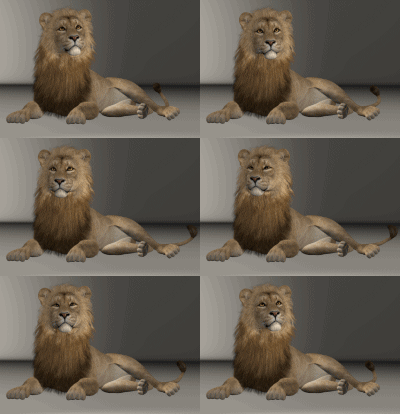
I noticed the lion animation included in the Hivewire email today...what a pleasant surprise  I was practicing to get back in the swing of things after taking a break from 3D for health reasons. Thanks so much for including me in on your email

Congratulations!! =) He's delightful animated!!I noticed the lion animation included in the Hivewire email today...what a pleasant surpriseI was practicing to get back in the swing of things after taking a break from 3D for health reasons. Thanks so much for including me in on your email
View attachment 39233
skylab
Esteemed
Thanks Napalm  Your tasteful (and sans tasteful) renders were well done
  I enjoy all of the Hivewire critters.
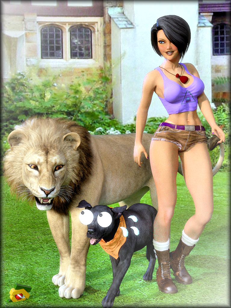
Playing with cats and dogs. Loving the new lion. Dawn is using a mix of Sora + BodyType-2 + CatsEyes, hair by me. HW dog with my bandana + Anime Xpression Props (sweat) + Manga Xpression Props (eyes). It may look like postwork, but it's all 3D. Rendered in Poser with Superfly.

So funny Ken!


