• Welcome to the Community Forums at HiveWire 3D! Please note that the user name you choose for our forum will be displayed to the public. Our store was closed as January 4, 2021. You can find HiveWire 3D and Lisa's Botanicals products, as well as many of our Contributing Artists, at Renderosity. This thread lists where many are now selling their products. Renderosity is generously putting products which were purchased at HiveWire 3D and are now sold at their store into customer accounts by gifting them. This is not an overnight process so please be patient, if you have already emailed them about this. If you have NOT emailed them, please see the 2nd post in this thread for instructions on what you need to do

Show Us Your Dawn Renders!

Hornet3d

Wise
Try them all out and see which ones you like the best. I have 2 or 3 I like, and use often, but there's quite a selection.

There is a good selection and I have done a part render with a couple of them and I like them a lot, just need to build a scene to use them, which is next on the list. In the meantime, one more envsphere and light test.

Shopping HW.jpg
 

Hornet3d

Wise
Looks good. Which light did you use for that one?

That was o e of me trying Ezydome that you mentioned earlier in the thread so it is the dome plus Sun. Next up I want try the Ghostship ones I like the look of the Superfly studio ones and the three light one but they l look good.
 

Lyne

Distinguished
HW Honey Bear
@Hornet3d ....I MUCH prefer your other firefly renders... she looks (IMHO) so washed out.... Her skin was rich and detailed before.... again, JUST MY own opinion! :)
 

Hornet3d

Wise
@Hornet3d ....I MUCH prefer your other firefly renders... she looks (IMHO) so washed out.... Her skin was rich and detailed before.... again, JUST MY own opinion! :)


It is an opinion I share but I guess I should not be surprised that superfly reacts to lights differently to firefly. If I cannot improve on the present situation I may well revert to using firefly but I don't want to forsake superfly yet and loose some obvious benefits for my scenes. It may be I have to use firefly for portraits and superfly for scenes. The skin is certainly washed out and that is not helped by the lack of skin tones but I now have better control of the bump maps in superfly than I did with the converted firefly renders. The Ghostship lights Miss B pointed me too also give a lot more colour and warmth to the skin, Not quite as much as I was getting with firefly but I have only just stated using them so I will have to see. One thing I am sure off is the shaders I have created are very sensitive to light and I am not sure if that is a superfly trait or a problem with my shaders. I also have a problem with controlling the strength of illumination with a sphere which does not help.

Thanks for taking the time to comment, although it might seem negative I find it positive in that it is trying to guide where I am going. It spurs me on to try harder and also keep in mind I may have a decision to make. I know it will have to be a compromise in the end but superfly may still be a step too far for me.
 

phdubrov

Noteworthy
Contributing Artist
@Hornet3d a bit on SF, skin, and lighting in general.
1. Low contrast and washed out skins are a general problem in outdoor photography. Yes, it's realistic but not always desired. There are books on how to mitigate this problem. The main idea is to find a pace with somehow directed light - window, blocking walls and roofs and so on. It is an even greater problem in rendering, as many HDRI is low-contrast, especially blurred HDRI (Env maps in sIBL packs). But more detailed, bigger DR HDRI mean more noise and slower renders. So, it's always a compromise. The second solution is additional light, mainly umbrella. It can mitigate both too harsh and too soft light but need care and experimentation to not ruin a natural look of a shot (render). In case of SF, it's area light 200-1000% scale, in 2-5 meters from the face. Also: default clamp settings (10) are VERY low. It's for VERY noisy lights. It's not for low- or high-key renders, it's not for high-contrast renders. 100, 1000, even zero (clamping off). But it can affect rendertimes too.
2. Colors. If you don't want experiment with the white point in postwork, consider colored lights. SF has color temperature node, great for this, far better than eyeballing. 5500K lights (sun in the summer midday) can make wonders to skin color. Or 3500K of the golden hour.
 

Hornet3d

Wise
@Hornet3d a bit on SF, skin, and lighting in general.
1. Low contrast and washed out skins are a general problem in outdoor photography. Yes, it's realistic but not always desired. There are books on how to mitigate this problem. The main idea is to find a pace with somehow directed light - window, blocking walls and roofs and so on. It is an even greater problem in rendering, as many HDRI is low-contrast, especially blurred HDRI (Env maps in sIBL packs). But more detailed, bigger DR HDRI mean more noise and slower renders. So, it's always a compromise. The second solution is additional light, mainly umbrella. It can mitigate both too harsh and too soft light but need care and experimentation to not ruin a natural look of a shot (render). In case of SF, it's area light 200-1000% scale, in 2-5 meters from the face. Also: default clamp settings (10) are VERY low. It's for VERY noisy lights. It's not for low- or high-key renders, it's not for high-contrast renders. 100, 1000, even zero (clamping off). But it can affect rendertimes too.
2. Colors. If you don't want experiment with the white point in postwork, consider colored lights. SF has color temperature node, great for this, far better than eyeballing. 5500K lights (sun in the summer midday) can make wonders to skin color. Or 3500K of the golden hour.

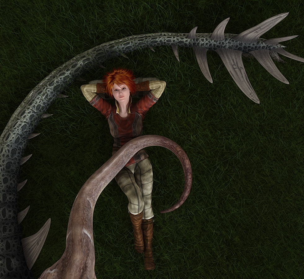
Thanks you so much for that input, having on firefly as a reference point I was unsure if it was a lighting issue or my (modified commercial) shaders or a superfly trait, even a mixture of all three. Thanks for, not only the input, but the explanation on the reasons that is going to be a great help. I am off to try the Ghostship lights and see if I can modify the colour as well.
 

Hornet3d

Wise
Got side tracked, one of the solutions for dealing with the washed out look is to add an HSV node into the mix. Not sure I have got this right but it proves the concept and a fair amount of adjustment in possible.

Shopping HSV HW.jpg


So now to play with some coloured lights.
 

Hornet3d

Wise
Putting it all together. HSV node added to the shaders and rendered using Ghostship's twin light setup with temperature set to 3500K. Lights are area lights thus giving a soft illumination.

Beach Time HW.jpg


I may have gone too far but comparing this to the washed out renders before gives an idea of the range that is possible, I just need to find my personal sweet spot.
 

Miss B

Drawing Life 1 Pixel at a Time
CV-BEE
I think the "sweet spot" will all depend on the scene itself. As you can see, daytime and early evening will give you different results, but at least if you have a comfortable starting point, then you can tweak accordingly.
 

Hornet3d

Wise
I think the "sweet spot" will all depend on the scene itself. As you can see, daytime and early evening will give you different results, but at least if you have a comfortable starting point, then you can tweak accordingly.


I think that is the conclusion I have come to and I might even have to have two setups one for outside with HDRs and another for internal scenes. My plan now is to pick the light from GhostShip's collectionI like the most and then adjust the HSV to something I am happy with and use that as the starting point. From there it is no more difficult to adjust a few HSV nodes than it is to get a pose just right.

I have learnt a great deal though and it has been worth the effort. What I did not learn was that there are a bunch of talent people here who are prepared to spend their valuable time helping others but that was only because I knew that already.

Many thanks to all.
 

Lyne

Distinguished
HW Honey Bear
@Hornet3d just a note...on using EZ skin...I found IT washes out skin colors when I use it...so I've upped the saturation to make up for it! :)
Although this is for P2014, it may give you a way to go for superfly:
(and yes called a wip, it's actually a tutorial!) :)
wip9
 

Miss B

Drawing Life 1 Pixel at a Time
CV-BEE
The EZSkin2 I've used in Poser 9 is probably the EZSkin you use in PP2014 Lyne. That can be used for a FireFly render in P11/PP11, but for a SuperFly render, Snarly created a newer EZSkin3, which works the same, but takes into account options not available with a FireFly render, or treats them differently because the render engine treats them differently.

I always have to go into the Material Room and adjust any Specular nodes when rendering with SuperFly, mostly because skin comes out waaaaaaaay too shiny for my taste, where it doesn't necessarily do so with a FireFly render.
 

Hornet3d

Wise
@Hornet3d just a note...on using EZ skin...I found IT washes out skin colors when I use it...so I've upped the saturation to make up for it! :)
Although this is for P2014, it may give you a way to go for superfly:
(and yes called a wip, it's actually a tutorial!) :)
wip9

The EZSkin2 I've used in Poser 9 is probably the EZSkin you use in PP2014 Lyne. That can be used for a FireFly render in P11/PP11, but for a SuperFly render, Snarly created a newer EZSkin3, which works the same, but takes into account options not available with a FireFly render, or treats them differently because the render engine treats them differently.

I always have to go into the Material Room and adjust any Specular nodes when rendering with SuperFly, mostly because skin comes out waaaaaaaay too shiny for my taste, where it doesn't necessarily do so with a FireFly render.

I don't want to knock EZskin 3 because when you see what a default figure with firefly shaders looks like in a superfly render before and after, it does an amazing job. For me personally I was not completely happy, skin was washed out the skin detail was missing and the eyes were ghostly white. Most of the problems in the eyes were to do with reflection values so similar to the problem Miss B had. My original plan was to use the EZskin conversion and modify that but as I looked into the materials there were a number of nodes and links not recognised by superfly. Now I struggle in the advance material room at the best of times so this was a nightmare for me, I suspect others with a better knowledge of materials would have modified the shaders in minutes but it was not going to be that easy with my skill levels.

The route I took was to use some superfly shaders that I had purchased as a starting point. The beauty here is that most of them have compound nodes so I can leave them closed and just regard them as PFM (Pure Flipping Magic) and just play at the extremes. My most complex shader is about six nodes if you ignore all of those hidden in the compound node and makes the shader easier to work with. Working this way I was quickly able to gain better control over bum maps and gain back the skin detail, before I struggled to get anything to show now I can make Dawn look as though she has goose mumps with ease.

Adding the HSV nodes has given me a solution to the washed out problem and has answered another problem arising from the way my figure was developed. The skin maps for the face and the rest of the body and the arms and legs come from different sources due the fact I wanted a mature looking figure, at least facially, but not that mature looking in the body that she could not be an action women. That works fine until you try and do a full body render and see the joins at the collar and the neck where there are subtle differences in colour due to the differing maps. I am not that skillful now when I built this character I had a lot fewer skills and my solution then was to change the strength on the image map by trial and error until it looked right. It is a very imprecise way of doing things and very time consuming. The introduction of the HSV nodes turns that chore into a breeze as I have so much more control as long as I move forward in small steps.

A long answer I know but I am trying to get the information out there as I am concerned the some might try superfly and be disappointed, then try EZskin 3 and find it is not a total solution and give up on superfly. I am hoping at least a few people read this and go into superfly with their eyes open and stick with it.
 

Miss B

Drawing Life 1 Pixel at a Time
CV-BEE
Oh, I've found it needs tweaking for sure, especially the first time I used it and found my character's eyes made her look like she had some sort of disease, as they were filmy white. It took a lot of practice, and the help of one of the regulars on the SM Poser forum, to get me to the point where I don't get that look any more.

That, and you can deselect any of the options in the EZSkin3 list before running it, so I now never select the Eyes, and I'm usually off to a good start. There's definitely no point and click in any kind of artwork, but especially not 3D. You get to your desired point by practice, practice, practice, and a lot of trial and error.

I'm glad you're feeling better about rendering with SuperFly. I don't always use it, but I'm using it more often than I ever did when I first got PP11.
 

Hornet3d

Wise
Oh, I've found it needs tweaking for sure, especially the first time I used it and found my character's eyes made her look like she had some sort of disease, as they were filmy white. It took a lot of practice, and the help of one of the regulars on the SM Poser forum, to get me to the point where I don't get that look any more.

That, and you can deselect any of the options in the EZSkin3 list before running it, so I now never select the Eyes, and I'm usually off to a good start. There's definitely no point and click in any kind of artwork, but especially not 3D. You get to your desired point by practice, practice, practice, and a lot of trial and error.

I'm glad you're feeling better about rendering with SuperFly. I don't always use it, but I'm using it more often than I ever did when I first got PP11.

For the art that I do, which is mainly sci-fi, there are a lot benefits of using superfly but great light emissions, convincing metals, glass and water are not worth a lot if the figures used are less convincing than in firefly. I am not expecting to completely duplicate my character in superfly so I am prepared to compromise I just need to reach a point where I am happy with figures in superfly. I am not quite there yet but I am a lot closer now than when I started a few weeks ago.
 

Miss B

Drawing Life 1 Pixel at a Time
CV-BEE
Well, as far as cloth, metals and such, If you go back to ShareCG, Ghostship also has a set of shaders for SuperFly that are quite nice.

Ohhh, and before I forget, he recently came out with some nice SuperFly Eye shaders too. I grabbed them, but haven't played with them as yet.
 

Hornet3d

Wise
Well, as far as cloth, metals and such, If you go back to ShareCG, Ghostship also has a set of shaders for SuperFly that are quite nice.

Ohhh, and before I forget, he recently came out with some nice SuperFly Eye shaders too. I grabbed them, but haven't played with them as yet.


Thanks again, I will go and have a look.
 
Top