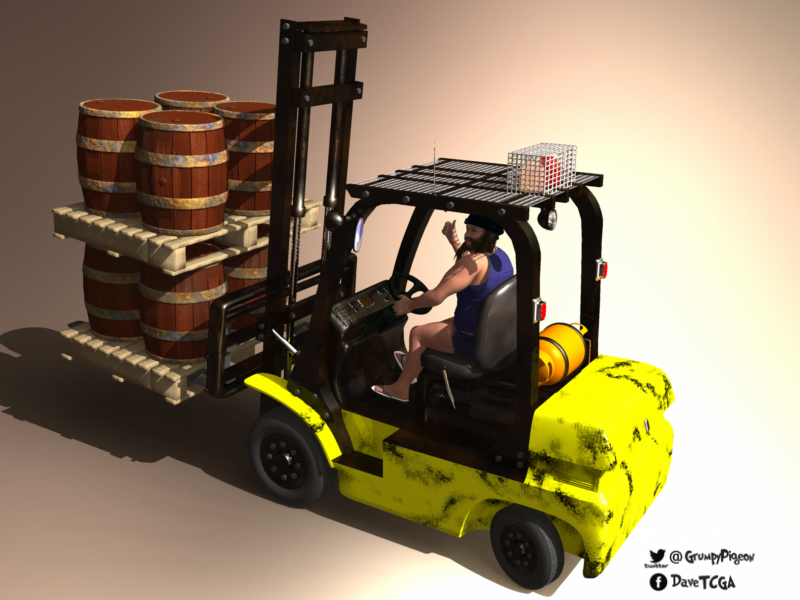
Thank you for the offer, I will PM you a little later. Just wrapping up a week of repairs on a home right now, then I can get back to my animations and projects.Tell me what you want. Maybe I can model some of them for you.
-
Welcome to the Community Forums at HiveWire 3D! Please note that the user name you choose for our forum will be displayed to the public. Our store was closed as January 4, 2021. You can find HiveWire 3D and Lisa's Botanicals products, as well as many of our Contributing Artists, at Renderosity. This thread lists where many are now selling their products. Renderosity is generously putting products which were purchased at HiveWire 3D and are now sold at their store into customer accounts by gifting them. This is not an overnight process so please be patient, if you have already emailed them about this. If you have NOT emailed them, please see the 2nd post in this thread for instructions on what you need to do
You are using an out of date browser. It may not display this or other websites correctly.
You should upgrade or use an alternative browser.
You should upgrade or use an alternative browser.
I Just Wanted to Post an Image Thread
- Thread starter Stezza
- Start date
Rokket
Dances with Bees
Sure! I will be around....Thank you for the offer, I will PM you a little later. Just wrapping up a week of repairs on a home right now, then I can get back to my animations and projects.
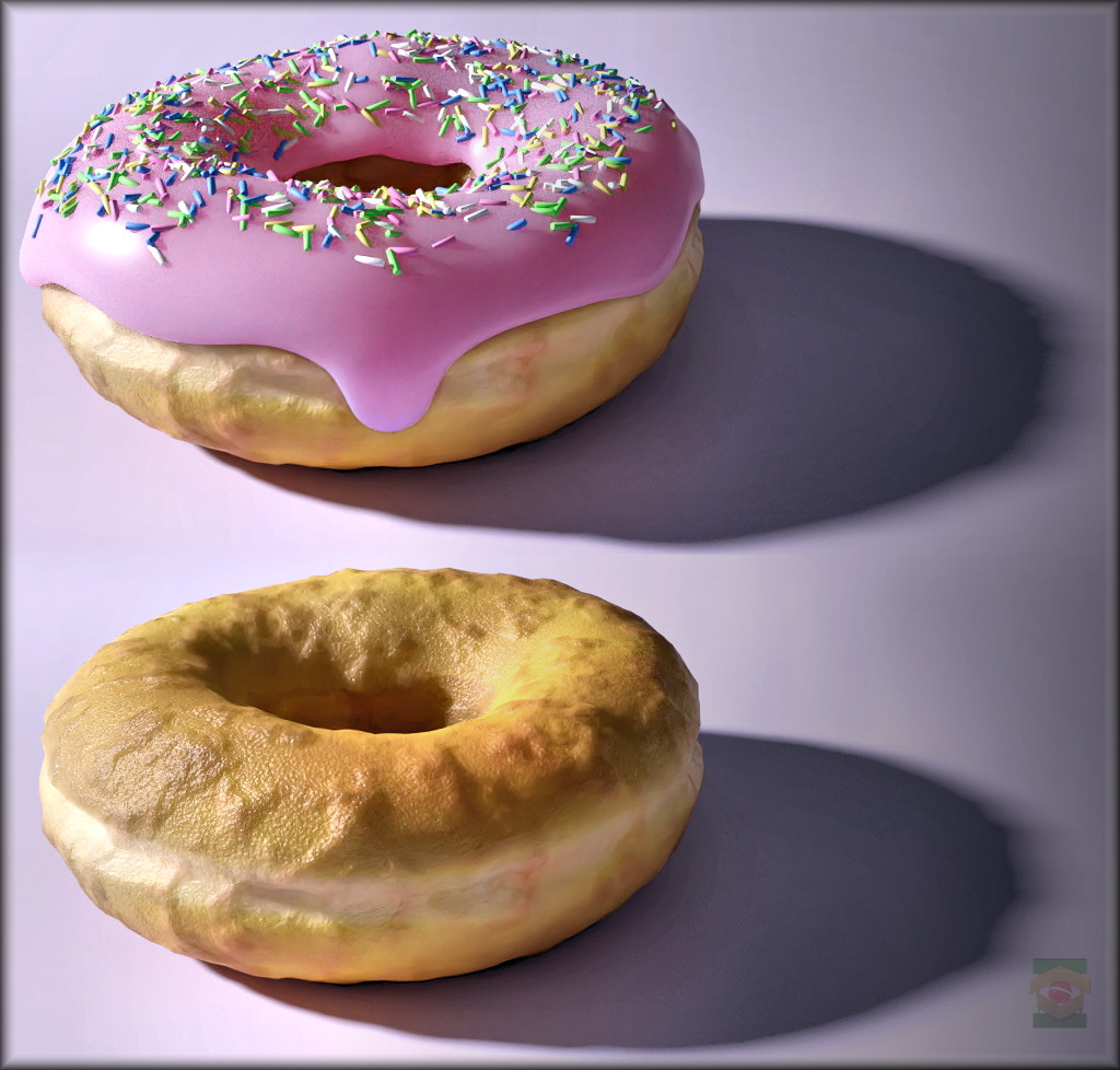
With the changes they did on the new Blender3D 2.80, I have decided to give it a try again. They have finally decided to make it easier for people coming from other programs, by making the interface less alien. I kind of liked how it is now. The interface is still not as good as in 3DSMAX, but it's miles better than it used to be. I have followed a tutorial to create a doughnut, complete with modeling, sculpting details, building shaders, and painting textures.
I just went WOW, this used to be a pain to do anything, but now it's very usable. The denoiser for Cycles still sucks big time, washing out details and blotching out colors. However, someone found a way to use nVidia's "OptiX AI-accelerated denoiser" in Blender, with a plugin called D-Noise. I just went WOW again, because this actually works nicely with Cycles. Some of the best free denoisers I have ever seen, and it doesn't require a license from nVidia.
Blender's shader "room" is pretty similar to Poser's advanced Material Room, so I had no trouble creating shaders there. The new Eevee real-time preview mode is now fully integrated with viewports, so we can actually see the shader results as we build them. Of course, not everything will work in real-time, but it's still better than rendering over and over to see what we are doing. For example, bump and normal shows in Eevee, but vector displacement I have used below doesn't. Cycles can also be used in viewports in those cases, and it's way faster than what we have in Poser because it was updated many times since Poser 11 was released.
Below is the final result of the Youtube tutorial, showing the doughnut with and without the pink icing and sprinkles. I especially enjoyed the sculpting and texture painting tools in Blender 2.80. However, one very disappointing issue was that Blender still doesn't fully support 3D mice. It can only rotate or translate, but not both at the same time like we do in Poser, DS, or 3DSMAX. It's still better than zBrush, which doesn't support 3D mice at all.
The nice part about this tutorial is that it covers various parts of the pipeline process, to include a particle system to spread the sprinkles, and shader nodes to dynamically set their colors. It was fun, but I still felt handicapped due to the limitations on 3D mice support. It was like modeling with one of my arms tied behind me.
The Cycles render below has used only 2 lights (key + fill). Took about 30 seconds in GPU CUDA mode, plus a final D-Noise pass at the end, which takes about 2 seconds. I just wish Cycles renders in Poser would look as good as this.
Stezza
Dances with Bees
That does look good. All my work, apart from the pumpkinhead was done for classes in Maya. But my student copy has timed out, and I'm not altogether sure I want to sign up for the subscription.
I think Maya is the most expensive option from Autodesk. That's why I keep an eye on Blender, because 3DSMAX is also quite expensive, and it has been lagging a lot on innovation. Not to mention MAX takes several minutes just to launch, and the installation is several gigabytes. Blender launches almost instantly, and it's quite small. The interface in Blender used to be terrible, and so was the workflow (compared to MAX), but it's getting better. In this version 2.8, they even gave up the ridiculous choice to select objects with the right mouse button. It now uses the left button, like all other 3D programs. I think Blender was being sidetracked exactly for this kind of oddball standards that make no sense. Not sure why it took them so long.
@Ken1171 yummy looking donuts
Thanks! This was my first time in Blender where I could finally make object selections with the left mouse button, like it is with all other programs. Hey, nice vehicle! Looks really good! ^___^
See, now, I'm so used to the 2.79 UI, but then I've been playing with that UI since version 2.5, so I'm used to it. That said, however, I started playing with Blender when it's latest version was 2.42 (or 2.45), and THAT was a horrible UI. Why I kept at it? I don't know, but I'm glad I kept plugging away.The interface in Blender used to be terrible, and so was the workflow (compared to MAX), but it's getting better. In this version 2.8, they even gave up the ridiculous choice to select objects with the right mouse button. It now uses the left button, like all other 3D programs. I think Blender was being sidetracked exactly for this kind of oddball standards that make no sense. Not sure why it took them so long.
What I'm looking forward to playing with in 2.8 is the EEVEE render engine, but I won't be giving up 2.79 any time soon.
See, now, I'm so used to the 2.79 UI, but then I've been playing with that UI since version 2.5, so I'm used to it. That said, however, I started playing with Blender when it's latest version was 2.42 (or 2.45), and THAT was a horrible UI. Why I kept at it? I don't know, but I'm glad I kept plugging away.
What I'm looking forward to playing with in 2.8 is the EEVEE render engine, but I won't be giving up 2.79 any time soon.
Oh yes, I remember 2.4 - still give me the shivers. I was following a tutorial to model something I could make in 2 minutes in MAX, and it was taking 10X more mouse clicks in Blender. I was worried the mouse wouldn't survive it to the end - TOO much clicking to do the smallest things. Conversely, it was a whole different experience with 2.8 last night. The workflow is now much more optimized, though the poor 3D mice support made it kind of painful for me. How come even ancient Poser can translate and rotate at the same time, and Blender can't?
Eevee was a nice addition. I was already used to real-time PBR with marmoset toolbag, and then with iClone 7 for the some years now. I am a bit surprised that Reallusion got it done before the Blender Foundation, since both have been interacting with the media industry, but Blender was doing it for longer. Perhaps the difference is that Blender is free, and iClone is not. In addition, I found Eevee a bit more complicated to setup and adjust than the real-time PBR from iClone and CC3. Even the guru instructor was complaining it was too finicky, with too many obscure parameters. Those expecting an easy to use solution will be disappointed.
And when it comes to features, it still appears that Blender 2.8 Cycles has no micro-poly displacement I could find. I had to subdivide the doughnut a lot to get proper displacement. Perhaps it's hidden somewhere and I couldn't find it, but the 2.8 tutorial guru just subdivided the model a lot. I think someone told me this had been resolved already.
PS: Found micro-poly displacement, but I am not sure if it's really micro-poly, because we cannot see any changes until we subdivide the model enough times to generate sufficient geometry. Micro-poly displacement was supposed to do that on its own in render time. That doesn't seem to be how it works in Blender...
Last edited:
Saphirewild
Brilliant
I am back with more renders!!
My first render with Male Centaur Lovers!
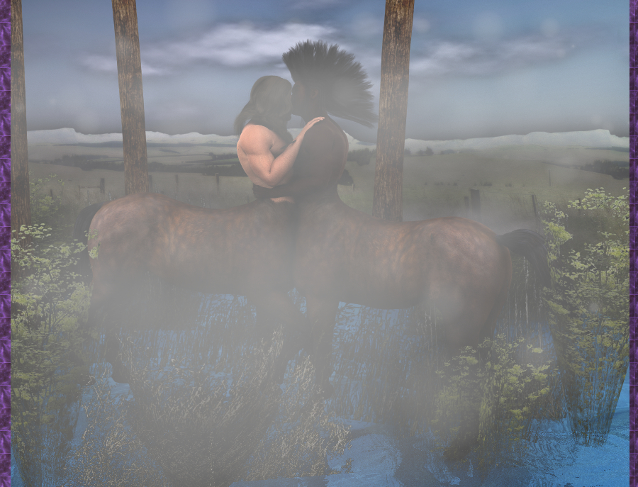
My first render with Male Centaur Lovers!
Saphirewild
Brilliant
I took my render into fotosketcher and this is what came out
Saphirewild
Brilliant
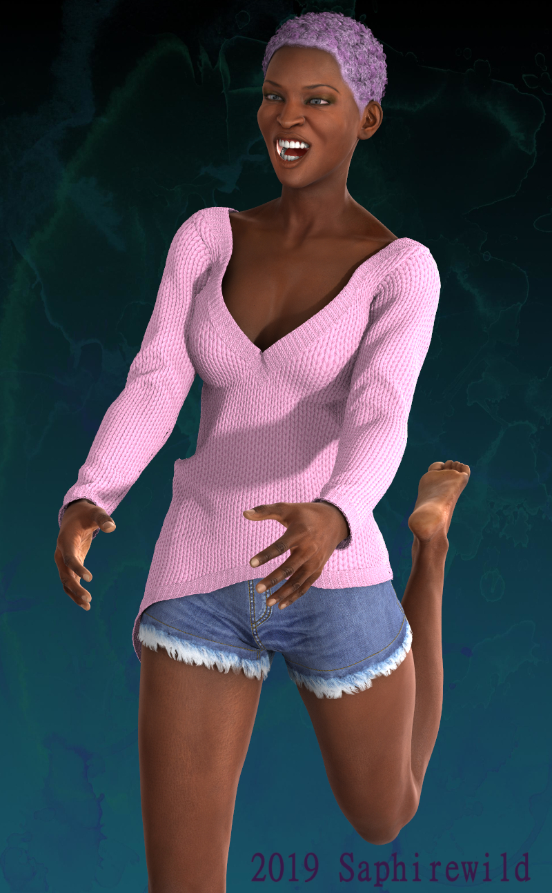
I was trying out the new clothes I got for GF2's Monica 6
Saphirewild
Brilliant
Another one done in fotosketcher!

That's the one thing I've loved about versions 2.5x through 2.79, the huge amount of keyboard actions so you don't need to use a mouse or Wacom pen for everything. Any time I can keep my hands on the keyboard, I'm way ahead of the game, so to speak.Oh yes, I remember 2.4 - still give me the shivers. I was following a tutorial to model something I could make in 2 minutes in MAX, and it was taking 10X more mouse clicks in Blender. I was worried the mouse wouldn't survive it to the end - TOO much clicking to do the smallest things.
I think with Blender it's not so much that it's free, but rather that the Blender Foundation is a group of developers who are NOT part of a "company". IOW, anyone who wants to, even you or I, could contribute to the development of Blender, and that takes longer because folks take their time developing, whereas in a corporate atmosphere, there's always the dreaded "deadline", so companies like Reallusion get it done faster, because they push to get it done faster.Eevee was a nice addition. I was already used to real-time PBR with marmoset toolbag, and then with iClone 7 for the some years now. I am a bit surprised that Reallusion got it done before the Blender Foundation, since both have been interacting with the media industry, but Blender was doing it for longer. Perhaps the difference is that Blender is free, and iClone is not.
companies like Reallusion get it done faster, because they push to get it done faster.
Yes, what's what I meant when I said it was free. Things take longer to happen.
Saphirewild
Brilliant
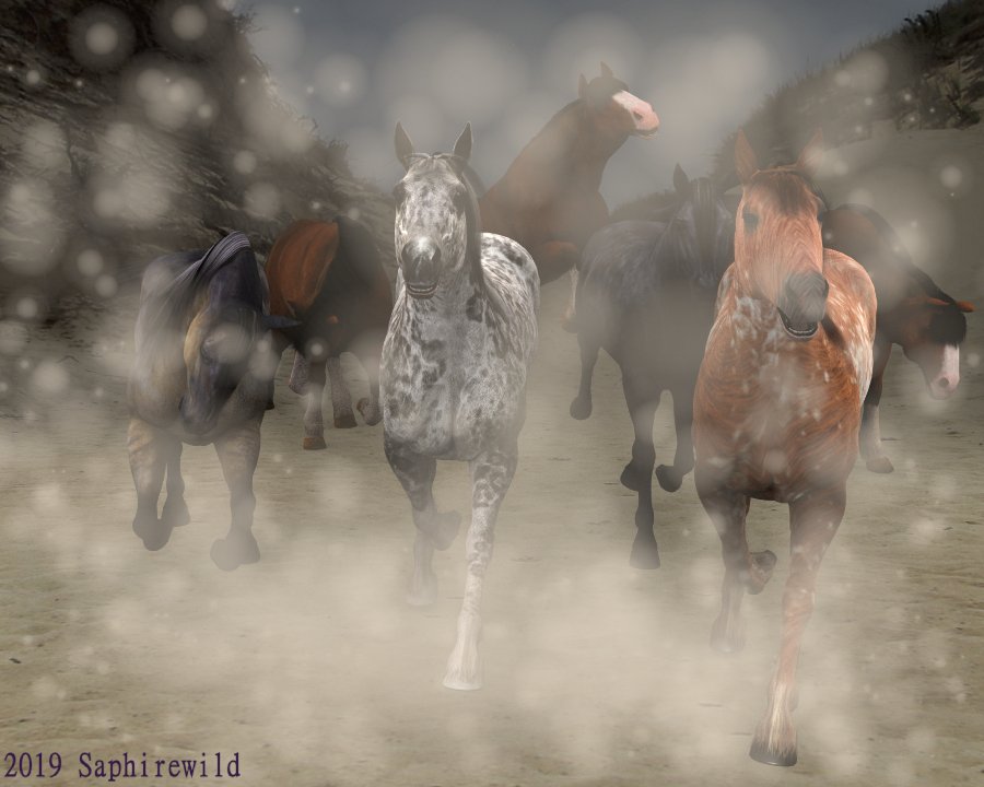
I just had to do this up because I love horses!! In the render is charger horses, Daz horse 2, and the all time favorite Mill Horse!
Dreamer
Dream Weaver Designs
Ahh! I recognize some of those coats. So pleased to see folks are still getting good use from themI just had to do this up because I love horses!! In the render is charger horses, Daz horse 2, and the all time favorite Mill Horse!
View attachment 51361
And sometimes, that's a good thing, because "all" the quirks have been worked out.Yes, what's what I meant when I said it was free. Things take longer to happen.
And now, for something Poser has, but it's ever so rarely used in Firefly - volumetric lights. This uses a single light and an atmosphere shader root to create a volumetric light cone. I have used a "clouds" node to make the light look like it's going through smoke or fog. Poser has so many cool features that are never advertised. 

When you go to the Materials Room, the scene itself has an "Atmosphere" root node that can be used to add fog to the scene. Whenever we use that, all lights become volumetric, and that's for granted. For example, in Octane, volumetrics are way more complicated to set up. If you have a large scene, volumetrics can add depth to your render. It's just that SMS made no effort to ever advertise about it, and nobody uses it.

