• Welcome to the Community Forums at HiveWire 3D! Please note that the user name you choose for our forum will be displayed to the public. Our store was closed as January 4, 2021. You can find HiveWire 3D and Lisa's Botanicals products, as well as many of our Contributing Artists, at Renderosity. This thread lists where many are now selling their products. Renderosity is generously putting products which were purchased at HiveWire 3D and are now sold at their store into customer accounts by gifting them. This is not an overnight process so please be patient, if you have already emailed them about this. If you have NOT emailed them, please see the 2nd post in this thread for instructions on what you need to do

I Just Wanted to Post an Image Thread

JOdel

Dances with Bees
HW Honey Bear
Well, I'm 71 and proud of it. Besides, as long as I maintain a valid student ID I get my Adobe subscription for about half price. That's certainly an incentive for staying in school.

Whoever did the figurine pretty clearly hadn't a clue as to how armor goes together. And the instructor who demonstrated the process of building it in ZBrush to us blithely put the buckle in backwards (no, that's not how a buckle works. I mean, c'mon, this isn't especially sophisticated mechanics, after all). MY Hulks armor has buckles on the straps in the inner arm area. Presumably he'd have someone to help him get in and out of it.

Although, from what little I recall of the mythos, as soon as he's not in a rage about something he reverts back to the normal human who pays his taxes. But then, what do I know?

Yeah, the reference images did show him with fairly short stubby legs. But his arms were at least normal length, if not longer. My bad. I didn't catch it in time. Or rather, I did catch it, some time ago, but I didn't correct it *enough*.
 

Rae134

Renowned
CV-BEE
Contributing Artist
Very nice @Rae134. Excellent work on the palette. I'm sorry I didn't UVmap the window frames.
Hadn't thought how nice they could be with a wood texture.
The tone looks good.
Did you do this in DS?
There are no restrictions on use, so if you make textures for DS you can re-distribute the set for that if you want.
I was surprised I got such a good result on the pallet, I used a filter forge filter and the bump from it really makes the paint look like its popping off the wood.

Thanks for the new windows, I'll have a go on the weekend when I have more time to play. This was a Poser Firefly Render I still need to see how it looks in Superfly. When I get time I'll even have a go in DS :D

I've done a black wood, but still have to test it. I did want this to be a red wood and I'll try it with different lights, just thought it looked a bit too orange in this render. I might do a pale wood texture as well.
 

Miss B

Drawing Life 1 Pixel at a Time
CV-BEE
Not renders. ZBrush screen grabs composited in Photoshop. This is what has been keeping me occupied for the past few weeks.

It's our midterm project. The other image is one of the four photo references that we were to work from.
Nicely done JOdel. Very nicely done. I've not really had much luck sculpting, but I only tried in Sculptris, and really didn't like the software. We're supposed to be doing some in the Blender class I'm taking, so it should be interesting to see what I wind up with. ;)
 
Gaius Catullus
Gaius Catullus.jpg
 

Rokket

Dances with Bees
Messing around with Pauline's morphs. She has potential if you put in some time. I stated that I need to learn how to use her face controls. I am still pretty clueless about that.
Pauline1.png
 

Rae134

Renowned
CV-BEE
Contributing Artist
I think my dad had cards with image like that Stezza!

Now some new studio options for @Miss B :p
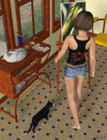
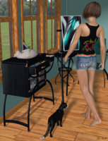
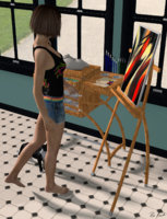
The first is the same render as the one on the previous page but rendered in Superfly (and so it wasn't exactly the same, I changed the floor to tiles instead of wood and changed the colour of the chair, the studio itself is the new one SM did with the mapped windows). The next 2 are Firefly renders, same scene just different view points and textures. The second image is the black wood option (with paler wood floor/windows than before) and the third one is the paler wood option (black wood on the windows and new tiled floor I was playing with). (all thumbnails, click to view larger)
Studio 1 SF.jpg Studio 2.jpg Studio 3.jpg
 
Last edited:

JOdel

Dances with Bees
HW Honey Bear
Really nice variants for the studio. The tiled floor is a good alternate, especially when the wood in the room is close in color to the furniture. The tabouret rather blended into the floor in that very first render with Alexis.

Horner3d: Am enjoying the halloween story as it develops. (Am also recognizing nearly all of the scenes and props. Tomalin has some great mortuary architecture.)
 

Miss B

Drawing Life 1 Pixel at a Time
CV-BEE
Now some new studio options for @Miss B :p
The first is the same render as the one on the previous page but rendered in Superfly (and so it wasn't exactly the same, I changed the floor to tiles instead of wood and changed the colour of the chair, the studio itself is the new one SM did with the mapped windows). The next 2 are Firefly renders, same scene just different view points and textures. The second image is the black wood option (with paler wood floor/windows than before) and the third one is the paler wood option (black wood on the windows and new tiled floor I was playing with). (all thumbnails, click to view larger)
Very nice Rae. :D I really like the white tiled floor, though the tan one is nice as well. I also like the variations of the furniture textures.
 

Desertsilver

Busy Bee
So you made that model, Stezza? Impressive work. It reminds me of the wonderful old calendars we used to have at the farm, that nostalgic, Currier and I
Tried to get a late 1950's early 1960's feel to this render.. The old shop in town..
Modeled and rendered in Carrara

ves feel.
 
Top