-
Welcome to the Community Forums at HiveWire 3D! Please note that the user name you choose for our forum will be displayed to the public. Our store was closed as January 4, 2021. You can find HiveWire 3D and Lisa's Botanicals products, as well as many of our Contributing Artists, at Renderosity. This thread lists where many are now selling their products. Renderosity is generously putting products which were purchased at HiveWire 3D and are now sold at their store into customer accounts by gifting them. This is not an overnight process so please be patient, if you have already emailed them about this. If you have NOT emailed them, please see the 2nd post in this thread for instructions on what you need to do
You are using an out of date browser. It may not display this or other websites correctly.
You should upgrade or use an alternative browser.
You should upgrade or use an alternative browser.
Faery_Light's Products
- Thread starter Faery_Light
- Start date
And I agree too!
I know this is smaller but waiting to do the full sized image.
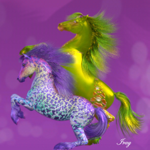
Do you think this is better as far as pose and lighting?

Do you think this is better as far as pose and lighting?
I think the same !
But we talk about the second closer one that is showing the side
I like the Main-TN.jpg best personally. There is a bit more light on the purple horse in the other, but I like the overall effect in the Main-TN.jpg the best.
That is the one that is getting the most likes. 
I need to get the lighting right though.
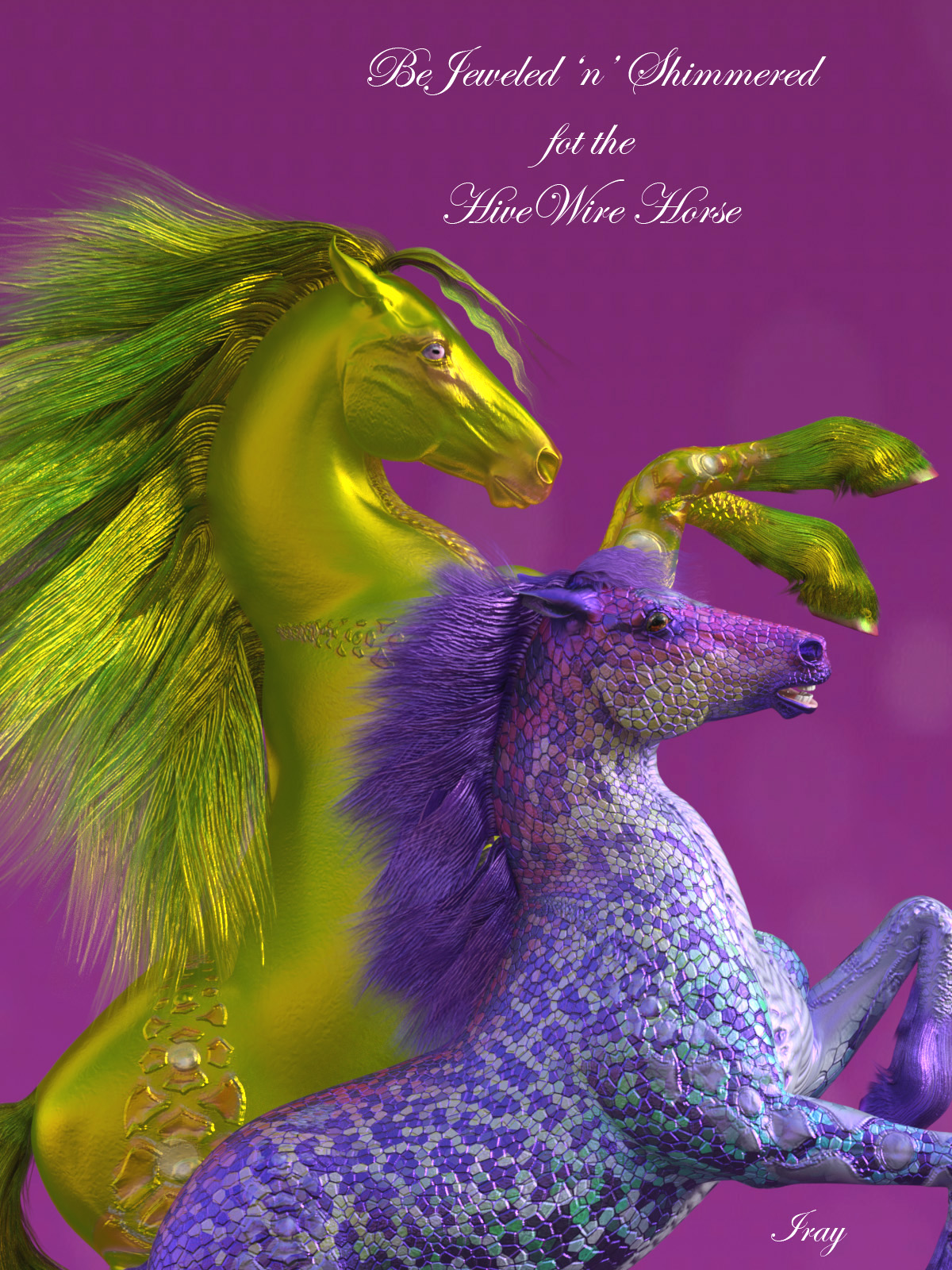
That mane on the front horse is supposed to be a light purple, not nearly white.
One of the lights is causing it to look that way.
That mane on the front horse is supposed to be a light purple, not nearly white.
One of the lights is causing it to look that way.
I don't know what your light set up is, but it looks like the light is coming straight from the right, so if you have a light situated to the far right, that's probably the one that needs to be toned down a bit, as his chest and neck area is too light as well.
I somehow how the light duplicated, was only supposed to be one sunlight.
And it was too far to the right.
And it was too far to the right.
I think I got it!

I will add the right facing one as a pop-up. 


