• Welcome to the Community Forums at HiveWire 3D! Please note that the user name you choose for our forum will be displayed to the public. Our store was closed as January 4, 2021. You can find HiveWire 3D and Lisa's Botanicals products, as well as many of our Contributing Artists, at Renderosity. This thread lists where many are now selling their products. Renderosity is generously putting products which were purchased at HiveWire 3D and are now sold at their store into customer accounts by gifting them. This is not an overnight process so please be patient, if you have already emailed them about this. If you have NOT emailed them, please see the 2nd post in this thread for instructions on what you need to do

Always Room For Improvement-- How can I make this Better?

Tynkere

Motivated
Hi everyone,

Don’t know how common asking for critique is, but I look at it this way. How else will I get better?

I’ve been cautioned though, that some might be uncomfortable giving critique, so maybe a little bit about myself.

Been using DS 7 months now and am in a bit of a rut. Worked 14 years layout & design for an advertising/marketing agency before on-demand digital prepress forced them out of business. If choose to comment, please don’t pull any punches. Developed a thick skin ‘in the trenches’ as it were, so everything is fair game.

Problem (to my eyes at least) is that it looks like advertising, or looks exactly like what it is. I’ve plopped a bunch of actors into the scene, but it’s still missing... Can’t quite put my finger on it. Supposed to convey movement, but looks static if that makes any sense.

So how would I improve it? Give it a bit more ‘zing’ or breathe some life into it if that makes sense!

Thanks for reading!
--Bruce

PS: I forgot to put the texture files into some of the clothing. The file is about 12.7 GB so didn’t want to render it again. O _ o
---
 

Pendraia

Sage
Contributing Artist
What are you aiming for? Realistic? Or are you just looking to add a bit of zing to the render?

Overall it's a great render and you have included many items in a pleasing composition.

If I was to be picky...an area of improvement might be to look at some of the textures. You did mention that you left off some textures due to size issues.
One textures that rings a false note to me is the lilypad leaves...they don't come across as real where other parts of the render do. Especially as the water looks so great and is right next to them. They also look very flat to me. I would suggest maybe looking at the textures on them. Do they have bump and spec maps? It could be as simple as the surfaces settings need adjustment. Were the textures designed for DS or Poser?

Also you could maybe play with the shapes in a modelling program or use deformers so they aren't totally flat and maybe some water added in postwork to the leaves if you don't want to use deformers or a modelling program.
I hope this is what you were looking for in terms of feedback. Overall it's a great render and you have way more patience than I do to have included all those items in the scene.
 

Satira Capriccio

Renowned
CV-BEE
Contributing Artist
Just one question ... is the brunette in the back flirting with a priest?!?

You have a lot going on in the scene, which is great. Love the birds, frogs, and especially the pup by the bench.

I think it's the straight on view that might be making it seem so static. Because you're looking at the walkers from the side, you don't get much of a sense of motion from them. Nor do you get much of a sense of motion from the puppy since you're head on with him. Try experimenting with changing the angle of the view, either moving the camera around or turning the scene. Try rotating the scene to the right about 30 to 45 degrees.

You could also try lowering or raising the camera angle, although you don't want to lose the wonderful reflections you have in the water.
 

Janet

Dances with Bees
Contributing Artist
A nice sunny day with people out enjoying themselves. The lilypad textures need some work. That's my only nit.
 

Rae134

Renowned
CV-BEE
Contributing Artist
I think the lighting is nice (and can be one of the hardest things to pull off!).

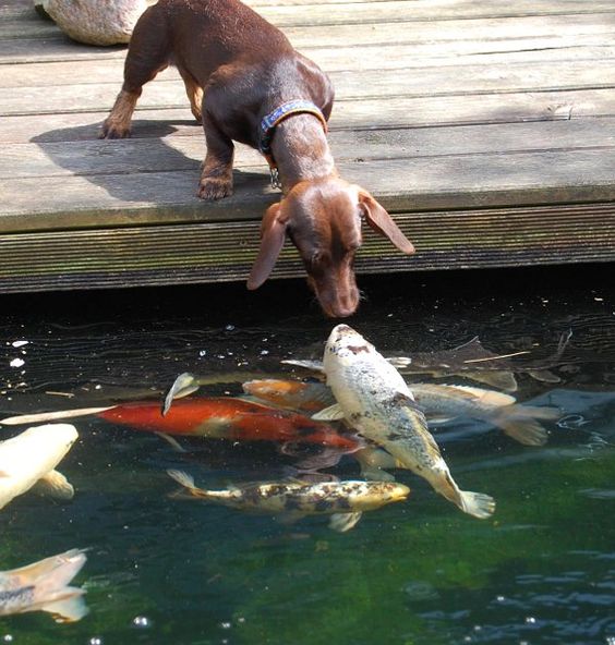
The only thing that is really bugging me is the fish. When they are that far out of the water, it is normally on an angle (head end further out than the tail end) so try tilting him a bit.

I find with 3D art, you have to think like a photographer, look at some tutorials that show the difference between a "snap shot" and a "professional photo".
Sometimes its the angle of the image that makes it look static, like Satira said, play with the angle more, sometimes just tilting slightly can give more movement.
What is your main 'point of interest' eg: if it the girl taking the photo, some DOF to blur out the background characters a bit so they don't look prominent might help or if your aim is more "telling a story", find that point, is it a general sense of a nice sunny day with life happing? Then you've captured that, if its not, then you need to show whatever it is more.

Not all textures are going to work "out of the box" due to the nature of the programs getting updated all the time, some are old products designed for 3DL (or Poser) and if you are rendering in Iray, you'll need to updated them, either by tweaking the settings or using a suitable shader etc. I too am finding the lily pads a little flat, that could just be because they are all in shadow. If it allows you to select different ones, maybe changing the greens lighter/darker on some could be all it needs and/or some changes in bump settings etc.

Overall, nice job!
 

Hornet3d

Wise
Great render with lots going on. I agree with the comment on lilypad textures they could do with some work and I think the same could be said about the tree on the foreground which I think could do with a little more bump or displacement. Same could be said for the fish. I am a little bothered by the monk on the far right as I find myself wondering what he is looking at. What is your light source?

I should add I am only commenting because you have asked for it otherwise i would have just said it was a great render and the comments above could be see and nit picking.
 

mininessie

Dances with Bees
Contributing Artist
as hornet said...i only add this because you asked...i consider it a great render...agree with the tips my fellows said...just add a bit of movement to the fish ..it looks so straight...not sure if that model have movable parts...if not you can add a Dformer at the fish tail to give it a bit of movement.
 

Satira Capriccio

Renowned
CV-BEE
Contributing Artist
I didn't think the walking monk was looking at anything specific, but was lost in contemplation.

It took me the longest time to figure out the white and red thing in the water was a fish. It's obvious this morning because of the light coming in from the window, but in the evening, this area doesn't get a lot of light, so it just looked like a blob. I have a dozen or so desk lamps saved in my lighting list on Amazon, but I'm no where near making a decision. (Blame it on the Libra)

While the cattails, tree leaves, and lily pads are rather simplistic, especially compared to the grass, I thought it was the set, especially given how every lily pad is exactly the same shape. I wonder if there are morphs included in the lily pads which would allow changing some of the shapes.


Oddly, the wall behind the father/monk with the apple box is far more strongly detailed than the wall at the front of the building. But that's the only surface that looks like the bump is working. All the other surfaces are flatter than you'd expect. It's been ages since I used DS, and I don't even have a copy installed on this computer. I have issues with that service that is installed with DS ... comparable to the issues some have with Windows 10 :wink: Consequently, I don't have any idea what's required to increase the bump on the textures. If the intent is to resemble a photograph, a bit more work on all the textures would help. Or, you could go in the opposite direction and experiment with post work to produce something uniquely you.

It may not bother me all that much because a render is just a starting point for me. By the time I'm done with a render, it doesn't look anything like what came out of Poser as this before and after shows.

The Cat's Truth_Before and After.jpg


Whatever changes you make, or chose not to make, it's a great scene.
 

Hornet3d

Wise
I didn't think the walking monk was looking at anything specific, but was lost in contemplation.

It took me the longest time to figure out the white and red thing in the water was a fish. It's obvious this morning because of the light coming in from the window, but in the evening, this area doesn't get a lot of light, so it just looked like a blob. I have a dozen or so desk lamps saved in my lighting list on Amazon, but I'm no where near making a decision. (Blame it on the Libra)

While the cattails, tree leaves, and lily pads are rather simplistic, especially compared to the grass, I thought it was the set, especially given how every lily pad is exactly the same shape. I wonder if there are morphs included in the lily pads which would allow changing some of the shapes.


Oddly, the wall behind the father/monk with the apple box is far more strongly detailed than the wall at the front of the building. But that's the only surface that looks like the bump is working. All the other surfaces are flatter than you'd expect. It's been ages since I used DS, and I don't even have a copy installed on this computer. I have issues with that service that is installed with DS ... comparable to the issues some have with Windows 10 :wink: Consequently, I don't have any idea what's required to increase the bump on the textures. If the intent is to resemble a photograph, a bit more work on all the textures would help. Or, you could go in the opposite direction and experiment with post work to produce something uniquely you.

It may not bother me all that much because a render is just a starting point for me. By the time I'm done with a render, it doesn't look anything like what came out of Poser as this before and after shows.

View attachment 38891

Whatever changes you make, or chose not to make, it's a great scene.


Yea, the monk thing is just me being curious. As you say I think there is an issue with the foreground being too simplistic, if you contrast that with the grass of the lawn in the mid picture it almost highlights this fact. The lawn is very detailed and looks quite realistic with a variety of blade lengths, very different to the identically sized lily pads. Certainly the lily pad in the very front with the frog on should at least have a change of shape. For some reason the shadows bother me slightly but I cannot for the life of me think why.

As someone who often does a lot of postwork, I love you examples of before and after.
 

Bonnie2001

Extraordinary
It's a nice render Bruce, with a lot going on in there. The lily pads need work as they are in prime position in the frame, and things that close need to look right. Also, the render might benefit from some depth of field, maybe the focal point being the girl at the pond and the foremost (tree stump and birds) and the far wall just a little bit less sharp. Adjust the middle wall bump map so it is more like the farthest wall, the difference stands out as it is.
 

JOdel

Dances with Bees
HW Honey Bear
Primarily there is the question of focus. All the quibbles about surfaces and shape of the lily pads matter, but are secondary. What are *we* supposed to be looking at? The girl with the camera? Or what she's trying to take a photograph of? They are too far apart for it to be both. And there is enough going on in the image for the eye to wander about without settling on anything.

If she's the focus, why is everyone else ignoring her? Somebody putting a ladder in a public pond and standing on it would draw at least *some* passing attention. If it's the bird or the frogs, we need to be closer to them, and the photographer somewhat softer focus.

(And, imho, I'd lose the fish. It isn't convincing as a fish. There must be better fish out there.)
 

Satira Capriccio

Renowned
CV-BEE
Contributing Artist
Thanks Hornet. Out of everything involved in producing an image, I enjoy the post work the most.

Now I'm wondering ... who is the puppy with? The man with the book who is completely ignoring the puppy? Or is it the man napping in the grass? Who is soon to be awakened suddenly by a puppy jumping on his tummy. Or ... perhaps the girl with the camera, in which case, the camera might well end up in the pond when the puppy reaches her and starts barking for attention.

Perhaps, the puppy lives with the monks?

The girl with the camera seems to be looking at the fish. Perhaps, she's thinking what a strange looking fish. Does she plan on stepping further down the ladder? Perhaps, even stepping into the water. Hopefully, the fish aren't hungry :D There are also at least two fish submerged in the water between the colorful fish and the stump in the foreground. And of course, the beautiful blue butterfly.

I finally decided the guy sleeping in the grass has his shoes on his chest. Less chance of someone sneaking off with them. Although, the puppy could be planning to steal them.


One could be entertained for some time making up stories from this render.

Is that camera girl's phone sitting on the ledge of the pond? Just to her right? Maybe that's what the puppy is after!
 

Tynkere

Motivated
Great stuff! I’ve gotten more specific feedback here than I did at a DAZ new user contest! (Maybe they have to go easy on us, or contest is so popular, their volunteers just don’t have time )

Anyway, to the meat & bones. Definitely given me a lot to chew on, so happy as a dog with a bone!

1.) Ladder prop very good call. Need to find some stone steps or stairs. Ladder was only prop I had, but how many people go down a ladder face first? If not careful, she’s going to be swimming with the fish!

2.) PS, Hexagon, and or d-former on lily pads for practice. Also picked up “Water Lily Garden” since will probably come in handy. (Am thinking of Bird contest that's judged by Audubon members. Maybe next year I’ll be ready!)

3.) Same for fish. Free as obj file, but need to learn how to rig things in DS. Another issue might be scaling. If compare it to rungs on the ladder-- that's one big fishie!

4.) Bump maps. Am sure a search will find answer, but as long as here.... #’s get larger or smaller as increase distance? (Example: I’m doing a head & shoulders portrait using V6. Don’t want skin on shoulders looking like a boiled chicken leg. Number would go down? I want to bring out detail on a wall 60 feet away. Number goes up or vice-versa?)

5.) Modeled surfaces. Like the stairs, might have to hunt around for something to kitbash a sidewalk. It’s just a cube, so even with textures-- that might be throwing some off?

6.) Tree in foreground. Yes, it looks like driftwood from the beach. Would probably have moss, a vine or at the very least maybe some dried algae on it. Since it’s in the foreground-- texture is awful. Find a better prop, or work on it in PS.

7.) Camera... Bull’s-eye! Maybe that’s what was bothering me! Unless camera on a tripod, not going to be perfect like that. Maybe tilt a little on “Z” ? Right now, it looks like an ad you might see in a free magazine. “Visit Old Abbey! State’s Oldest Working Monastery. Open to Public. Call for guided tours...”

This will be good practice for me. I’m glad I posted.

Thanks everyone, for taking the time to comment on it!

--Bruce
 

Miss B

Drawing Life 1 Pixel at a Time
CV-BEE
1.) Ladder prop very good call. Need to find some stone steps or stairs. Ladder was only prop I had, but how many people go down a ladder face first? If not careful, she’s going to be swimming with the fish!
Hey Bruce, I know I said in the other thread I had some thoughts, but I've been tied up beta testing a couple of things, so haven't had a chance to sit down and write something up.

I have to agree with you, there were some great comments in this thread, and I only had maybe 3 other things I thought of mentioning. The first being that ladder. I just didn't see it fitting in with the rest of your scene, however, what I DID picture was her sitting on the brick wall, next to what appears to be her cellphone, and maybe with her sandals off so she can have her feet (or just her toes) dangling in the pond's water.

One of the other things I noticed, and this is just me as I learned a lot years ago on another site about not cutting things off in your camera view. In this instance, I'm thinking the top of the archway into the monastery/church. Not hard to do, as you can just raise your camera a little to accommodate. There's a lot of lily pads in the scene, so cropping some off the bottom of the scene wouldn't cause the scene to lose anything. You'd probably have to move the one frog to another lily pad nearer the center of the scene, but I can't see that being too hard to do either.

The only other thing is the guy lying on the grass. I just don't see how he fits in the scene, and whatever that object is on his chest, it looks like a baseball glove, and I just can't picture a baseball/softball field anywhere near that monastery/church. Somehow, it just doesn't fit in my mind's eye.

In any case, these are just my 2¢ FWIW. Feel free to ignore any or all of them, as this is your render, not mine. :)
 

Stezza

Dances with Bees
Hi everyone,

Don’t know how common asking for critique is, but I look at it this way. How else will I get better?

I’ve been cautioned though, that some might be uncomfortable giving critique, so maybe a little bit about myself.

Been using DS 7 months now and am in a bit of a rut. Worked 14 years layout & design for an advertising/marketing agency before on-demand digital prepress forced them out of business. If choose to comment, please don’t pull any punches. Developed a thick skin ‘in the trenches’ as it were, so everything is fair game.

Problem (to my eyes at least) is that it looks like advertising, or looks exactly like what it is. I’ve plopped a bunch of actors into the scene, but it’s still missing... Can’t quite put my finger on it. Supposed to convey movement, but looks static if that makes any sense.

So how would I improve it? Give it a bit more ‘zing’ or breathe some life into it if that makes sense!

Thanks for reading!
--Bruce

PS: I forgot to put the texture files into some of the clothing. The file is about 12.7 GB so didn’t want to render it again. O _ o
---

My first thoughts of the image and how I would change things would be:

Have the brunette with leg out tripping the monk... the monk starting to lose it with the boxes heading towards the fella sitting on the seat.. the guy next to other monk starting to run towards the falling monk, the bald monk reading his bible oblivious to his surroundings.. I'd have the dog cocking his leg on the guy lying in the grass and the girl on the ladder turning around to see what the commotion is and losing her balance to start falling into the pond.. with her phone and camera.. tilt the ladder.

I'd ditch the fish and the jumping frog.
I'd play around with DoF and camera angles and tilts..

but that's just me... great start to an image though and so much you can do to it. :flower02:
 

Rae134

Renowned
CV-BEE
Contributing Artist
3) Fish is correct size (Koi grow HUGE) its just it looks very stiff and at an un-natural angle, just drop his tale underwater like this guy will help immensely (if you're not sure where the water line is, its about approx. where the second fin in the middle is) but if he could be give a slight curve like he's swimming would be even better.


4) sounds right, but usually bump isn't too bad on skin unless its really close up.

6) more bump could prob help the tree and maybe add a slight warmth to it?

And really, its all just nit-picking.
 

Hornet3d

Wise
Great stuff! I’ve gotten more specific feedback here than I did at a DAZ new user contest! (Maybe they have to go easy on us, or contest is so popular, their volunteers just don’t have time )

Anyway, to the meat & bones. Definitely given me a lot to chew on, so happy as a dog with a bone!

1.) Ladder prop very good call. Need to find some stone steps or stairs. Ladder was only prop I had, but how many people go down a ladder face first? If not careful, she’s going to be swimming with the fish!

2.) PS, Hexagon, and or d-former on lily pads for practice. Also picked up “Water Lily Garden” since will probably come in handy. (Am thinking of Bird contest that's judged by Audubon members. Maybe next year I’ll be ready!)

3.) Same for fish. Free as obj file, but need to learn how to rig things in DS. Another issue might be scaling. If compare it to rungs on the ladder-- that's one big fishie!

4.) Bump maps. Am sure a search will find answer, but as long as here.... #’s get larger or smaller as increase distance? (Example: I’m doing a head & shoulders portrait using V6. Don’t want skin on shoulders looking like a boiled chicken leg. Number would go down? I want to bring out detail on a wall 60 feet away. Number goes up or vice-versa?)

5.) Modeled surfaces. Like the stairs, might have to hunt around for something to kitbash a sidewalk. It’s just a cube, so even with textures-- that might be throwing some off?

6.) Tree in foreground. Yes, it looks like driftwood from the beach. Would probably have moss, a vine or at the very least maybe some dried algae on it. Since it’s in the foreground-- texture is awful. Find a better prop, or work on it in PS.

7.) Camera... Bull’s-eye! Maybe that’s what was bothering me! Unless camera on a tripod, not going to be perfect like that. Maybe tilt a little on “Z” ? Right now, it looks like an ad you might see in a free magazine. “Visit Old Abbey! State’s Oldest Working Monastery. Open to Public. Call for guided tours...”

This will be good practice for me. I’m glad I posted.

Thanks everyone, for taking the time to comment on it!

--Bruce


Great response, you deserve all the comments that have been made and I am sure this will continue for the future.

I am not sure in DS but in Poser the smaller the number the lower the bump will appear. There is also the playoff with bump and displacement. With bump there is just the appearance a texture, for example bump on the fish would make the scales more distinctive but the edge of the fish would still appear smooth. With displacement the scales will be displaced so the scales around the edge would undulate as it follows the ebb and flow of the scales. It will have little effect on the fish but displacement would have a large impact on something like the bark of the tree. Again I can only speak for Poser but I know that superfly does not implement displacement well, I am not sure if the same is the case in iRay.
 

Pendraia

Sage
Contributing Artist
Hey Bruce, glad that we were all able to help.
1.) Ladder prop very good call. Need to find some stone steps or stairs. Ladder was only prop I had, but how many people go down a ladder face first? If not careful, she’s going to be swimming with the fish!
Simple cubes that have had a uv map would do. Then you could borrow the texture for the wall and match it to the wall.
If you haven't created uv's previously you can do it in hexagon and also in UVMapper classic is still free...UVMapper - UV Mapping Software It's what I started with...I never really like hexagon's uv mapper. These days I use either UVLayout which is expensive but the best uv mapper I've come across or the uv functions in ZBrush so it's been a while since I used them but if you get stuck pm me and I'll try to help.

4.) Bump maps. Am sure a search will find answer, but as long as here.... #’s get larger or smaller as increase distance? (Example: I’m doing a head & shoulders portrait using V6. Don’t want skin on shoulders looking like a boiled chicken leg. Number would go down? I want to bring out detail on a wall 60 feet away. Number goes up or vice-versa?)

Bump maps would be less noticeable in the distance, whereas closer you would want more detail especially if the main focus is the women with the camera.

Numbers go up in DS to increase the amount of bump. Remember also that anything less than mid grey in a bump map for ds is actually a negative so depending on the map your using you might want to consider playing with the negative setting as well as the positive setting as this would increase the crevice size.
 

Tynkere

Motivated
Thanks again for replies. Figured that was a wrap, but the more help the better!

@Miss B

Yes, very good observation about the crop. Don't know why I overlooked it unless focusing too much on getting her reflection in there.

Hopefully if I go more oblique on the camera angle that will open things up.

"Object on guy's chest" LoL! Well I can get rid of that prop! Supposed to be her purse/wallet/phone carry-all thingie. Since I didn't have a prop, it's really a modified shopping bag with IRay leopard skin print. Most of my renders are illustrations for stories, so would be a long explanation of why she tossed the bag on his chest. (While he's an athlete & physically fit, he's also inert and could easily double as a piece of lawn furniture or maybe a chase lounge.)

@Stezza

LOL! Definitely more zing to your version!

Am sure you’re familiar with the RRRR at DAZ. Only contest I enjoy because it can be either serious or seriously silly.

I think this random pull was: Architectural IRay Shaders, Fantasy Thief Outfit, Sci-Fi Warrior Outfit, and Fantasy Friar outfit. It’s how boozing, cigarette smoking monks entered my story telling. : )

---
"Spell Czech"

"Park officials at the small town of Sulphurous-Springs, commissioned a statue near the village green. The contract was supposed to read, “Streaming bird statue.” But when HAZMAT discovered the contract actually read, “Steaming bird statue” (venting smelly fumes from the sulphurous springs) it was too late. Some villagers had already panicked at the end result..."


---

@Rae134

Thanks for ref. photo. I see what you mean about the tail & fins. Not sure why PAs would skip the rigging part in sets or props unless it's a cost/time issue. Koi was free though so can't complain. ; )

@Hornet3d & @Pendraia

That's good to know because I get them mixed up. Little bits like that definitely going into a 3-ring binder I keep.

Thanks again, everyone, for replies!

--Bruce
 
Top