• Welcome to the Community Forums at HiveWire 3D! Please note that the user name you choose for our forum will be displayed to the public. Our store was closed as January 4, 2021. You can find HiveWire 3D and Lisa's Botanicals products, as well as many of our Contributing Artists, at Renderosity. This thread lists where many are now selling their products. Renderosity is generously putting products which were purchased at HiveWire 3D and are now sold at their store into customer accounts by gifting them. This is not an overnight process so please be patient, if you have already emailed them about this. If you have NOT emailed them, please see the 2nd post in this thread for instructions on what you need to do
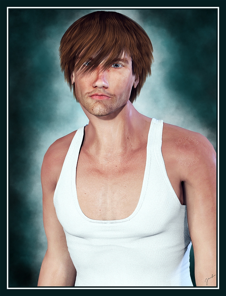
Marcello
Sympatico Studio Promo
Caption
Promo
Marcello by Tempesta3D
A good thing, actually. Most 3D portraits, look like 3D portraits. For the good book cover models, it needs to look like someone turned a photo into a digital asset, and this does. If I didn't know the Marcello model, I would think this was a photo that had been worked over with PS or Filter Forge. So, Kudos! A lot of bookcover design websites, and even authors, won't take an image that looks like it was 3D rendered. (I have run into this personally, had several covers rejected because of it.) Would love to learn more about your techniques. Doing book covers is one of the reasons that I got into learning 3d, then to find out a lot of places won't take 3D if it "looks" 3D.
 
@Dakorillon (IMArts) I think most book cover models look more "airbrushed", aka softer without skin details. I didn't do much postwork, I think two skin layers and two adjustment layers. Point me to some of the other images which you think have the look you're after. Maybe I still do have the original layered PSD for some of them (I usually tend to merge layers if there are too many).
 
Premade Fantasy Book Covers - The Book Cover Designer

On this site there are a lot of photos, because they don't allow anything that "looks" 3d rendered. They can have more details or more airbrushed, but there is just a certain "quality" that I haven't been able to figure out. Even after post work mine look like this:
And this:

The second one "Rogue" did get accepted, but I've had no takers, at all for it as a pre-made book cover.
I don't use PS (I do have GIMP but it's only for emergencies.) So, more I'm looking for the technique you are using. Because all the ones you posted recently have that quality to me.
 
@Dakorillon (IMArts)
The main process in my postwork is done in PS and I usually use key shortcuts. I have no idea what would be the equivalent in Gimp or any other image-editing software. Back in the beginning I used PSP, but started in PS because of high-res brushes years ago. I found that some things could be done easier in PS back then; mostly masking, also layering due to more options and not to mention actions. And I can't live without the Liquify Tool. I usually render in layers and compose in PS later. Skin usually looks dull right out of the box and needs the most postwork; but the postwork shouldn't affect clothes textures, so a lot of masking may be involved or even separate rendering. Also, this is a promo, so I usually focus on the product in question while if I actually have time resp. take the time I may postwork way more and change even parts like Three Witches vs. Fire Witch

The website has lot of various styles. One is definitely a total airbrushed look, which can be done several ways. I just skimmed thru the first few pages... if you have favourites over there, show them to me: may be easier. This one is nice: Sorceress - pretty sure it's a photo, but this could be done in 3D as well with a similar outcome. Hah, I found covers by Antje Darling overthere. These are definitely 3D, but highly postworked (and so easily identifiable due to her hair/fur painting skills - and her hair brushes are a must!)

I won't critique your renders in public. I see some things that could have done better. But critique should be better done in private. I totally hate it when I get a so-called critique (which usually isn't a critique at all) on images on deviantArt, though the critique feature is not enabled.
 

Media information

Album
Doodles and Promos
Added by
Jeanne Harmon
Date added
View count
1,867
Comment count
8
Rating
0.00 star(s) 0 ratings

Image metadata

Filename
harmon-marcello.jpg
File size
426.3 KB
Dimensions
735px x 960px

Share this media

Top